| World Energy to 2050: A Half Century of Decline | The Oil Drum: Canada | The Finance Round-Up: November 16th 2007 |
Energy Decline and National GDP in 2050: The Growth of Destitution
Posted by Stoneleigh on November 13, 2007 - 11:30am in The Oil Drum: Canada
This is Part 2 of a post by GliderGuider. Paul's website can be found here.
In Part 1 I derived a scenario for the changing global energy supply picture between now and 2050. The conclusion in that article was that due to the rapid decline of oil and natural gas supplies, the total energy available to the world would drop by about 30% in that time. That single figure, however, doesn't tell us much. The picture is dramatically complicated by the fact that the world will be forced to transition from an energy economy largely based on fuels (oil and natural gas) to one based primarily on electricity generated from a variety of sources. In addition, most of the world's population growth in that time will occur in the energy-poor and economically-poor developing world.
In order to gain more insight into how changes in energy will affect different parts of the world, this article will examine the impact of energy declines in specific countries. We will disaggregate the global picture presented in the baseline energy article, and apply those changes to the specific energy circumstances of individual nations. Those energy changes will be translated into their effect on national GDP. The national population changes projected by the UN Medium Fertility Case will be used to translate the national GDP changes into average per capita GDP changes for each country.
The examination of changing per capita GDP, driven by changes in the energy supply and national populations, will help us understand the distribution and extent of wealth and poverty over the next half century.

Figure 1: Total Energy Use, 1965 to 2050
Methodology
National Energy Budgets
The analysis in this article is supported by the global model of energy trends referenced above, that defines an individual supply curve for each energy source - oil, gas, coal, hydro, nuclear, solar and wind power.
In order to apply this to individual countries or regions, I started with the national energy consumption figures for 2006 found in the BP statistical Review of World Energy 2007. To establish each country's consumption in 2050 I multiplied their current use of each energy source by its production increase or decline factor derived from the model.
In the case of renewable energy, which is not included in the BP data, I used an ad hoc approach to add some amount of renewable energy to each country's budget. To do this, I took the basic energy budget determined in the first step and increased it by 5%, 10%, 15% or 20%. The assignment of a particular percentage to a given nation was to some extent arbitrary. It was based on their current energy wealth and their current activity in the field of renewable energy. As a result, countries like Denmark and Germany were given 20%, countries like Canada and Australia were assigned 15%, countries like Indonesia, Poland and Portugal gained 10%, and nations and regions like Pakistan, Bangladesh and most of Africa were given 5%,
I recognize that these approaches for both classical and renewable energy ignore probable differences in supply evolution in individual countries - some countries may develop hydro power at a faster rate than the model suggests while others lag behind, for example, and some nations may develop a "Manhattan Project" approach to wind or solar. Given the great degree of uncertainty inherent in this projection, though, I felt that such an approach was good enough to give the reader a feel for the nature and magnitude of the changes we may see over the next forty or fifty years.
National GDP
The standard economist's position on the influence of energy on the economy has been based on a theory developed by Robert Solow in 1956. In Solow's analysis economic growth was driven by two factors, capital and labour, both of which were quantified financially. 70% of the money flow in the world goes to labour as salaries, 30% goes to capital as rent, dividends etc. Solow used the Cobb-Douglas equations to map the growth function of an economy as labour and capital increased. He got nice curves, but unfortunately they under-predict observed economic growth by two thirds.
As reported in David Strahan's excellent book, "The Last Oil Shock" (pp. 116-123), two physicists, Reiner Kummel and Robert Ayres, independently observed the global economic slowdown following the oil shocks of the 70s and 80s and wondered if the role of energy in the economy was being under-valued. Their analysis convinced them that the price of oil (which was used by Solow in his analysis) underestimated the productive contribution of oil by a factor of ten. In other words, to truly reflect the contribution of oil to the economy, it should be priced about ten times higher. They developed their own economic model that started from Solow's work but incorporated their findings about oil's productive contribution, and found that their predictions matched observed economic growth perfectly.
The models by Kummel and Ayres predict that for every 1% increase in energy inputs you get about a 0.7% increase in GDP on average. The immediate implication is that a reduction of 1% in energy will cause a corresponding 0.7% drop in GDP. So if the world's oil supply were to decline by 30% the global GDP would lose 23% of its value.
Once the national energy budgets were established by the method described in the previous section, I calculated their impact on GDP using the above ratio:a 1% energy change gives a 0.7% change in GDP.
As with the energy budget calculations, there are significant caveats. The ratio observed by Kummel and Ayres is by no means axiomatic. Many factors peculiar to a given country will act on its GDP, driving its performance away from the projections of a simplistic one-number model. On the other hand, the same observation that was made above also applies here: given the inherent uncertainties, this approach should suffice to give the reader a feel for the shape and size of the coming changes.
The other caution applies to oil exporting nations. The future energy budgets and GDP for countries like Saudi Arabia, Canada, Russia etc. are not well addressed by this generalized model. Those nations have more options than do importing nations, since they can choose to retain their oil and gas as described in the Export Land Model (PDF warning). Such actions may reduce the decline in their GDP over the period being considered, though obviously at the expense of importing nations. It is also possible that the deliberate witholding of oil from the world market could trigger military action by desperate and militarily capable importers. Such resource wars would have unpredictable (though necessarily negative) consequences for the energy status and GDP of the otherwise well-endowed target oil producers.
National Population and Per Capita GDP
National population figures for 2006 were obtained from the CIA World Factbook. The figures for 2050 were obtained from a private re-publishing of the projected medium-fertility data from the United Nations Population Fund report of 2001. National GDP figures were also obtained from the CIA World Factbook. To ensure uniform comparisons they are Purchasing Power Parity (PPP) figures from 2006. Per capita GDP is derived by dividing the actual (2006) or projected (2050) national GDP by the actual or projected national populations.
National Results
The full data set for the model is also available in an Excel spreadsheet here.
The data on national population, energy and GDP in 2006 and 2050 that resulted from the research and calculations described in the above section is available in an HTML table here.
Winners and Losers
The research disclosed some of the profound economic and demographic changes that will affect the nations of the world over the next four or five decades. To start getting a sense of these changes, let's first take a look at the top 10 and bottom 10 nations in terms of per capita GDP, in 2006 and 2050. All GDP figures are in 2006 dollars.
The 10 Richest Nations
Table 1: Top 10 in 2006
| Country | Population (millions) | Per Capita GDP |
| Norway | 5 | $46,435 |
| Republic of Ireland | 4 | $44,073 |
| USA | 301 | $43,607 |
| Denmark | 6 | $36,636 |
| Canada | 33 | $35,269 |
| Austria | 8 | $34,610 |
| Finland | 5 | $33,923 |
| Switzerland | 8 | $33,618 |
| Japan | 127 | $33,069 |
| Australia | 20 | $33,069 |
| Total Population | 518 | |
| Average GDP | $39,627 |
Table 2: Projected Top 10 in 2050
| Country | Population (millions) | Per Capita GDP |
| Norway | 5 | $48,580 |
| Switzerland | 7 | $31,634 |
| Japan | 105 | $29,692 |
| Austria | 7 | $29,283 |
| Finland | 5 | $28,886 |
| Denmark | 5 | $28,320 |
| Germany | 73 | $26,826 |
| USA | 349 | $26,720 |
| Taiwan | 19 | $25,997 |
| France | 60 | $25,625 |
| Total Population | 635 | |
| Average GDP | $27,372 |
The interesting thing about the winners is that the size of the group has barely changed, and while their GDP has declined, it has not gone down by much. The average per capita GDP has dropped by about 30%, mostly driven by the decline in the United States. While this drop will be noticeable, given the high level of income that exists today it will not be beyond peoples' means to accommodate.
The 10 Poorest Nations
Table 3: Bottom 10 in 2006
| Country | Population (millions) | Per Capita GDP |
| Other Africa | 720 | $1,889 |
| Uzbekistan | 28 | $2,005 |
| Bangladesh | 150 | $2,239 |
| Pakistan | 165 | $2,656 |
| India | 1130 | $3,678 |
| Indonesia | 235 | $4,040 |
| Egypt | 80 | $4,164 |
| Ecuador | 14 | $4,458 |
| Philippines | 91 | $4,940 |
| Other C&S America | 60 | $5,185 |
| Total Population | 2,673 | |
| Average GDP | $3,162 |
Table 4: Projected Bottom 10 in 2050
| Country | Population (millions) | Per Capita GDP |
| Other Africa | 1,436 | $582 |
| Uzbekistan | 41 | $718 |
| Pakistan | 345 | $787 |
| Bangladesh | 212 | $794 |
| Other Middle East | 229 | $1,247 |
| Egypt | 115 | $1,487 |
| Ecuador | 21 | $1,736 |
| Other C&S America | 108 | $1,768 |
| Indonesia | 312 | $1,896 |
| Algeria | 58 | $2,077 |
| Total Population | 2,877 | |
| Average GDP | $939 |
It's a very different story for those nations on the bottom of the ladder. While the population of the bottom 10 countries hasn't changed much, their per capita GDP has dropped a whopping 70%. The average income has fallen from $8.50 per day now to $2.50 per day (in today's dollars) in 2050. Also notice the inclusion of Africa's 1.4 billion people in this group. As their average income is so low, probably a full billion people in this group will be trying to live on less than a dollar a day.
The primary reason for this precipitous drop is that the developing world gets much more of its energy from oil and gas. When those sources start to decline, they have little hydro or coal, and no nuclear power to replace them with. In addition, due to their lack of industrial infrastructure they will find it difficult to install enough renewable energy capacity to offset the decline to any significant degree.
On a national level, two factors seem to determine how well or poorly a country will fare. These factors are its population change (falling is good, rising is bad) and how much coal vs. oil and gas they currently use. Those countries that use a high proportion of coal relative to oil and gas will find their GDP somewhat more stable as time goes by. Countries that use more oil and gas, but less coal, will be more severely affected. This explains the anomalous performance of China: their population is falling and they use a lot of coal. While their coal use is bad news for the global environment, China's GDP will be well protected, dropping only 13% by 2050.
Three Case Studies
To clarify the picture we will now take a closer look at three nations that dominate the economic and energy news these days. We will examine the specifics of their energy use and how that use will evolve until 2050. By translating their energy use into an estimate of their future GDP and then factoring in the changes in their populations, we will derive an estimate of their per capita GDP in 2050.
United States: a Wounded Giant
Table 5
| Year | Energy (Mtoe) | Pop. (x 106) | GDP ($Millions) | Per Capita GDP | ||||||
| Oil | Gas | Coal | Hydro | Nuc. | Renew. | Total | ||||
| 2006 | 939 | 567 | 567 | 66 | 188 | 0 | 2,326 | 301 | $13,130,000 | $43,607 |
| 2050 | 169 | 146 | 599 | 90 | 183 | 178 | 1,365 | 349 | $9,333,733 | $26,720 |
The energy picture of the USA is dominated by oil and natural gas, and the decline of those sources will determine the nation's future.
Oil
The mathematical calculation of American oil consumption in 2050 indicates a drop of 82%. This results from multiplying the current consumption by the expected global decline in supply, under the assumption that most nations will experience broadly similar reductions given the free market for oil that exists today. Is such an assumption warranted? Let us analyze the situation a bit further.
America currently consumes over 900 million tonnes of oil a year. Of that total, 300 million tonnes are produced domestically and over 600 million tonnes are imported. American domestic oil production has been in decline since 1970, at a constant rate of around 2% per year. If that rate holds for the future, the USA will be producing about 130 million tonnes per year in 2050. In order to meet the calculated figure of 169 million tonnes in 2050, America will have to import about 40 million tonnes of oil compared to 600 million today. I believe that this is a reasonable expectation because of the imminent effect of the "Net Oil Export Problem". Under that scenario it is possible for global oil exports to go to zero quite rapidly, and according to the linked paper by Jeffrey Brown is it possible that this may happen by 2040. Accordingly, projecting American imports of 40 million tonnes per year in 2050 may even be optimistic. It is possible, however, that such a level of imports could be secured by long term contracts or even military force.
Gas
Natural gas production in the USA has been relatively constant for the last 30 years, though this has required drilling ever more holes at an ever-rising cost to maintain the level of supply. Gas imports have risen to about 15% of overall consumption. These indicators point to a coming peak (in my opinion within the next decade), followed by a sharp decline for reasons outlined in my earlier article. The projected drop of 75% would be generated by a loss of imports and a decline in domestic production of 5% per year from 2020. This is in fact less than the average 6% decline rate I used in my earlier article.
Coal, Hydro and Nuclear
These sources follow the global patterns determined in the earlier article. Coal use will be up marginally world-wide in 2050, nuclear power will be down marginally, and hydro use will see a general increase of about 40% over today's values. These changes seem reasonable given the current energy development patterns in the USA.
Renewables
As I said above, I assigned an arbitrary percentage of renewable power to each country based on its industrial capacity and its current level of involvement with renewable energy. That meant that I allotted the USA an additional 15% of their total energy in 2050 to account for wind and solar development.
The Changing Energy Mix
The energy mix of the USA stays quite diverse, though the growing role of coal is clear. Because of their original heavy reliance on oil and gas, the total US energy supply in 2050 declines to about 60% of its present level.
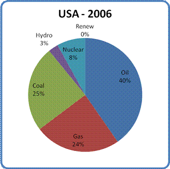
Figure 2: USA Energy Mix in 2006
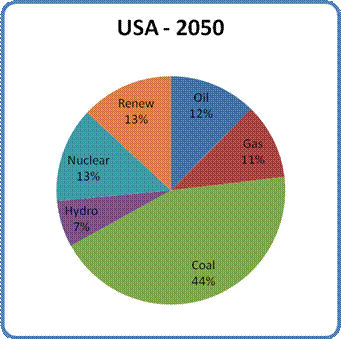
Figure 3: Projected USA Energy Mix in 2050
GDP
Due to the 40% decline in total energy, the American GDP will decline by about 30%. This is determined by applying the 0.7 multiplier determined by Kummel and Ayres to the energy decline.
Population and per capita GDP
According to the UN figures, the American population will have grown by about 16% in 2050. This, combined with the expected 30% drop in GDP, gives a decline of about 40% in per capita GDP in 2050. This would still leave the USA as the 8th wealthiest country in the world in per capita terms, with the second largest GDP (just behind our next case study, China).
China: a Coal-Fired Powerhouse
Table 6
| Year | Energy (Mtoe) | Pop. (x 106) | GDP ($Millions) | Per Capita GDP | ||||||
| Oil | Gas | Coal | Hydro | Nuc. | Renew. | Total | ||||
| 2006 | 350 | 50 | 1,191 | 94 | 12 | 0 | 1,698 | 1,322 | $10,700,000 | $8,094 |
| 2050 | 63 | 13 | 1,257 | 129 | 12 | 147 | 1,621 | 1,478 | $10,362,682 | $7,013 |
China's energy picture is dominated by coal.
Oil
Unlike the USA, Chinese oil production is rising, though slowly (about 1.5% per year). However, their largest oil field, Daqing, has peaked. This makes it quite probable that overall Chinese oil production will go into decline in the next decade. In addition, China became a net importer of oil in 1993 and currently imports about half their requirements. If they, like the USA, lose access to most of their imports over the next 40 years, a decline in domestic production of only 3% per year would bring them to the projected level of oil consumption. As in the case of the USA is is entirely possible that China will try to secure oil supplies outside of normal market channels, so they may end up with a bit more oil than I have projected.
Gas
Natural gas production in China has been rising rapidly in recent years, averaging 15% annual growth since 2000 as China pursues an aggressive program of industrialization. So far their production has kept pace with their usage, but a decline parallel to that of oil is inevitable over the next four decades, especially if they attempt to increase their extraction in concert with their economic growth. The derived global mathematical ratio of 25% by 2050 seems reasonable, though it is also reasonable to assume that China will try and secure foreign gas supplies either though long term contracts or military or economic warfare.
Coal
It is clear that China has placed enormous emphasis on their large endowment of coal. Recent reports indicate that they have plans to build two or three coal-fired power plants per week for at least the next decade. As a result, it's possible that China may exceed the 6% projected net global growth in coal power by 2050. If they do, it could give a large boost to their GDP and vault them well into the global lead. Of course, there is always the question of the environmental damage done by coal, both from the CO2 production and localized pollution by soot, ash and heavy metals. The extent to which this will restrain China's development of coal power remains to be seen. For now, we will leave the increase in China's coal power output in line with the global model.
Hydro
The development of the Three Gorges Dam has left no doubt that China is serious about developing its hydro potential. The increase of 40% in hydro power postulated by the model seems entirely achievable, especially given China's apparent willingness to sacrifice ecological concerns in favour of industrial development.
Nuclear
Nuclear power may see its strongest growth in China, growth that will be driven by the need for electricity that produces less greenhouse gases and enabled by the willingness of the central government to ignore the personal wishes of its citizens. It is also likely that there will be less public opposition to nuclear power in China than in the West because of the relative weakness of their environmental movement. China currently has 30 reactors planned and 86 proposed, a full third of the world total. It is quite likely that the contribution of nuclear power proposed by the energy model will be too low in China's case. If that turns out to be the case, its contribution could push their GDP decisively past today's level.
Renewables
One area where my model has perhaps been too generous to China is in the penetration of wind and solar. To cover their increasing role I have allotted China an additional 10% of their non-renewable energy budget. However, while China may play a large role in manufacturing such equipment, it seems less likely that they will install it with much enthusiasm. The Chinese system is much more sympathetic to large, centralized power sources and as such more likely to favour increased nuclear power over wind and solar.
In the final analysis the model's pessimism with respect to nuclear power may be balanced by its optimism over wind and solar, with the net result being a wash. Only time will tell.
The Changing Energy Mix
The role of coal in China's energy picture is obvious. As I said above, much of the increase in renewable energy in 2050 could be replaced by nuclear power, with the two sources essentially trading importance. As they are both electrical sources, that realignment would make no difference to the outcome of this particular analysis. The total Chinese energy supply in 2050 is projected to drop by about 5%.
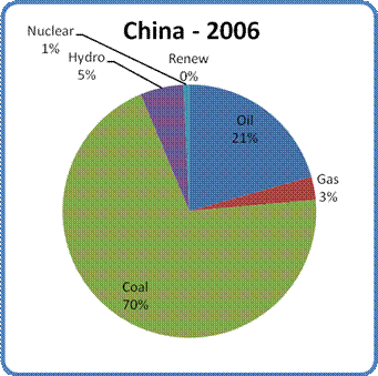
Figure 4: China Energy Mix in 2006
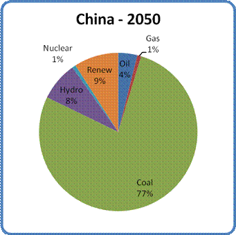
Figure 5: Projected China Energy Mix in 2050
GDP
Due to the 5% decline in total energy, the Chinese GDP will decline by only about 3%, which will still leave them with the world's largest GDP.
Population and per capita GDP
According to the UN figures, the Chinese population will have grown by about 12% in 2050. This, combined with the expected 3% drop in GDP, gives a decline of only about 13% in per capita GDP in 2050.
India: a Nation in Distress
Table 7
| Year | Energy (Mtoe) | Pop. (x 106) | GDP ($Millions) | Per Capita GDP | ||||||
| Oil | Gas | Coal | Hydro | Nuc. | Renew. | Total | ||||
| 2006 | 120 | 36 | 238 | 25 | 4 | 0 | 423 | 1,130 | $4,156,000 | $3,678 |
| 2050 | 22 | 9 | 251 | 35 | 4 | 16 | 336 | 1,529 | $3,559,573 | $2,328 |
For its population, India has a much smaller energy base than the USA or even China.
Oil
India's oil production has been constant for the last decade, though its consumption and imports have been slowly rising. India currently imports about two thirds of its oil requirements. That level of imports leaves it in a very vulnerable position as the international export market dries up. Its domestic production is barely enough to cover the mathematically projected oil consumption in 2050 (20% of current consumption), so any decline in their production could drop India below even the projected 22 million tonnes per year.
Gas
Natural gas production in India has risen by 25% since 2000 but its imports have recently shown a sharp rise - from 0 in 2003 to 20% of their consumption in 2006. As in the case of China's gas consumption, this is probably due to India's ongoing industrialization. The relatively small amount of natural gas used in India and their relatively healthy level of production means that even if depletion strikes other continental gas exporters India's gas supplies may fare somewhat better than the model indicates.
Coal
Like China, India has placed great reliance on coal as a proportion of their energy supply. It is likely that this dependence will continue in the years and decades to come. As a result, it is possible that India may exceed the expectations of the model to some extent, especially as a growing population demands enough electricity to live a basic life. On the other hand, the resulting ecological damage expected in China would also be expected in India, and might, to some extent slow the growth of coal power. For now, the picture is unclear enough to warrant moving away from the model's projections for coal.
Hydro
India's hydro development is expected to be on par with the global
projection. However, in this case the reduction of Himalayan glaciers due to global warming may reduce water flows faster than experienced in other parts of the world. This reduction would slow the development of more hydro power, which would act to offset any gains in the coal sector. As with coal, we will accept the projections for hydro, on the assumption that any shortfall could be broadly balanced by increased generation in other energy sectors.
Nuclear
India is also taking the development of nuclear power seriously, with 19 reactors currently in the planning or proposal stages. There is a possibility for India to outperform the model's projections over the next couple of decades, but this performance should be taken with a grain of salt. A trend towards de-industrialization driven by declining oil and gas supplies may put the brakes on nuclear development after 2025. This trend could manifest not only as a loss of industrial capacity, but also in a loss of the capital required to support such a technologically intensive enterprise.
Renewables
There are significant opportunities for solar power in India, both in small photovoltaic installations and in the use of thermal solar generation. At the moment there isn't much penetration of solar power in India, especially for utility-scale electricity. There has been some installation of point application solar power, for running specific services like pumps, lighting etc. where grid feeds are not available. As a result I have given India a 5% allotment for renewable energy. To put that amount in perspective, it would give renewables a greater role than natural gas by 2050.
The Changing Energy Mix
India uses almost as high a proportion of coal as China, though their total energy supply is only a quarter the size. As time goes on, coal will take on even more of the burden - not so much by choice as by default, as imported oil falls away. It seems unlikely that renewable energy will be able to alleviate much of the 20% drop in energy supplies projected to occur by 2050.
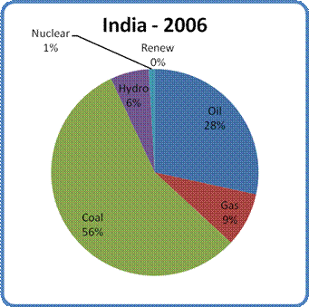
Figure 6: India Energy Mix in 2006
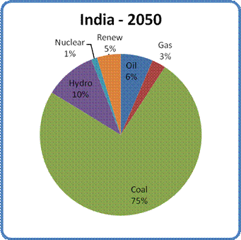
Figure 7: Projected India Energy Mix in 2050
GDP
Due to the 20% decline in total energy, in 2050 the Indian GDP will decline by about 14% in today's dollars.
Population and per capita GDP
According to the UN figures, the Indian population will have grown by about 35% in 2050. This growth combined with the expected 14% drop in GDP will give India a decline of 37% in per capita GDP in 2050. This decline from $3,700 to $2,300 per person will represent a catastrophic drop below the poverty line for much of the Indian population.
The Big Picture
The easiest way to get a feeling for the global change this all represents is to divide the Earth's population into three groups based on their national per capita GDP (loosely speaking, the poor, the middle class and the rich countries). The bottom group has an income of less than $4,000 per year. The middle group has an income between $4,000 and $15,000 per year, and the top group has an income over $15,000 per year (all numbers in 2006 dollars). Here is how the number of people in each of these groups will change between now and 2050:
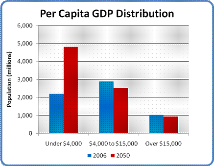
Figure 8: Per Capita GDP Distribution 2006 and 2050
The story here is the same as it was above. In 2050 the size of the upper and middle classes remains almost constant, while the number of poor balloons to two and a half times its current level.. Even worse, the average per capita GDP of the poor group drops from $2,900 today to $1,500 in 2050, a drop of almost 50%. This is due to the burgeoning population of this group sharing the shrinking energy pie. Another significant factor is the movement of a number of large and growing countries from the from the middle class to the poor group.
Who Are The Rich?
The following tables give the countries that comprise the rich nations now and in 2050 - those with average per capita GDP over $15,000 per year.
Table 8: The Rich in 2006
| The Rich (2006) | |||
| Country | Population (millions) | GDP (millions) | Per Capita GDP |
| Norway | 5 | $213,600 | $46,435 |
| Republic of Ireland | 4 | $180,700 | $44,073 |
| USA | 301 | $13,130,000 | $43,607 |
| Denmark | 6 | $201,500 | $36,636 |
| Canada | 33 | $1,178,000 | $35,269 |
| Austria | 8 | $283,800 | $34,610 |
| Finland | 5 | $176,400 | $33,923 |
| Switzerland | 8 | $255,500 | $33,618 |
| Japan | 127 | $4,213,000 | $33,069 |
| Australia | 20 | $674,600 | $33,069 |
| Germany | 82 | $2,630,000 | $31,917 |
| Netherlands | 17 | $529,100 | $31,873 |
| United Kingdom | 61 | $1,930,000 | $31,743 |
| Belgium & L'bourg | 11 | $342,800 | $31,741 |
| Singapore | 5 | $141,200 | $30,696 |
| France | 62 | $1,891,000 | $30,353 |
| Italy | 58 | $1,756,000 | $30,224 |
| Taiwan | 23 | $680,500 | $29,716 |
| Kuwait | 2 | $55,910 | $27,955 |
| Spain | 41 | $1,109,000 | $27,383 |
| New Zealand | 4 | $106,900 | $26,073 |
| South Korea | 49 | $1,196,000 | $24,408 |
| Greece | 11 | $256,300 | $23,953 |
| Czech Republic | 10 | $224,000 | $21,961 |
| Portugal | 11 | $210,100 | $19,821 |
| Slovakia | 6 | $99,190 | $18,035 |
| Hungary | 10 | $175,200 | $17,520 |
| Lithuania | 4 | $54,900 | $15,250 |
| Argentina | 40 | $608,800 | $15,107 |
| Total | 1,023 | $34,504,000 | $33,745 |
Table 9: The Rich in 2050
| The Rich (2050) | |||
| Country | Population (millions) | GDP (millions) | Per Capita GDP |
| Norway | 5 | $231,143 | $48,580 |
| Switzerland | 7 | $213,373 | $31,634 |
| Japan | 105 | $3,115,347 | $29,692 |
| Austria | 7 | $207,734 | $29,283 |
| Finland | 5 | $141,486 | $28,886 |
| Denmark | 5 | $135,740 | $28,320 |
| Germany | 73 | $1,966,411 | $26,826 |
| USA | 349 | $9,333,733 | $26,720 |
| Taiwan | 19 | $491,347 | $25,997 |
| France | 60 | $1,534,492 | $25,625 |
| Italy | 41 | $1,009,096 | $24,494 |
| Spain | 30 | $714,144 | $23,627 |
| Czech Republic | 8 | $184,491 | $23,565 |
| Canada | 42 | $963,140 | $22,763 |
| United Kingdom | 57 | $1,273,956 | $22,481 |
| Belgium & L'bourg | 9 | $207,336 | $22,057 |
| Republic of Ireland | 5 | $99,343 | $21,092 |
| Australia | 26 | $529,660 | $20,561 |
| Greece | 8 | $166,303 | $20,200 |
| Netherlands | 14 | $280,913 | $19,844 |
| New Zealand | 5 | $87,506 | $16,674 |
| Portugal | 8 | $132,346 | $16,265 |
| South Korea | 51 | $823,141 | $16,053 |
| Slovakia | 5 | $76,489 | $15,817 |
| Singapore | 4 | $62,020 | $15,447 |
| Total | 949 | $23,980,687 | $25,280 |
As you can see, the world's rich nations fare quite well in 2050 under this scenario. The number of countries in "the club" drops by four, their population numbers shrink a little, and the per capita GDP of the group declines by 25%. Despite this, the rich nations are not going to escape the coming energy realignment unscathed. The impacts they feel will be due to their heavy reliance on oil as a transportation fuel, and on the central importance of transportation to the modern industrial enterprise. These effects will be addressed in a later article. For now, the messages are that energy decline per se is not a lethal threat to the economies of the world's wealthy countries, and that they will have far more options for dealing with energy changes than do the poor countries.
Who Are The Poor?
The following tables give the countries that comprise the world's poor nations now and in 2050 - those with average per capita GDP under $4,000 per year.
Table 7: The Poor in 2006
| The Poor (2006) | |||
| Country | Population (millions) | GDP (millions) | Per Capita GDP |
| Other Africa | 720 | $1,360,000 | $1,889 |
| Uzbekistan | 28 | $55,750 | $2,005 |
| Bangladesh | 150 | $336,700 | $2,239 |
| Pakistan | 165 | $437,500 | $2,656 |
| India | 1,130 | $4,156,000 | $3,678 |
| Total | 2,193 | $6,345,950 | $2,894 |
Table 10: The Poor in 2050
| The Poor (2050) | |||
| Country | Population (millions) | GDP (millions) | Per Capita GDP |
| Other Africa | 1,436 | $835,649 | $582 |
| Uzbekistan | 41 | $29,129 | $718 |
| Pakistan | 345 | $271,788 | $787 |
| Bangladesh | 212 | $168,749 | $794 |
| Other Middle East | 229 | $285,425 | $1,247 |
| Egypt | 115 | $170,754 | $1,487 |
| Ecuador | 21 | $36,781 | $1,736 |
| Other C&S America | 108 | $190,978 | $1,768 |
| Indonesia | 312 | $591,254 | $1,896 |
| Algeria | 58 | $119,915 | $2,077 |
| Philippines | 131 | $301,390 | $2,303 |
| India | 1,529 | $3,559,573 | $2,328 |
| Iran | 115 | $290,784 | $2,530 |
| Turkmenistan | 8 | $20,405 | $2,645 |
| Venezuela | 42 | $126,989 | $3,013 |
| Azerbaijan | 10 | $30,072 | $3,013 |
| Saudi Arabia | 54 | $167,110 | $3,068 |
| Peru | 42 | $136,631 | $3,231 |
| Total | 4,808 | $7,333,377 | $1,525 |
In sharp contrast to the outcomes expected for the rich countries, poor nations face a decidedly bleak future in 2050. The number of poor nations or regions jumps from 5 to 18. The total population of the group more than doubles while the average per capita GDP for the group drops by half. Given the level of human misery that exists in the poor nations today, this is a decidedly ominous forecast.
Current statistics from The World Bank indicate that over a billion people today live on a single dollar a day - half of the population I listed above as comprising the poor of 2006. The growth in that population, coupled with the drop in per capita GDP, implies that well over twice that number will be desperately poor in 2050 - perhaps as many as 3 billion. According to the same source, about half the world's population today lives on less than $2 a day. If the scenario developed in this article is close to being true, that number could double by 2050. That demographic and economic earthquake could leave 6 billion people - almost the size of today's entire global population - trying to survive on such a pittance.
Conclusion
The conclusion is straightforward. By 2050 well over half the world's population will be desperately, abjectly poor, and even the rich will find themselves living in constrained circumstances as their average per capita income drops by 25%. Just at the time when foreign aid is most desperately needed, the nations that will be called on to supply it will be find themselves less able to deliver. The implications for life and death in the poverty-stricken regions are dire indeed.
So far, these articles have examined only the impact of energy and demographics on the global economic picture. Complicating factors which have not yet been addressed include: geopolitical upheavals (primarily economic migrations and the threat of increased resource wars); the effect of impoverishment on the food supply of the growing ranks of the destitute; and the underlying drumbeat of ecological damage heralded by the droughts and floods of climate change, the loss of soil fertility and ground water supplies and the death of the oceans. The prospects for the Earth's poor are not likely to improve as we progress though this analysis.
Personnel
Archives
- December 2008 (1)
- October 2008 (1)
- July 2008 (2)
- June 2008 (2)
- May 2008 (6)
- January 2008 (2)
- December 2007 (8)
- November 2007 (9)
- October 2007 (11)
- September 2007 (14)
- August 2007 (14)
- July 2007 (10)
- June 2007 (9)
- May 2007 (11)
- April 2007 (9)
- March 2007 (11)
- February 2007 (11)
- January 2007 (11)
- December 2006 (12)
- November 2006 (16)
- October 2006 (13)
License

This work is licensed under a Creative Commons Attribution-Share Alike 3.0 United States License.
http://politics.reddit.com/info/60hht/comments/
thanks for your support.
Interesting comment by George Ure, at Urban Survival:
Yep. Over the last 100 years we in the developed world have come to regard our increasing wealth as inevitable, normal and somehow our "right". It's the old problem of shifting perceptual baselines writ large.
GliderGuider,
Thank you for the article.
Most of my daughter's friends are taking year off before starting at university. A surprising number of them are planning trips around the world, stopping off in South Africa, Australia and New Zealand, then California and a wander through the US before the get to New York!
A quick word with these "golden children" reveals a total lack of awareness about the nature of the world of scarcity we appear to be heading for. It's frightening. They all come from educated, professional families, who live really well, pretty similar to the Roman gentry. For the them the world is their gilded oyster. They're mostly occupied by finding new ways to spend, new sports to try, and exotic vaction destinations.
Basically, people are enjoying the party as long as it lasts, because they've given up on thoughts of changing society. Society, is, as it is. Whilst there are environmental "challanges" new technology will provide, and materially, things can only get better!
My niece attends a private school, and many of her classmates in my opinion are spoiled rich kids. Thus my niece comes home from school with all kinds of crazy ideas about what's important in the world and what isn't. This kind of handbag. That kind of car. Etc, etc...
I try and bring her back to earth every so often, but she usually just looks at me like I have two heads...
My brother and his wife aren't that way at all, and my brother and I are really in agreement about our consumeristic society and Peak Oil. They both teach in the public school system (and the crap they see at work is what motivated them to send their kids to private school).
Thanks for your report and I would like to add a link concerning the transfer of wealth from West to East via the so-called soverign wealth funds. I dont know how this current trend will play out in 2050 but it will affect global balance of power in the shorter term, imo. Perhaps this shift of wealth constitutes an 'unknown unknown' in Rummy parlance?
Widening cracks in the West
GWYN MORGAN
From Monday's Globe and Mail
Read Bio | Latest Columns
November 12, 2007 at 6:04 AM EST
http://www.theglobeandmail.com/servlet/story/RTGAM.20071112.wragendamorg...
'CALGARY — History demonstrates that events that changed the course of human endeavours could have been forecast by a clear-minded analysis of the big picture.
Unfortunately, it's hard to focus on the big picture when we're distracted by disconnected snapshots.
Financial markets, for example, have been battered by the realization that investors couldn't trust the ratings assigned to structured debt securities. Looking back, the warning signs were clear: instant credit approvals on everything from second mortgages to cars to vacations; oversubscribed low-yield debt issues funding highly leveraged takeovers; financial engineering so extreme that investors couldn't discern who they were lending to or for what; and staggering Wall Street bonuses driving even more-extreme schemes.
But a much bigger financial earthquake is reversing the centuries-old dominance of Western-based global economic power. It's an earthquake set off by a combination of petrodollars and trade flows.
More and more of the West's oil supplies are coming from the Middle East and Russia. As oil gushes out of these countries, enormous amounts of petrodollars flow back to their national treasuries. The rise of oil prices to the $100-a-barrel range further accelerates this enormous West to East wealth transfer.'...snip...
' Economists will give you a long and arcane explanation, but the real answer is quite simple. Many of the dollars sent to pay for Middle Eastern oil and Chinese manufactured electronics return through purchases of Treasury bills and all kinds of assets - including the shares of U.S.-based companies and the very real estate that the country is built upon.
The Sheiks, Oligarchs and Indian entrepreneurs are certainly changing the game in global markets, but it's the unprecedented power of government-controlled wealth that is really sounding alarm bells in the U.S. and other Western countries. From Abu Dhabi to Qatar to China, governments are awash in cash. Investment Bankers estimate that the multitrillion-dollar sovereign wealth fund sector is growing by half a trillion dollars a year, while a lot of western countries sink deeper into debt. Few sovereign fund owners are democracies and some can't be considered friends of the West. This has fuelled concern that investment decisions are motivated more by geopolitical power versus normal market considerations. The continuing meltdown of the greenback means the sovereigns get even more for their money, thereby accelerating the process.
Bank of Canada Governor David Dodge recently spoke about the "insufficient transparency" of the sovereigns. U.S. officials have called for international reporting standards. Clay Lowery of the U.S Treasury points out that if the world's Sovereign funds bought all U.S. and European Treasury bond issues they would still have about a billion dollars left in the kitty.'...snip...
'This earthquake is shaking the very poles around which global power rotates.'
Gwyn Morgan is the retired founding CEO of EnCana Corp.
The funniest line is "US officials have called for international reporting standards". Like the guv approved reporting standards where in the span of a couple months the largest bank in the USA can go from "neglible" writedowns re subprime to potential bankruptcy/bailout. Physician, heal thyself.
One comment wrt projected natural gas declines in the US. If we are looking at that severe a decline, then I think that it is reasonable to assume that there will be a much bigger push to put in anaerobic digesters for agricultural and municipal wastes to generate methane. The technology is mature and has been widely deployed throughout the world. It is not super-high-tech, I'm not aware of any rare minerals involved that could create a bottleneck, and the technology is not super expensive. The technology is scalable from home-brew rigs for individual homesteads up to massive operations.
Such a widespread biogas generation deployment could imply a higher overall level of renewables by 2050 than you have anticipated. It might not make a huge difference, but it will help a little.
WNC Observer,
In the 1990s I was involved in a few attempts to develop prototype anerobic plants. Even when you explain that anaerobic digesters are NOT open to the atmosphere you keep getting remarks that people don't want the smell.
And when you do get an area for a foundation you sometimes have "accidents" that look remarkably like acts of sabotage; but I know that it's really my imagination and that sturdy brick structures do crumble naturally... and quite often.
Actually, you do need to worry about the sulfur based gases, which is something that was supposed to be looked into in this research. Currently, the gases can be "trapped" by using metal filings to bind with the sulphur. The research projects I was interested in was looking into a more sustainable method of capturing sulfur (with a positive EROEI). I haven't kept up on this... maybe this problem has already been solved.
During the aparthide embargoes, some South African farmers reportedly had great sucess in running their farms on livestock-produced methane; but, I don't know what weather conditions they had to deal with.
I question your statement that the USA will have only 349 million by 2050. The UN estimate is about 396 and the world population council estimate is 419 million. Your estimate gives artificially high values for GDP per capita. Otherwise, I found this a stimulating article, well worth reading. Obviously a lot of work has gone into it.
Don Spady
The UN medium variant projection that I used for all countries gives 349 million for the USA. I preferred to take all my population projections from a single source so as to provide a level playing field at this point.
None of the current population projections will be accurate in 2050, largely because of the unforeseen effects of famine in the developing world and the knock-on effects of massive economic migrations. That combination could result, for instance, in the projected GDP of developing countries being better than predicted as their populations get decimated, while the GDP of developed countries would drop more due to higher immigration levels (legal or illegal)
I went to the UN 2004 World Population Prospects and got for the USA as a medium projection a population of 394,976,000. Is it possible you inverted the 394 to 349 early in your calculations.
It looks like I was using slightly older numbers: http://www.sdnbd.org/sdi/issues/pollution/world-population-2050.htm shows the 349 number.
Another source of population numbers for various countries is the US Census Bureau web site, http://www.census.gov/ipc/www/idb/idbr200707.html. USCB does their own scrubbing of the data. At best this might be characterized as 'untainted by UN political correctness', but it is at the very least a source having different workers scrubbing the data. I noticed from the Release Notes that the former French colonies are now called overseas Departments, and their populations are included in the total for France in Europe. USCB does not do its own data collection on other countries (of course not, only CIA might try to do that).
If there are discrepancies for various sources and for various countries, I suggest one ask whether they are large enough to change the main conclusions. For population of USA, I guess no available population estimate knocks USA out of the well-to-do group.
Hello,
I assume it is not all the former French colonies, but only the little bits and pieces that remain (Martinique, Guadaloupe, Réunion, etc.).
Obviously, Algeria, Indochina (i.e. Viet-Nam, etc.), Québec, large parts of Africa, etc. are not included.
Ciao,
FB
Nor New Orleans :-(
Alan
It's funny how everyone suddenly cares about the poor now that their energy supply is threatened.
But this is ok?
How many of people who are now concerned about poor countries running out of energy, cared before "peak oil"?
You can't buy much energy on a dollar a day; not much to lose.
It's funny how everyone suddenly cares about the poor
Are you sure that what you see is caring?
This is the wrong approach and invalidates your country comparisons. Consumption is not rationed pro rata, but allocated by purchasing-power via price. For example if the price of meat doubles, a rich and a poor person will not adjust their consumption equally. Effectively you are assuming all countries are equally rich.
A more plausible but still simple approach would be to estimate a cap on fuel expenditure at say 20% of GDP. As oil and gas exports decline, rising prices (set to equalize supply and demand) mainly reduce imports for poorer countries . This produces a more realistic "pricing out of the market" effect that is already observable for some countries.
So the situation with wealth disparity will be worse than I propose? Yes, I agree that it probably will be.
This is about the most optimistic choice for a decline scenario I could have chosen, and that was deliberate. My earlier attempts at doing what you said (allocations with spending limits) involved far too many individual assessments for someone with a day job. To make matters worse, I ended up with 6 billion people simply sliding off the face of the earth into a zero-income abyss, which is just as unacceptable, both in that it won't happen like that at the very bottom, and it would open me up to charges of racism.
At the bottom of the income scale in 2050 we are very close to singularity conditions, which are "difficult" to model. The basic message of this scenario is "The rich will muddle though, the poor will not, and there will be a metric crapload of poor."
you give a share of energy production of 15% for the renewables in 2015 in the US. I can't buy that, especially if you make the hypothese of a decline of energy production. Don't you think that the US and others could not start a kind of Marshall Plan on solar energy? If they cover all the building , the desert and road sides with solar panels, they could produce a lot more. Thx for your comments
There was a lot of discussion about this after Part 1. My short answer is that I am not a member of the Solar Temple, and even the levels I project for solar and wind strain my credulity.
"I am not a member of the Solar Temple"
I'm sure that buggy whip manufacturers weren't members of the Gasoline Temple, either. Gasoline replaced electricity, ethanol and coal for horseless carriages very, very quickly. Kerosene replaced whale oil and town gas for lighting very quickly. Oil replaced coal in post-war II Europe very quickly. Nuclear replaced oil very quickly for electrical generation in the US.
Oil and gas have been incredibly cheap for 100 years. Now that they're not, things will change enormously. These things take a few years to ramp up, and then they take off. Don't mistake capex expenditure lag for fundamental barriers.
As I said yesterday, get back to me when solar PV generates an annual exajoule, and I'll revisit my position. Feel free to disregard everything I say between now and then.
"get back to me when solar PV generates an annual exajoule, and I'll revisit my position."
That's a pretty high level - I don't think wind is quite there.
"Feel free to disregard everything I say between now and then."
I'd to prefer to resolve our differences. Further, you're speaking in a public forum, and there are impressionable folks out there, apparently making life decisions on what they read here, so it's important to get it right.
It is not necessary that reasonable people resolve all their differences. Sometimes it's instructive to leave the differences out where people can see them and make up their own "impressionable" minds. (BTW, you do realize how patronizing that remark sounded, don't you?)
"It is not necessary that people resolve all their differences. Sometimes it's instructive to leave the differences out where people can see them and make up their own "impressionable" minds. "
Well, if both sides are available, it's much better than nothing. OTOH, resolution is best. For instance, no scientist would agree to "teaching the controversy" for evolution.
"you do realize how patronizing that remark sounded, don't you?"
I meant no disrespect. I just wish people gathered more info before making life decisions, that's all. But...they don't, so we need to be very careful about what we say, and also how we frame it. For instance, if this scenario is meant to be a "reference case", that should be said clearly. Including your statement of "Unless we get off our collective asses, here's what's likely to happen if we continue as we have been going" would make an enormous difference to help people frame this properly.
In the original article I said this: "The analysis is intended solely to clarify a "most likely" future scenario, based purely on the situation as it now exists and will probably unfold. You will not find any specific suggestions for what we ought to do, or any proposals based on the assumption that we can radically alter the behaviour of people or institutions over the short term. While the probability of such changes will increase if the global situation shifts dramatically, such considerations "
The intent is there, but it's vague - I didn't really distill the intent into a single pithy sentence until today. I'll add that to the version on my web site.
OK, both articles now carry the following clarification in the introduction:
A scenario where we do nothing other than what we are now doing is not "most likely". It is highly unlikely because it would require that we do nothing to mitigate an enormous problem. That is much too pessimistic an assumption. I think you should take out "intended solely to clarify a 'most likely' future scenario,".
Also, a "Manhattan Project" is much too small a mitigation effort. As Matt Simmons has written, we should be talking about a World War II level effort. The US spent 38% of GDP in 1944 on the war effort. I think we need to spent 5-10% of GDP for each of 20 years.
I agree about "most likely".
I'd quibble about costs. Some of them may be much smaller than one might think. For instance, replacement of ICE's with serial PHEV's (aka EVrX, for "range extended EV") wouldn't cost anything at all (except for a bit of R&D, which is essentially finished), if done through attrition of ICE's.
Similarly, nuclear, and many wind locations, especially in the US, are as cheap as coal, if you look closely at some of the proposed coal plant costs, even without sequestration.
I like that.
I think I agree with Sterling, though, that "most likely" and "probable" aren't good. I'd remove "most likely", and simply make the first sentence "The analysis is intended solely to clarify a future scenario, based purely on the situation as it now exists and the directions it shows obvious signs of taking." I'd change "business as probable" to the classic cliche "business as usual".
I think I have to agree that improved public policy is essential, so I would agree that this scenario is "possible", based on strictly status quo. For instance, I think that PV is likely to explode, but even that could be stopped by utility finagling with rates (reducing marginal costs by shifting costs excessively to base costs), or utilities refusing interconnections to customer systems. For another, the US could have doubled CAFE, and produced PHEV's 10 years ago, but industry resistance prevented it. So, BAU could include a slow-down in renewables due to industry resistance. I'd be comfortable with that, if it was explicitly stated, as you've been so flexible about doing with the changes you just made.
I think we're now seeing a sea-change in intellectual, public and corporate attitudes towards climate change and energy in general (for instance, GM has strongly and publicly embraced Peak Oil), and I think decent improvements in public policy are likely, but they're certainly not guaranteed.
It surely not that hard to talk about things in a neutral way?
Just say "it's a projection based on current trends", or alternatively "if we continue our current course".
You don't need to specify whether these are probable or obvious, nor introduce any value judgements.
Keep all those intelligent comments coming, Nick.
Hello,
That may sound patronising, but... I would bet there are a lot of impressionable people reading.
Me for one. Believe it or not, I actually read large parts of the first Club of Rome book by Meadows, then... went on with my life.
It is only a few months ago that some part of my brain kicked back into gear and I have since been reading, trying to catch up, and TOD has been a large part of that.
Given the problems at hand, who would not be impressed?
So, I have no problem being called "impressionable", I am making important decisions on the basis of all I read and hope to read many more articles on TOD.
Concerning your article however, I am surprised that France remains so close to Germany in 2050, in terms of per capita income. Being French and having just returned from a long stay in Germany, that result does not fit my gut feeling. I am afraid France will slide more.
Sorry not to have any solid data to offer, but my fairly intimate familiarity with the two countries makes me doubt that particular result.
Thank you for an interesting analysis.
FB
This brings the immigration issue to the fore. The US and the EU have taken in millions of people from poor nations. These folks greatly multiply their energy use simply by moving out of their native lands. In the US immigrants and their children born here constitute all of our population growth. In a time of declining energy availability the political power in opposition will grow significantly. The more humane response would be more assistance to economic development in poor countries to at least bring up their per capita GDP to the bottom of the middle group.
Another point that has yet to enter the political agenda is the definition of how much is enough. In America this would be embarassing to most voters in that it would show how much more than enough most of us are using. For instance my household per capita income is about 1/4 of US per capita GDP excluding the value of the health care I recieve from Veterans Affairs. Yet I don't consider myself to be destitute. Most American households could lose a lot and still have more than enough for a satisfying life. We as a society need to redefine success as something other than dollars per day.
I agree on all counts. The effects of economic migration are going to assume Biblical proportions over the next 30 years. Decisions related to that problem (humanitarian vs. self-protection) are going to get pretty heated.
"[M]ore assistance to economic development in poor countries to at least bring up their per capita GDP to the bottom of the middle group" is unlikely to be a general response. As the energy pie shrinks, our ability to render such aid will be constrained by our growing domestic gap between supply and demand. "Charity begins at home" may become a popular slogan...
Yes, we need a change in value systems and the definition of success. Given the continued the presence of institutions that support the "permanent industrial growth" paradigm - i.e. our economic institutions, schools and media - I have no clue how that might happen on a large enough scale to make a difference. I think Jevons might have a paradoxical hand in that game as well.
Paul,
Thanks for this excellent report. Your assumptions are kept simple, and thoroughly explained. This is the approach that made the COR models so informative.
His assumptions are flat out wrong. This sort of nonsense is wonderful because it makes quantitiative predictions that people in 40 years will laugh at.
Energy supply is going only one way over the next several centuries: Up.
And I know you can't be bothered to, but I'll ask.
Do you have proof of your claim?
Dezakin,
Models are tools, built for a specific purpose. I believe the purpose here was to project what business-as-usual will look like in 2050, based on specific assumptions of GDP/Joule and fossil energy availability. If you don't agree, fine. Model your own assumptions and tell us what you conclude.
I think you are missing the point of this type of exercise, which is to identify where the opportunities lie, and how sensitive the outcomes are to changes in inputs.
I also disagree with Paul about the potential of solar, particularly in China. The real question is how much of a difference it really makes.
The decline in nuclear with every other source of energy is ludicrous when France easily went from almost nothing to 80% of its energy supply in two decades.
The whole notion of energy decline is just plain dumb.
The reactor figures I used in this model (from http://www.uic.com.au/reactors.htm) don't show any evidence of such a trend.
"It doesn't have to happen" != "It won't happen"
Look, Paul, there has essentially been a moritorium on reactor construction for 20 years or more. Reactors directly displace coal, the most important GW source. (All other electrical power sources displace dispatchable reserve sources like gas and hydro.) During this time, coal has had a free ride on waste disposal (the millions of tons of garbage that each plant spews into the air each years) and safety while nuclear has had to pay more than it costs for these. The recent trend in nuclear construction tells you nothing about what is possible to build or what is likely once we get serious about global warming and resource depletion. Dezakin's point about the French buildup some time ago gives some idea what is possible without a crisis.
A ten fold increase in world nuclear power would require about 2,000 new reactors that, on averge, produce about twice the power of the current fleet. At $4b a piece, that's $8 trillion or about 50% of US GDP for one year.
All I'm saying is there's no such trend in the numbers at this point. If a rising trend shows up, the projections will change.
Oh come on! Coal is still dirt cheap with gigatons avaliable. Trends require market signals, and the market, agnostic of energy sources, is just continuing to bid for more energy. As coal gets more expensive trends will change and more nuclear and wind will rise.
This sort of paranoid garbage is as responsible for all kinds of softheaded policy planning in the world as any polyannaish projections about oil supply.
"At $4b a piece, that's $8 trillion or about 50% of US GDP for one year."
Or, .2% of world GDP for 50 years.
New and better energy infrastructure isn't as expensive as many people think, relative to status quo infrastructure and the overall economy.
Right. So why is it that we are not going to or cannot do that especially if the alternative is so dire? The oil companies are going to spend several times that managing the decline.
I think we could build to 60% nuclear, 20% renewables and 20% fossil fuels. We could probably build a higher percentage of renewables but why would we want to? To make the demand driven electrical power grid work the way it does now, we would need to have nuclear baseload and renewables dispatchable reserve for the variable demand. If we did not do it that way, it would be plagued by shortages or be more expensive than it would need to be because we would have to build too much storage for the variable production over what we could get from nuclear baseload.
There is a way that we could avoid energy declines and preserve the electricity on demand that we have now but to do that we would need a mix of sources. Going with one source would be too risky.
Have you looked at the prior reactor order tables from the same source?
http://www.uic.com.au/reactorsJan07.htm
Since January 2007 to October 2007 there are 100 more nuclear reactors in the development pipeline since the beginning of the year.
There has been a trend for a lot more nuclear plant orders. There are more orders coming for the Chinese interior. The UK likely will have orders.
Out to 2050, China is talking about 200+ more orders for nuclear reactors.
Russia, India all have far larger build plans.
If you don't want to include them then stop the projection prior to 2030.
Also, if more and stronger climate change bills pass over the next few years then there will be a lot more nuclear build and less coal.
China is already planning a lot more hydro, wind and less coal. Its energy mix will be far different than your projection.
http://advancednano.blogspot.com/2007/05/beyond-three-gorges-dam-more-hy...
India's president is talking about a lot more thorium for nuclear power.
=========
http://advancednano.blogspot.com
India's president talking about an energy independence plan
http://www.autobloggreen.com/2007/01/07/india-president-outlines-energy-...
Note: china's projected energy mix looks far different based on actual projects
Some analysts say the country will build 300 [nuclear plants] more by the middle of the century
http://www.washingtonpost.com/wp-dyn/content/article/2007/05/28/AR200705...
russia has big nuclear plans. About 15 percent of Russia's electricity comes from nuclear power. Putin wants to increase that to 25 percent or more by 2030. it also hopes to export as many as 60 plants in the next two decades.
To facilitate the crash expansion, the Kremlin this month ordered more than 30 nuclear-related companies to amalgamate into a single state-owned behemoth, which will control every stage of civil atomic engineering from uranium mining to construction and export of power stations to fuel enrichment to decommissioning old reactors.The new nuclear giant, to be called Atomenergoprom (Atomic Energy Industry Complex), is similar to other conglomerates that the Putin government has created and now runs in branches such as aircraft production, arms exports, electricity, and gas.
http://www.csmonitor.com/2007/0717/p01s04-woeu.html
==============
http://advancednano.blogspot.com
The increasing trend can be seen as you look at each of the different lists of nuclear reactor build orders Jan, Mar, ... Oct. Steadily increasing orders.
Once the legislation hits for climate change (cap and trade) and/or carbon taxes where coal and fossil fuel taxes and costs go up then the acceleration in build orders for nuclear and renewables will take off.
The EIA projection of the effect of the Lieberman/McCain climate change bill is illustrative of the shift.
The UK
http://en.wikipedia.org/wiki/Nuclear_power_in_the_United_Kingdom#2007_Co...
On Sep 7 2007 several anti-nuclear groups including Greenpeace, Friends of the Earth, CND and the WWF announced that they had pulled out of the consultation process. They stated that it appeared as if the Government had already made up its mind regarding the future of nuclear power.
This is an early indication that the UK is reversing it decision to phase out nuclear power.
In November 2006 the Prime Minister told parliament that "in common with countries around the world, we need to put nuclear back on the agenda and at least replace the nuclear energy we will lose [from closing old plants]. Without it we will not be able to meet any of our objectives on climate change, or our objectives on energy security."
In May 2007 the UK Planning Review white paper set out proposals for streamlining approval for major infrastructure projects, including energy. It detached policy decisions from planning approvals and highlighted both the energy security challenge and the need to minimise carbon emissions in building 25-30 GWe of new [nuclear] capacity in the next two decades.
Areva NP, in conjunction with EdF, then applied for GDA of its 1600 MWe EPR design. EdF has said that it wants to build several EPR units in the UK. Areva had said that it could build new nuclear plants by 2017 if planning procedures were improved and government decisions were made on wastes.
In the list there (UIC/WNA list) are no nuclear plants for the UK. The writing and legislative momentum is on the wall for that to change.
================================
http://advancednano.blogspot.com
All this before there is a wide spread appreciation that oil, gas and coal will all be in serious decline in 25 years. Once we do reach that appreciation, then there will be pressure for a major buildup which will include the US and other advance countries like Britain and Germany where there is effectively a moratorium today.
80% of their electrical supply, not their energy supply.
Alan
Yes, I really appreciate you being pedantic. Thank you so much.
Within the scope of this discussion, it is a critical point.
Total French energy from nuclear power is less than 25% (from memory). Significant, but no where near self sufficiency. which is implied by your 80% remark.
Alan
Hello,
That is not being pedantic, that is a basic distinction.
Nuclear represents 80% of electricity, but only 16-17% of energy consumed in France.
The distinction is often "blurred" by those who wish to emphasise that there is no way we (the French) could ever return to a non-nuclear situation.
FB
Not pedantry, Dezakin, but a key distinction in that peak oil is not an energy crisis but a transportation fuels crisis.
I know that Dezakin knows that but just misspoke. One reason that distinction was not at the front of his mind is that in the future there will not really be a distinction between electricity and all energy. All other fuel sources will decline but electricity should continue to grow dramatically. Transportation will almost certainly be provided by electric vehicles.
I'm not sure I would call the notion dumb. I think that depends on how long it takes to dispel the massive amount of denial of the problem at hand. CERA has a lot more influence on policymakers than the ASPO and it's not the only advisory body denying there will be a problem with energy supplies.
I agree that much more could be done using available technology, but I am concerned about the lack of political will and leadership on a whole range of issues.
I certainly don't find it hard to believe that the numbers of the poor in the world will grow substantially. This is another issue where measures to mitigate the problem have failed to gain traction, even though it directly affects us though immigration and terrorism.
Clint
I've heard this paranoid canard over and over, and there's no reason to believe that its true, for the simple reason it doesn't require any political will and leadership. It just requires profit motive. With oil at a hundred bucks a barrel, and coal prices going up, capital will flow into new opportunities simply because theres so damned much money to be made.
There is some movement in a number of areas such as utility scale solar due to the profit potential. But it's not clear that the market signals are going to be sufficient. I for one think it would be wise for the government to favor development of wind, solar, and nuclear under the circumstances.
But look at what kind of energy bill they are trying to pass in Congress. Look at the Democratic front-runner's energy plan. I don't think this concern can just be waved off, sorry to say.
The real problem with nuclear power for electricity is the supply of fuel. I humbly suggest that you read these two articles before assuming there is an endless supply out there.
An even bigger hole - Update
Cursed to the third and fourth generation? (Deuteronomy 5:9)
At a high enough price, reprocessing spent nuclear fuel for a second (and third) run though becomes economic. it also largely solves the waste problem.
The French may actually have a viable commercial reprocessing plant now (the Brits just blew a few billion on theirs).
Alan
We have been debating this Uranium supply issue here endlessly. We know that there is a huge supply generally in the crust Uranium Distibution. But not that much has been discovered. Those of us who think this is not an issue say that the mining companies have not been looking (exploration intensity in potential Uranium bearing crust volume has been about 1/120,000th of that for oil in comparable potential oil bearing crust volume) because they have plenty for their market, the market demand is not elastic (because Uranium cost are 1% of costs) and finding and proving reserve costs money which they do not need to spend now.
The other guys say, no since they have not found it that must be because it is not there. It must be like the oil industry where they have to look for every possible deposit because they do not have enough for the current business horizon. I would contend that where you have inelastic demand, in other words where even if it is free, no one is going to buy more, it never makes sense to spend money to find and prove reserves out beyond about 50 years. So the fact that proven reserves are so small tells you nothing about the potential size of the resource. I contend that we have only identified far, far less than 1% of the available resource.
With respect to your article, they say that that mine might not be developed because diesel cost might be three times as great as they are now. However, since Uranium costs are 1% of costs (fuel costs are 4% of costs but Uranium costs are 26% of fuel costs) the price of Uranium could rise 100 fold and that would only double the cost of nuclear generation. Now if you think that an energy cost doubling makes it not viable what do you say about the recent price rise in crude oil which has almost doubled this year? If the world is facing an absolute decline in energy do you think they would balk at doubled generation costs? So the cost of Uranium can go up a least 100 fold and still be viable. It could probably go up 1,000 fold and there would still be a big market.
Hi
I did not se Sweden among the rich countrys?? It should be among them i think. Or?
It looks as though I missed Sweden when I was amalgamating the countries. It's in my basic data from the BP spreadsheet, and yes, it's one of the rich nations.
Paul,
I didn't see Iceland either, I would expect them to weather the situation well with their geothermal resource and infrastructure.
Clint
I doubt that the analysis covered all countries. Sweden should definetly be in the top-20 GDP-wise 2006.
According to CIA World Factbook Swedish GDP per capita for 2006 was USD 32200, placing it ahead of Germany and the UK in the list in the analysis above, placing it at position 11.
If the analysis missed the 11th richest country, one can but wonder what else was missed.
You know of that invasion of 1814 and treaty of 1905 ?
Well, things changed again, and Stockholm will became the seat of government for the County of Sweden in the Kingdom of Norway.
They have oil, you don't.
Best Hopes for Afternoon Sarcanol,
Alan
We won't mind. If nothing else, we will invade Norway and then immediately unconditionally surrender, making Sweden a county in the Kingdom of Norway.
Very close cooperation between Norway, Sweden, Finland and Denmark is a realy good idea.
And Iceland is forgotten again.
Alan
Who?
Iceland will be a useful stopover point if there's plenty of new available farmland in Greenland.
I did not forget Iceland, I ignored Iceland since the physical distance and population size make it a second tier country from a Swedish centric point of view. But I would not hesitate to share embasies etc with Iceland and they will continue to be gurus in fish management and important trade partners even withouth a sharing of grid and railway network and all that follows from that. I would expect the flow of institutional services to be mostly to Iceland due to population size and that is ok.
Then it is extremely important for us what happens with core EU GB - France - Germany - Poland and then Russia. If those countries have healthy economies and handle future chage well life will be easy for us and EU can afford to help the EU countries hit hardest by climate change. Ukraine and Belarus are also important.
I regard the Baltic states to be well or very well run and they can prosper in efficient ways but they are as thru history sensitive for bad neighbours. We and they need a healthy and non agressive Russia. Thus it is good when Russia plans to invest oil wealth in efficient infrastructure and nuclear power and bad when they invest it in upper class extreme consumption and arms.
I can't see a middling scenario panning out. The crucial time is the next years, with peak oil and surviving it. We either find find a way of doing it in which case we have business as usual or we don't, in which case we are in Mad Max territory. I don't see any third way.
Well, we still have the basic question of the inaccuracy of the treatment of renewables in your basic 2050 energy scenario. I know we've discussed it at length, but it's too important to just drop: there are no significant barriers to renewables growing sufficiently, at least in wealthier countries.
Certainly, in the US there will always be sufficient electricity, especially from renewables in the long run.
Investment in renewables and electrification of transport in developing countries is an important question, just touched on here.
Let me reprint my earlier response to questions about limits to renewables:
Variability: wind variability isn't a big problem below 20% market share. Solar will be able to grow to at least 20% as well, so that's a combined market share of 40%. I actually don't think we'll need wind & solar to go much above 40% in the next 30 years, unless we choose to reduce coal usage sharply. In that case, the straightforward solution is to keep coal plants for backup, and sharply reduce their % utilization.
Although retaining coal as a backup is sufficient, there are other solutions as well. PHEV's will soak up a great deal of variance. Pumped storage, long distance transmssion will reduce variability - they're large capital projects, but heck, we have decades in this scenario.
Manufacturing capacity: wind costs about $1.50 per watt and falling, solar $1.15 and falling fast, for an average of $1.33. In the US, electrical demand grows by about 1.8% per year. If we start to electrify transportation, this might rise to 3%. Wind/solar needed new capacity to satisfy this would be about 3% of 440GW average, or about 13.2GW. At 24% capacity factor (an average of 18% for solar and 30% for wind) we'd need about 55GW of capacity, which would involve production of about $73B per year. That's only about 15% of our car manufacturing per year. IOW, it would be easy to build that much.
Installation capacity: Wind and solar installation aren't especially highly skilled jobs. This might easily be a limit in a 2-5 year timeframe, but in a 43 year time frame??
Site availability due to public opposition: For wind, this is a non-issue of esthetics. First, there's plenty of rural and off-shore sites - even now NIMBY is really not a big problem, despite a few highly visible sites like Cape Wind. 2nd, it's not an issue for solar at all. 3rd, in a world where energy was desperately needed, no one would allow this to get in the way.
Regulatory and approval delays: are not a real problem for wind or solar, even now. As with NIMBY, if we desperately need power, this will be even clearer.
Increasing maintenance requirements of the installed base as it ages: wind has some moving parts, but maintenance isn’t a large cost - less than 1% of revenue, even at current low electricity costs, and total maintenance and operations cost is much lower than conventional generation. PV is negligible, CSP is quite low, certainly no higher than conventional generation. Again, this technology isn't that complex, or hard to do right.
Constrained capex in the third world: that could be a real problem. OTOH, as solar gets very cheap, it will be much more affordable than oil is now. It certainly is for lighting in Africa.
"would you all feel better if I said it would be exponential for the next 5 years, then switched to some arbitrary lower-growth regime based on the constraints I outline above?"
That would be fine. Careful analysis of the constraints discussed above will clarify that wind/solar will grow to the point of meeting demand, whatever that is. Your overall energy curve will flatten out, and probably grow, though the greater efficiency of electricity (between 4:1 and 6:1 for light vehicles) may make that unnecessary.
So the assumption is that once we realize that there is this big problem, we will not do obvious things that we could do to mitigate it, like increase the use of nuclear power? Forgive me, but that does not seem reasonable to me.
If there are reasons that we could not have a 10 to 20 fold increase in nuclear power, bringing nuclear to perhaps 60% of all energy usage in 50 years, you have not made them. This puts in doubt your whole premise, that total energy usage in likely to decline. It seems like you have a conclusion that you want to flog and you are fitting the facts to make that case. George Bush did not have a lot of success with that.
No, the assumption is that once TSHTF I have no idea what different countries are going to do. This model is based on current consumption and obvious existing trends.
Hypothesizing 20x increases in nuclear power when such a trend is not in evidence is not what this model is about. I'm trying to stick as close to existing facts as I can, and 20x increases in nuclear power does not qualify (nor does solar power taking over all global electrical generating duties within 30 years, for that matter).
Perhaps it would help if you viewed this model as a cautionary tale: "Unless we get off our collective asses, here's what's likely to happen if we continue as we have been going."
OK. So this is not a forecast of what is likely to happen. It is a projection of what would happen if we do nothing other than what we are currently doing. That has some value I guess.
For your next project, since you have done all the good work to understand the current energy situation, you might consider what we could do once the shit does hit. I think you could predict with some confidence for those energy resources that are resource limited. Of those that are not (nuclear, wind, solar, maybe some others), what are possible mitigation scenarios. What power market model would be possible if solar supplied 100% of power and are there know production issues that would make this impossible?
I think that this analysis is useful but it gives the impression that the world is fated to face declining energy supplies. We have enough hopeless doomer sentiment on this site as it is. I hope that at some point someone can take this kind of systematic look at what is likely and what is possible.
See my post below on work withe the Millennium Institute T21-USA model.
A significant breakthrough in synthesis ! (IMHO)
Best Hopes,
Alan
Alan,
I think I'll pass since you have made such absurdly pessimistic projections of what we are capable of in the past.
Sterling
Sterling,
I find Alan's projections to be more realistic than most others I have seen. There is a lot more to account for than just technology if you want to get something done.
Clint
Clint,
Alan and I have gone back and forth on the possibility of a nuclear buildup several times in the past. I think it is fair to paraphrase his position as follows, "we are simply incapable of building nuclear power at any rate greater than we are now". I think this attitude is either ridiculously uninformed or so politically influenced that it leads me to not trust his judgment about other issues.
Sterling
Perhaps it's just a recognition of the controversy the subject generates. In my case I support expanding nuclear power, but would be cautious in projecting the rate at which it could be expanding.
I agree when we have issues with energy availabilty concerns will swept aside and the rate will increase. It's hard to say though when this will happen.
Clint
Clint,
I support nuclear, wind and solar as fast as we can build them up to a mix that can work. But wind and solar can take care of themselves among the people interested in this issue. If you speak in favor of nuclear you get this incredible, emotional laden resistance that is highly resistant to the facts.
I don't know how fast we could build up nuclear but I am pretty certain that it is not limited by the availability of fuels or the required construction materials. Neither is it too expensive to build it to the range of 60% of all energy. There might be some current shortages of some needed skills but there is an obvious solution to that. There are also some bottlenecks for critical components but again this is only a short term problem.
Another reason I favor it is that it is such a good solution, especially in fighting global warming. It is practically the only generation source that can completely take out coal, which is the worst GW problem and the only one that can continue to get worse for quite a few years. It also has a very low environmental impact and can operate in a highly reliable and economically valuable fashion by providing baseload power.
There are also some sincere objections, like waste disposal and proliferation but I am convinced that there are good answers to all of these.
I seriously bridle when I deal with people like Alan who take glib, cheap shots at those of us who support nuclear as a big part of the solution. We still have strong political opposition among many serious, thoughtful and well meaning people right now but it sure helps to have the facts on your side. Once the gravity of the crisis becomes widely evident, I am confident that there will be a sea change in attitudes in favor of nuclear.
Sterling
Hello,
I am afraid nuclear may be necessary.
But we have been hearing your comment
"There are also some sincere objections, like waste disposal and proliferation but I am convinced that there are good answers to all of these."
for decades. On either count, things would not appear to be improving.
So what are the good answers to these objections?
FB
Have you been following the discussion? I had concerns about these too, until I learned more about them.
On waste (or more correctly, partially spent fuel): What is the size of the problem? Each reactor produces about three cubic meters of partially spent fuel a year. That is less than the volume of two refrigerators. This has to stay on site for twenty years after it is used to cool. Is there any good reason that we could not keep all 160 or more refrigerators at the plant for the entire life of the plant and just dispose of it when the old plant is torn down and replaced with a new plant or otherwise rebuilt? Or just keep it there for two or three generations of plants?
Eventually we will want to do something with this partially spent fuel. In the 1980s we thought, with the technology available then, that the best thing to do with it was to bury it in some place like Yucca Mt. That might or might not have been a viable strategy technically but it was a non starter politically. People did not like the idea of burying waste that would be radioactive for thousands of years. The better idea now is to reprocess the spent fuel so that more of the 98% or so of available energy still in the fuel can be recovered. All of the long lived elements can be recycled and used as fuel in reactors built for this purpose. What would be left as actual waste would only be a small fraction of the original spent fuel and it would only have relatively short lived radioactivity, half lives a few hundred years. Only that would need to be disposed of. And, yes, that would go to some place like Yucca Mt.
On proliferation: Again, what is the size of the problem? It was thought that since power reactors produce Plutonium, this would make them vulnerable to theft that could then be used to make bombs. A big part of this concern is just a misunderstanding of how reactors work. After new fuel is loaded, some portion of it is turned into Plutonium 239 and this might be used to make a bomb after it has cooled. Cooling the spent fuel currently takes about 20 years. It also take a fairly large scale industrial process to separate out the Plutonium but nothing on the scale of isotope separation. However, within three to six months after the new fuel is loaded, a substantial portion of the P239 created has been converted to P240 and the relative amounts of P240 keeps increasing. This mix of P239 and P240 is no longer usable for making bombs. It is three times as difficult to separate these two isotopes of Plutonium as it is to enrich Uranium. This requires enormous, multi billion dollar plants with thousands of supersonic centrifuges.
So it is really not possible for terrorists to steal Plutonium from a power reactor and make a bomb out of it. It might be possible for a rogue government like North Korea or Syria to do that but the answer to that is to not let them get hold of power reactors. If a government really wants to build bombs, they have better ways to go about it than trying to subvert power reactors. We are not going to stop these rogue governments by stopping nuclear power in countries that already have huge stockpiles of nuclear weapons.
Unfortunately, one can make a bomb with high % Pu240 (and further irradition results in Pu241, also superb bomb making fuel).
http://www.ieer.org/ensec/no-2/scm-txt.html
And a secondary quote
http://www.foe.org.au/campaigns/anti-nuclear/issues/power-weapons/rgpu/?...
BTW, what is your source for stating that "98% of the ENERGY remains". I strongly suspect that is misleading. Existing commercial reactors cannot access most of that "98%" if that is being calculated the way I suspect that it is. Breeder reactors (MANY failed attempts) would be needed.
I do agree that the only feasible way to deal with waste fuel is recycling, and this results in a significant increase in real (as opposed to accounting) fuel costs for nukes.
Alan
These aren't 'superb' materials for weapons production, event though they're weaponizable. The real challenge someone will have after stealing this reactor grade spent fuel then is doing PUREX without killing themselves.
Say what? You dont have to recycle it, you can keep it aboveground onsite for several centuries and revisit the issue again later.
I mis-spoke.
The odd numbered isotopes of Plutonium are superb bomb materials (such as Pu239 & Pu241). The even number are less so. Pu238 (80%+) is not considered viable for bomb making. Pu240 can, however, be made into either a crude small bomb # or a complex efficient bomb.
# One source stated that a crude Pu240 bomb would be limited to one or a few kt.
It is a matter of semantics where delay "is dealing with" the issue of spent fuel. I would argue that delay is not resolution, but I also understand your POV (delay long enough and ...)
Alan
Like the tiny one the North Koreans tested.
In all probability, yes.
Alan
Sure, just engrave a "to do" note on your headstone
Er, why not? Managing spent fuel is not an urgent issue. It just sits there.
Keep in mind that we are talking about keeping the spent fuels at operating power plants. So when a reactor needs to be replaced after 80-90 years in service, presumable the containment dome could be re-used for a new reactor. If none of the existing facilities are reused, the site certainly will. This might happen for several generation over hundreds of years. If they decomissioned the site they would have to remove the spent fuel.
Unfortunately, one can make a bomb with high % Pu240 (and further irradition results in Pu241, also superb bomb making fuel).
http://www.ieer.org/ensec/no-2/scm-txt.html
And a secondary quote
http://www.foe.org.au/campaigns/anti-nuclear/issues/power-weapons/rgpu/?...
BTW, what is your source for stating that "98% of the ENERGY remains". I strongly suspect that is misleading. Existing commercial reactors cannot access most of that "98%" if that is being calculated the way I suspect that it is. Breeder reactors (MANY failed attempts) would be needed.
I do agree that the only feasible way to deal with waste fuel is recycling, and this results in a significant increase in real (as opposed to accounting) fuel costs for nukes.
Alan
Let's hope that one of the nuclear experts that often posts on this site can weigh in on the Plutonium issue. I am a software guy.
Hello,
In response to a number of remarks by Sterling.
Size.
The waste problem is not measured in cubic meters. It is measured in half-lives.
Storage on site.
Storage on site has always been considered a stop-gap solution while waiting to find a real solution. Every country I know of is looking for a solution. It is not easy.
Reprocessing.
OK, but then why is France, which has a reprocessing plant, still working on a burial solution for rather large quantities?
Proliferation.
Alan responded to this question in part. And why limit the problem to terroists? What about Pakistan?
Another question. By what right does the West think it is entitled to forbid the access of other countries to nuclear power? Simply because the West has more guns or the means to twist arms? Whatever happened to international law?
I have spoken with a number of people working in the nuclear industry. They favour nuclear power, but to a man, they all admit that waste and proliferation are very worrisome problems.
As I started out by saying, I am edging toward the conclusion that we (the world) will need nuclear power, but I find it unsettling when people attempt to sweep such major problems under the rug.
FB
How long the material will be radioactive is a measure of how long waste will be dangerous but it is also important to be aware of the physical volume of the waste/spent fuel. A very small volume, such as comes out of reactors, is obviously easier to manage than a large volume.
I think that is the old thinking. Because of the small volume, there really is no urgency to do anything with it. It might be better to wait until we have a better solution. I think the better solutions now involve separating the spent fuel that can be recycled from the actual waste, that it turns out all has short half lives.
No one is considering burying large volumes because the reactors do not produce large volumes of spent fuel much less true waste. The true waste should be disposed of but it is quite small, even compared to the spent fuel. Big enough to alarm the anti-nukes, of course.
We will have to see if we can get someone who has some expertise to weigh in on the Plutonium issue. I could be wrong about this but I suspect that it is more complicated that that the mix of isotopes does not matter. I have read the case I made from nuclear experts. There is a lot of contradictory information out there.
What does Pakistan have to do with proliferation from power reactors?
We were talking about the risk of proliferation from power reactors.
Whose trying to sweep it under the rug? I just gave you a detailed discussion of the problems. I can not help it if I think they are all quite managable.
Then I guess the mercury problem must be infinite, since its half life is forever.
If we can do a better solution tomarrow, and an even better one the day after, doing the stopgap solution indefinately would be far more prudent than rushing to build a giant vault for some stuff that isnt all that dangerous to begin with. I dont believe I know of anyone who has ever been killed by spent fuel, unlike say, chemical waste.
The difference between the nuclear industry and other industries is they internalize all of their waste costs.
I seriously bridle when I deal with people like Alan who take glib, cheap shots at those of us who support nuclear as a big part of the solution
That is a serious mis-characterization of my position !
I support a reasonable and economic build-up of nuclear power. For example:
from my vision of the USA in 2034.
http://www.theoildrum.com/node/3140
Completing six USA nukes and eight North American nukes in one year, 27 years from now is certainly a reasonable rate of build-up. Assuming the current range of 1.2 GW to 1.7 GW /nuke expands slightly, this is 14 GW or so of new nuke power in North America in just one year.
Yes, I think that your analysis of how fast new nukes can be safely built is unrealistic. You take GDP and assume that can be easily converted to building new nukes.
I point out that the US nuclear power building industry is moribund, dead for all practical purposes. The vast majority of the nuke building workforce is dead or retired. Nuke rated equipment & supplies are available only for maintenance items. Restarting almost from scratch, whilst maintaining extremely high quality standards, can only be done deliberately.
I am aware of nuclear plants that were so poorly built that they were scrapped when almost complete (Zimmer & Bellefonte, Zimmer was converted to coal). You apparently are not.
That you call these points "glib cheap shots" is telling.
Alan
Alan,
What about the military reactors? I have to admit not knowing a lot about the subject, but it seems there is no shortage of expertise or quality control in the defense sector. Cost is another issue of course, quality control has a price. Can any of this be leveraged?
Clint
A maker of military reactor parts should find it easy to get nuke rating (civil) for comparable parts. However, fewer parts than you would think are going to be comparable.
Fuel rod handling is done differently (I will leave it at that, although my info is decades old). And so forth.
Military reactors are small (few MW) and compact (very high energy density using much higher enriched fuel). Also, the US Navy build just one or so new nuke ships/year. So they are set up for low volume work.
But, yes, as the USA ramps up to finish one new nuke every year or so a decade from now (which I consider reasonable, it could be slightly faster), this parts manufacturing industrial base will be needed.
Alan
Thanks for making my case for me.
The two TXU nukes (Toshiba) are
expectedscheduled to be finished between 2015 & 2020.NuStart, a consortium, made up of nine energy companies and two reactor vendors (Calvert Ciffs 3 + another) "hopes" to have both completed by 2015.
Etc.
Remembering the delays of the last nuclear reactors, and all the problems of restarting, I hope/expect that 2 to 5 new nuclear plants will go commercial in the years 2016, 2017 and 2018. I cannot see more than 5 going commercial during taht time frame, given the constraints.
See Finland #6, Olkiluoto 3, delayed once again, now to 2011.
http://uk.reuters.com/article/oilRpt/idUKL101390320070810
It is ridiculous to suggest that in the face of an existential crisis where we mobilize the world to a World War II level mitigation effort that the best we could do would be to build one nuclear reactor a year in a decade from now. You and I obviously differ on the seriousness of the problem.
Perhaps, but I have quicker and better solutions that allow for the "2nd Best" solution of nuke to safely ramp up.
You do not realize it, but your approach will end up killing the nuke industry a second time.
Alan
Alan, my problem with you is your tactics of debate. Rather than try to convince people who do not agree with you instead you vastly overplay your hand. You insist that other people's ideas are just not possible and that you know better. Rather than acknowledge my ideas but advocate that you do not support my approach and here is why your approach is better, you belittle my ideas and just assert that you are right. I do not listen to you because it is clear that you do not really listen to me.
It is clear to me that you have no experience and little knowledge of large construction projects and less of nuclear power plants. Your clearly *WANT* lots of nukes ASAP (if not sooner) and mold facts to support that goal.
I have seen the tragedy of the nuke industry committing hari kari once before and do not want to see them do it again.
And unlike you, I see better and faster alternatives to nukes.
LevinK and Dezakin (spelling) understood more of the technical details.
Alan
Still going for Mr. Personality, huh? That's so persuasive.
As an observer with no dog in this fight, I would say this is much the pot talking to the kettle. Thus far I am more persuaded by the kettle.
Good point. This is a waste of every ones time.
On the contrary, I am finding this discussion to be very informative.
Sterling, forgive me for saying this but you're taking this way too personally. Written communication sucks in trying to judge intentions, sincerity and emotions. It's missing every kind of feedback we get from tone of voice and facial expressions. Look how many people can't even tell when someone is being sarcastic.
You even admitted yourself you were a software guy. I don't know what Alan does for a living but I think he's probably a pretty experienced engineer, maybe even a civil engineer.
I'm an engineer too, but with Alan, Dezakin, and advancednano talking I really don't think I can contribute much to the discussion. The subjects are not in my current range of expertise. I'm just hoping for a realistic assessment of the capacity for building up nukes. This is really worthy of a keypost on its own.
Give yourself some credit for getting this discussion going and try not to take things so personally. And try to keep in mind that people with analytical skills don't always have the greatest people skills.
Clint
Clint,
Thanks for your empathetic comment. Perhaps I am taking it too personally but I am advocating a very controversial issue where people react very emotionally. Some people react like I am insane for the things I write or some kind of baby killer. I try to be careful about what I write but sometimes I get it wrong.
Maybe its a generational thing (I am in my mid fifties). I am more than anything trying to advance rational discussion about a very important and controversial topic and part of that is an attempt to insist on respectful debate tactics. I think people who insist that others should not talk because they do not know anything really hinder a reasoned discussion. I may get too aggresive with people who are hindering a debate by trying to shout people down. Maybe that is just the way it is on the Internet but I not yet ready to give in to that.
It's not like I do not know anything about it. I majored in physics in college and I am a software engineer. Understanding how systems work is very helpful in putting the pieces together at a high level. Stuart Staniford and I have pretty similar backgrounds, although he is much more distinquished.
If the things I write do not make sense, people should point it out. Pretty much the only people who do are people who do not really listen to what I say.
Sterling
May I respectfully suggest that you download the DoE report linked by advancednano and at least scan it. It details the issues and problems in building eight new nukes in 8 years (2010 to 2017). In whatever way my position differs from the DoE report, I withdraw/change my position. I am willing to accept this paper as definitive.
Best Hopes,
Alan
I will look at it more closely later but I do not now have time to read 246 detailed pages. Bear in mind that this represents the situation before any crisis is recognized. The DoE is certainly not recommending the type World War II mitigation effort that Matt Simmons is selling.
So maybe the business as usual situation is that it takes tens years to build a plant today including the six years or so that it takes to get the permitting. I do not think this permitting process is the best we can do if society believes getting this done is a matter of survival. Now that we have just a few standard designs, unlike the many semi custom systems that they used to build, it should be faster to get the permitting done in any case.
I have read that reactor manufacturers say that they can build the plants in about four years in today's business as usual circumstances. Many of the new plants would be at the sites of existing reactors. Japan has as many as seven at their sites.
As advancednano argued, there is not a safety advantage to building up slowly. To build up the equivalent of all today’s US energy demand from nuclear alone would require about a 10 to 15 fold increase in nuclear generation. Current new reactors provide about twice the power of the existing fleet. Conservatively estimate that new reactors built over the next 50 years would average three times the power of current reactors. A twelve fold increase would then require four times the current number of reactors (103) or around 400 new reactors. This would give an average about 8 per year during the next 50 years. Assume that average reactor life turns out to be over 80 years, which means that the average built would need to be nearer to 10 to account for retirements.
So my program of building nuclear to 60% of all energy by 2057, where all other sources together represent growth from current energy usage, would require a buildup averaging about 10 reactors per year. This is well within our historical experience without a crisis. If we really take this crisis seriously, with a World War II level effort with several percent of GDP devoted to the mitigation, it seems eminently doable.
Edit: This was a quick, ballpark estimate. Maybe the average power per reactor it a bit high (2.0 to 2.5 times the power of in place reactors?) but I also completely replaced the current fleet.
Sterling,
I sympathize with your experience in advocating nukes, I have read the site a few years and have seen some of the back and forth on the issue. Joule referred to the people on the other side as "Ultra-green idealogues" and this is probably not too far from the truth. Peak Oil makes for strange bedfellows.
Perhaps you've missed some of the conversations where Alan has tangled with them before. I don't put him in this category, he seems to me to be one of the few realists on the site. Which also puts him in very difficult position caught between people who want to push ahead with tech solutions and people who want to roll back tech. I'm sure he intended no offense.
Your background is interesting because I have my B.S. in physics and worked as a software engineer for years. I also have some electronics background and currently work as a systems engineer.
Clint
I have been thinking a bit about the question of whether you need to be an engineer in the power or transportation field to comment on this issue. I think that helps you talk about how some technologies work but I do not think it helps much over other technically educated people with the macro issues like what the economy is capable of or what are the best strategies for mitigation at the national level. Learning how to build a street car does not really help much with understanding the high level issues.
I mainly write about our energy problems at the macro level. Sometime I describe what I know about the lower down technical issues, like above about Plutonium, but I defer to people that really understand that. It turns out that Alan and I were both initially about half way right on that. But that's fine. In this forum, you put out ideas and as long as you listen to what other people say, eventually your ideas get formed so that they are more and more persuasive. Like the issue of how fast we could build up nuclear. Its beginning to look to me like the buildup that its already in process may well be enough to build up to the level I have been suggesting without the big intervention that I have been recommending. I have been really surprised myself how much less difficult it is appearing to be than what I thought when I first started thinking about the idea.
I guess it depends on the level of the exchange. I have superficial knowledge about a lot of things, and can deep dive if I need to. But I defer to specialists when the conversation gets into details, and just try to learn something new. I am just trying to assess the situation to do what is right for my family, and help out however I can.
It is indeed fortunate that we can learn from others. A lot of people let their egos or agendas get in the way of acquiring knowledge, and this is something I simply don't understand. I guess I could be accused of being a fence-sitter on a lot of things, but I am reluctant to take a position until I feel I know enough to defend it.
Power companies in my area have been cancelling plans for coal plants all year. A plant designed to work with gasified coal just got changed to work off Nat gas due to the uncertainies about climate change legislation. The article in the newspaper concluded with the inevitability of switching to nuclear. There are also plans for utility scale solar. So things are happening with the threat of legislation, but I am still uneasy. I think we will have a much better understanding of the situation over the next five years, and whether enough is being done.
Clint
I have been over this debate several times before. So, since time is limited, I tend to go to the conclusion. I spent days earlier spelling out the steps to LevinK and Dezakin (sp). before.
Not something to repeat IMHO due to time constraints & "been there, done that".
My apologies if I come off as curt.
Alan
Curt is not the issue. Arrogant and dismissive is. You do not listen. You are completely unreasonable and therefore frequently make absurd statements which you always stick to.
I do not agree that that is a reasonable rate of buildup. But, that is a lot different than what you have said in the past so perhaps I should be happy with that.
Even though it added tens times as much actual generation as wind (152twh vs 15) in 1997-2005. With a Word War II level effort, it should not take long to turn that around.
We need to have realistic standards. People like you call the Western nuclear power industry, which has had no documented deaths in its history, unsafe while you take no issue with coal safety, where thousands of people die every year. What's with this nuclear exceptionalism?
The nuclear industry certainly does not need to be any safer than it is now.
I do not agree that that is a reasonable rate of buildup. But, that is a lot different than what you have said in the past so perhaps I should be happy with that
Not so. The further out my time horizon goes, the higher I can see the safe build rate being. And there is some fuzziness in my crystal ball. I have not changed my position by more than a couple of years.
We need to have realistic standards
N O !
At best we end up with more Zimmers, at worst we end up with more Chernobyls.
If you want to kill nuclear power, there is no better way than to "relax standards" and build them like you would a FF plant on a crash basis.
Build Soviet quality (see Zimmer), get Chernobyl. And that appears to be what you are advocating.
What's with this nuclear exceptionalism ?
The maximum credible nuclear accident results in 100,000s of deaths and a large devastated areas. Entirely preventable by just staying with the highest possible standards.
Alan
You oppose realistic standards?
Yes,
The first words a polluter says is "We need realistic standards on XX pollution".
Alan
That's supposing what polluter say are realistic standards. You apparently also oppose actual realistic standards.
The maximum credible nuclear accident today is probably Chernobyl which resulted in fewer than 100 deaths.
Wrong on both counts. Chernobyl could have been much worse (location among other variables), it killed and will still kill many more than 100, and you forgot the large "no go" zone around the reactor.
Alan
Again, vastly over playing your hand. It may play well with the partisan on your side but it makes it difficult to debate with those who disagree with you.
5 SEPTEMBER 2005 | GENEVA -- A total of up to 4000 people could eventually die of radiation exposure from the Chernobyl nuclear power plant (NPP) accident nearly 20 years ago, an international team of more than 100 scientists has concluded
from the World Health Organization
http://www.who.int/mediacentre/news/releases/2005/pr38/en/index.html
That is more than 100 dead.
And 350,000 permanently relocated from their homes.
Locate Chernobyl on, say Long Island, or Calvert Cliffs, and the numbers would have been higher.
And, yes, substantially more radiation could have been released by Chernobyl.
And the US Gov't does the Maximum potential deaths analysis. I will take their word over yours on what "worst Case" could be.
And yes, your lack of technical understanding and real world experience does make it difficult to debate.
You apparently have an "idea fixe",
Alan
There he goes again.
While I imagine Alan will jump to the other extreme of nuclear scaremongering and play his hand as far as possible to pimp wind beyond any realistic expectable growth rate, Chernobyl resulted in some 100 immediate deaths. However there were several thousand thyroid cancers directly attributable to the incident of which some were fatal, directly caused by radioiodine poisoning, with iodine being rather environmentally mobile and having high biouptake; The local population being iodine deficient was the fatal icing on the cake.
However there have been no epidimeologically convincing reports compiled that have linked higher incidences of leukemia or other cancers related to the popularized favorite scary isotopes Sr-90 or Cs-137 because they aren't highly environmentally mobile even though they have decent bone replacement biouptake if they ever manage to get in your system.
Chernobyl type accidents are incredibly unlikely in the worst built western reactors however simply because of both containment and the moderator isn't a giant block of coal waiting to burn. Worst case incidents in a very badly designed western reactor are TMI type things gone really wrong where the pressure vessel blows up and some radioiodine escapes.
Thats bad; Some of people get thyroid cancer if they're iodine deficient. But you dont have bits of the reactor spread out across the countryside. Compare that to a dam break or a natural gas terminal explosion where tens to hundreds of thousands of people can die overnight, and indeed have before. Nuclear has dangers, but lets have some perspective here.
I agree with what you say except "However there have been no epidimeologically convincing reports compiled that have linked higher incidences of leukemia or other cancers"
The WHO report of a few years ago scaled back the expected deaths from 10,000+ to 4,000. I was surprised, but the thyroid cancer cure rate was 99%. Most of the cancer deaths were other types.
The report also said that the mental health issues were worse than the cancers. The 350,000 relocated people and those affected but not relocated had very poor outcomes. Fear and fatalism was keeping people from living decent lives, etc. Post-SU was bad for everyone, but worse for these people. Being in New Orleans I can understand and empathize with those people.
The same can be said for TMI. The psychological & mental health impact was the worst part.
Alan
Okay, Chernobyl was really bad because it made a bunch of people depressed. Got it.
I had dinner last night with my psychiatrist friend. I would rather that the people of New Orleans were unknowingly each exposed to 100 rads each than the levels of mental illness that we have.
Suicides were up x6, overall mortality up 47%,(now a bit lower than that) rates of depression in the 44% to 52% rate, 1/3rd of NOPD with traumatic stress disorder (not yet post). Radiation is to be preferred to mental illness !
YES CHERNOBYL WAS A TERRIBLE DISASTER even if no one had died of radiation poisoning. What coal plant forces 350,000 people out of their homes and destroys their lives ?
Alan
No what coal plants collectively do is kill about 1 million people every year. (World Health Organization and other sources). No accidents just business as usual.
I would classify killing three times as many people and moving them the hospital and then the morgue counts as destroying there lives.
Not even counting all the people who are more sick from air pollution. More allergies, lung disease, asthma etc...
Plus if the constant deterioration of health and lives and money is somehow too nebulous. There are the occasional more spectacular incidents of destroying towns or killing hundreds or thousands.
Here is a list of air pollution incidents
http://www.eih.uh.edu/outreach/tfors/history.htm
London had the worst air inversions where primarily coal pollution was trapped and concentrated and killed a lot more people right away.
http://en.wikipedia.org/wiki/Great_Smog_of_1952
4000 people died right away and then 8000 or so over the following months.
1966 Air pollution inversion in New York leads to 168 deaths.
Other costs of coal
http://www.appvoices.org/index.php?/site/comments/the_true_costs_of_coal...
there was the buffalo creek coal sludge dam break
http://en.wikipedia.org/wiki/Buffalo_Creek_Flood
Plus about 10,000 per year dead from coal mining. The long list of dead miners. A dozen here a few hundred there.
Plus the extra traffic and rail accidents from mining and moving 6 bilion tons of coal per year.
On the fossil fuel and mental health front:
There is the recent study which linked leaded gasoline to increased violence in youth by the brain damage caused.
http://advancednano.blogspot.com/2007/10/leaded-gasoline-linked-to-incre...
A lot of violent crime can then be traced back to the toxic poisoning of fossil fuels.
So in the 40 or so years that we have had nuclear plants, coal plants have killed about 40 million people (not counting indoor air pollution related deaths which is from burning coal or wood in poor countries - another 60 million). Another 80 million from fossil fuel outdoor air pollution.
Just coal plants. More than the current population California. More than the current population of Canada.
About 400,000 deaths just from coal mining.
Spread the nuclear deaths from Chernobyl over the 20 some years. The 4000 people have not died yet. It is a projection. Let us say they do die in the next 20 years. so 40 years for the 4000 people.
100 dead per year for each year of the 40 years.
10,000 times less than coal plants for air pollution.
100 times less than the coal mining on per year basis.
If you compare nuclear power to coal. Coal slaughter is higher every time.
==========
http://advancednano.blogspot.com
some other air inversion death events
1953 New York smog incident kills between 170 and 260 people.
1955 "Killer Fog" envelops London, England, resulting in 1000 deaths above normal.
1962 Another London smog incident; 750 die.
1963 Air pollution inversion in New York leads to 405 deaths.
1965 Weather inversion creates four-day air pollution incident in New York City; 80 die.
1966 Air pollution inversion in New York leads to 168 deaths.
more stats on air pollution deaths
http://www.treehugger.com/files/2007/07/beijing_enginee.php
Particulate deaths
http://pubs.acs.org/subscribe/journals/esthag/40/i15/html/080106news1.html
Even the most conservative estimates on air pollution annual deaths are still higher than the 350,000
http://books.google.com/books?id=i6s_iwQdRIsC&pg=PA422&lpg=PA422&dq=air+...
More on the science of air pollution deaths
http://www.sciencedaily.com/releases/2007/07/070731085554.htm
Canadian study on air pollution deaths
http://books.google.com/books?id=bZrKNWoG-9sC&pg=PA208&lpg=PA208&dq=air+...
========
http://advancednano.blogspot.com
One of the things we learned from TMI is that the containment is not adequate. And, because there is so much of it, blowing containment will be a pretty big pop. So, the area contaminated in an accident may well be larger than for Chernobyl. For a plant like Indian Point in a very populated region, the consequences of this kind of accident would likely put the federal government into receivership. It is sad that the fate of the country rests on a poorly run plant like this. I notice Entergy is spinning it off too along with Vermont Yankee and some others. More opportunities to cut costs at the expense of safety I guess.
Chris
Well, the containment was adequate to contain the TMI problem. No deaths, no injuries. Even if the containment was breached, which would have required a much more serious problem, it would still be there containing most of the problem. Whatever did escape could never cause as much of a problem has happened in Chernobyl, which effectively had no containment.
It is hard to imagine a better safety record than the Western nuclear power industry has had. It has to be compared with competing sources of generation like coal that kill thousands every year. Just because people fear it does not mean it is unsafe. Many people fear flying too much more than they do driving in a car but the car is objectively much more dangerous.
Actually, TMI vented quite a bit. The wind happened to be blowing in a favorable direction. What you are not understanding is a basic tradeoff: You can build containment that would always work if you scaled down reactor power by about a factor of 4 but this is considered uneconomical. So, you cross your fingers and hope that defense in depth works. But, if it does not, and there is a catostrophic containment breach, the effect is to put the poison up to to a higher altitude than if there had been no containment or weaker containment. This means that a broader area is made permanently uninhabitable. Our (US) major disaster will be bigger than Chernobyl.
The hydrogen bubble at TMI was a very close call on this. Defence against the hydrogen senario has since been added to defence in depth, but such back fitting can obviously fail. And, there are other ways to get a catastrophic breach.
Chris
Stop talking nonsense. Containment domes dont enhance explosions.
There is more kinetic energy at the initial release, thus the contaminated material reaches a higher altitude.
Chris
You really dont know what you're talking about, do you?
Do you understand the concept of a pipe bomb?
Look, I know you think you're being smart, but thats not how containment buildings work. Its more bomb in a box than the shell around a grenade. I suspect you haven't the slightest idea how light water reactors are constructed.
As I read your posts, you lack of knowledge of nuclear safety is truly breathtaking. It is nearly as lacking as you understanding of the energetics of nuclear power. Containment failure owing to overpessure is a known failure mode sometimes called burst mode. It spreads the core contents substantially farther than, for example, failing to isolate the containment. Without containment, material spreads largely owing to entrainement in thermals. With (failed) containment, it spreads ballistically initally so that thermals start at a higher altitude.
Chris
You really dont understand. A containment dome cant enhance an explosion but it can be an explosion is if there were no pressure release and the pressure just built up to the total mechanical failure of the dome, but this just doesn't happen. If there was a dome around Chernobyl you wouldn't have had a containment burst and that reactor had serious positive void coefficients going on. The core jumped to 40 gigawatts, melted out of critical configuration and ran on decay heat while spewing gunk and burning the moderator; If a dome was wrapped around it and well designed it would have vented overpressure, lame but not nearly as bad as spewing 10% of the reactor core into the atmosphere and countryside.
Several hundred gigawatts (the most a very poorly design thermal reactor can dump in a very poor configuration) isn't nearly enough to blow a dome faster than pressure vents can dump the excess with breakaway valves. I'd be curious as to the cite where you're getting your information.
None of the faster build rates say "let us not make containment domes". (the problem with Chernobyl).
The original scale up in US production was from almost no larger reactors pre-1967 to 8 completed in 1972, 10 in 1973 and 12 in 1974. Seven years to 12 completions per year. Zero casualties from accidents in the USA in the following 33 yaers.
Every year in the USA there are 60,000 deaths from air pollution from coal and oil. 30,000 from coal alone. So you are expecting maximium nuclear accident deaths every 4 years ? Where do you get the 100,000 deaths accident scenario from ? If we displace the coal plants we come out ahead.
There is no need to relax safety and still get a lot more reactors built. There are hundreds of high rises built, far more than in prior years, where was the reduction in safety ?
Coal plants as large as many nuclear plants are built several per week. They are consistently deadly. But the increased number has not meant reduction in safety standards.
Ten thousand large air craft are made per year. Is there less safety in building those aircraft ? Or is it better to build only a handful a year. I would argue that higher production volumes allows for a larger industry and better management of safety. There is more collective learning of better standards. Would you rather buy cars from toyota with 10 million cars made per year or a small car maker that is making a few hundred per year ? With volume you can develop superior quality practices.
There is no proven correlation with higher volumes and reduced safety and quality.
You need to prove the dangers in the higher volume case. Show how there are specific safety corners being cut to get to higher volumes.
What is the actual risks of the 100,000 casualty worst case accident? How is it possible given the siting considerations for nuclear plants. They are usually not near that many people. Clearly the 100,000 casualty accident is less than one in 10,000 reactor years.
The current possible scale up for the USA would be to 20 reactors per year completions in 2020-2030 if the climate change bill passes and most of the coal becomes less economic. Tripling the kwh from nuclear from about 800 billion kwy to 2400 billion kwh.
===========
http://advancednano.blogspot.com
The danger is NOT in higher volumes per see, but with the speed of the build-up. Could we safely complete 50 new nukes/year in the USA in 2050 ? SURE !! (If we started out right and stayed right).
The single greatest risk IMO is the lack of experienced and trained people. Zimmer after all, got largely nuke quality parts delivered to the site. It is what they did with them afterwards that junked the plant.
You wave off that concern with "an obvious solution". Yes, obvious, with decades of time to build up a large corps of experienced professionals. There is simply no way to create two hundred experienced, capable, top quality nuclear power plant construction managers in a handful of years.
And the examples you use are from assembly lines and have almost zero relevance for a massive civil works like building a nuclear power plant.
Safely building 20 new nukes/year in 2020 is a fantasy. In 2030, it could POSSIBLY be done, but I question if that rate is the best case. The cost per unit would rise above maximum economic rates (the Rush to Nuke would raise costs due to bottlenecks and shortages), that extra money would be better spent on wind & solar & HV DC & pumped storage.
An analogy. If Shell Canada was the only company expanding tar sands production in Alberta, they would see fewer delays and cost overruns because resources would not be so short and competition for them so fierce.
You also ignore the current Finnish experience (delays, cost overruns).
Alan
A rush to badly engineered pumped storage can produce catastrophes worse than Zimmer reactors gone wrong, Alan.
Not sure if this thread is still live, nor where to jump into the fray but:
1. Question: On the risks of 'proliferation' the discussion seems to focus on nuclear weapons. I have no expertise in this area, but it would seem that dirty bombs would still be a concern. No?
2. I am a civil engineer by education (BS, MS) and practice with 14 years of experience in heavy industry, dams, mining & transportation. Barring dramatic changes in regulatory and safety environments I would tend to believe that Alan is right to voice concerns regarding the potential for ramp up in construction rates. Anecdotally, I just had a long discussion about the industry with a non destructive weld technician and was struck by the staffing issues in this area.
3. Regarding pumped storage, a dam breach can certainly have the potential to case great damage. However, the amount of engineering involved in the civil work itself (vs power systems) is relatively small.
350,000 people were permanently displaced by the "dirty bomb" of Chernobyl, which consisted of a relatively small fraction of one fuel load. The chosen strategy of handling waste fuel on-site till the last reactor is dismantled allows for the accumulation of dozens of fuel loads on site. To be fair, the volumes of spent fuel stored on-site are so large that no terrorist, etc. could expect to cart off more than a small % in a successful raid.
The radioactive iodine disappears in weeks after spent fuel is removed from the reactor, but several other radioactive isotopes remain for decades (centuries ?). Strontium-90 is one of several isotopes of specific concern (the body seems to prefer it to calcium when building bones and will selectively scavenge it from the diet, from memory) and has a half-life of 28.8 years (the maximum ecosphere load from above ground nuclear testing may be 1/3rd to 1/4th it's peak load). Plutonium has a strong chemical toxicity (worst of any element, Be #2 I think). Osama bin Laden would be pleased to get his hands on some spent nuke fuel circa 1960, so there is a LONG term need for security. See tombstone suggestion by WCT.
Alan
Alan are you ignoring the comments where I addressed your "where is the coal plant that mentally distressed 350,000 people ?". This would give credence to some of the criticisms of you where you ignore or cherry pick your information. Also, I also was showing how after building 8 reactors by 2017 and Areva and others starting or restarting factories for constrained parts and addressing construction and operating staff, the US would be in better position than in 1969 and would be able to proceed to safely ramp up to 200+ reactors in the 2020-2030 time frame.
What is the scenario where accidents or terrorists can cause anywhere near the deaths of coal power? More people will live and the US and the world will be safer with a prompt build up of nuclear power to displace all coal power.
Yes, security would have to be maintained, but that is part of the staffing of the plants.
I have indicated that coal plants and mines sends 3 times that number to the morgue every year.
As for nuclear waste. It is unburned fuel.
http://en.wikipedia.org/wiki/Molten_salt_reactor
With continuous reprocessing, a molten-salt-fueled reactor has more than 97% burn-up of fuel.
So developing new reactors over the next 20 years would enable the "nuclear waste" to be burned as nuclear fuel. Generating more electricity.
==============
http://advancednano.blogspot.com
The vast bulk of those dying from coal are in China, many in India, etc. and are irrelevant for a discussion of US nukes vs. US coal fired plants. The balance of pros & cons in China are different than for the USA.
I consider mental health a more distressing disease than chromic bronchitis or reduced pulmonary function, etc. and suicide the worst form of death. So 1 to 1 comparisons are not valid to me.
You ignore the lack of experienced senior managers. However, if you were willing to see the cost per GW increase by 50% or double, I think that something close to your build rate is possible, just not desirable since there are better alternatives available.
And I do foresee multiple year uranium shortage if most of the world joins in a "Rush to Nuke". Spent fuel needs to be reprocessed for reuse, and the French seem to have the only large scale reprocessing plant in action (the Brits have theirs shut down ATM after "problems").
You will see me at the barricades before we build a molten sodium reactor ! A massive step back in safety IMO.
Alan
All of the people who died from Chernobyl were in the Ukraine as were the people who were displaced. The Chernobyl reactor is an obsolete class of graphite-moderated nuclear power reactor.
The RBMK reactor at Chernobyl, however, had manual control rods. RBMKs in operation underwent significant changes, lowering their void coefficients to +0.7 b. This new number precludes the possibility of a low-coolant meltdown. All western designs and all new plants are a lot safer. So how is the Chernobyl reactor a valid part of the discussion of new reactors?
The lead article of this thread is discussing the world energy situation. So it is not just the US that was being discussed. Plus as noted Chernobyl is in the Ukraine.
There are still 30,000/year dieing in the USA from coal pollution. Over 1.2 million over the 40 years in the USA. More than 1.2 because in the early years pollution was worse as well as mine safety was worse in the USA. With hundreds dieing each year as well.
About half from coal mining.
US mining fatalities injuries
1961-1965 449 23,204
1966-1970 426 22,435
1971-1975 322 33,963
1976-1980 254 41,220
1981-1985 174 24,290
1986-1990 122 27,524
1991-1999 93 21,351
Senior managers can be trained and developed as well. I do not see the senior managers increasing costs by 50%. Certainly not past the first few reactors. The learning curve will be well advanced by the 2020-2030 rapid build phase. Plus the lead article is talking about massive cost increases and declining civilization. A 50% increase in electricity costs is nothing. Plus if we replaced coal, any cost increase would be recovered in health and environmental benefits. Japan has large scale reprocessing plants.
I think the molten salt and other 4th gen reactors can be made plenty safe. Plus you whine about waste and then say reactors to take care of it cannot be made safe with more effort and development ? you need to look at the relative problems and relative safety.
Nuclear power 100-10,000 times safer than coal power.
4th gen reactors, chloride reactors, molten salt able to handle the nuclear waste. Safer than nuclear waste.
Learn how to compare two things and make the better choice not just choose the current situation by default. Lets keep killing 30000 per year in the US and 1 million around the world with coal. Lets worry about nuclear waste and terrorists instead of making the technology that can use all of the uranium and the plutonium for fuel.
I would enjoy seeing you televised on the barricades and then get carted off to jail. Post a picture so I will know who I should be laughing at.
===========
http://advancednano.blogspot.com
You posit the choice as just nuke vs. coal and that is a false/limited choice.
My choice is mostly wind, some solar, about a quarter to a third nuke with HV DC and pumped storage to link all together and match generation to load (nukes have a problem there as well since they are not designed for the thermal stress of daily cycling they run @ 100% when they run, 3 AM and 6 PM),
The 50% to 100% uptick in unit costs is due to *ALL* of the factors when you expand an industry with "maximum commercial urgency". And 100% may be low.
Lower quality management is part of it (and yes, a bad manager can double the costs on a project all by himself. The guy at Zimmer trashed a 99% complete nuke (which had serious cost overruns as well) with his infamous decisions and stubborn refusal to listen. IMHO, good nuke management requires a more Type B, collaborative leadership style than a Type A more typical of heavy construction. One reason that coal plant building managers are not the best choice for nuke building managers. See Zimmer.
Beyond management, EVERY nuke grade component is a potential bottleneck in a Rush to Nuke. The most benign and "common" component that I can think of is nuke grade Loctite. Very similar to the stuff you buy in stores, but much higher QC & QA and made "fresh" (cannot sit for many months before use). During a routine refueling outage, the local source ran out and Loctite was making a fresh batch (shipped all of last batch). I was at Federal Express office at 5:45 AM to get next shipment and we had the work crews do paperwork till I arrived at work site with this crucial supply. The same stuff was available (in smaller bottles) at every auto supply house I drove past. Just not nuke quality. Hours of semi-skilled labor (me) spent sourcing what would be a trivial item at, say, a wind turbine construction site over 3 days. A work crew of 40 nuke rated electricians held up a few hours.
Multiple that by 100,000s of parts. And hundreds of specific nuke grade skilled trades. (See note on scarcity of people to do nondestructive testing of welds made here).
Your proposed "Rush to Nuke" would recreate the bottlenecks of developing Canadian tar sands (they created a world wide shortage of giant tires for several years until new factories could be built and old ones expanded). Dozens and hundreds of bottlenecks. If Shell was building the only new tar sands operation, their costs and time lime would be significantly lower and shorter. Billions of dollars lower and years shorter.
Just to mention one, I think the world can build mines and reprocessing plants to supply a growing fleet of nukes. I do NOT think that this will be done smoothly and seamlessly. Since EVERYBODY in the world will be rushing to nukes, every part, including fuel will run into problems. I can foresee Calvert Cliffs #5 being held up for months waiting for the first fuel load and enormous pressure to extend times between refueling (a safety issue BTW) and dismantle more nuclear weapons.
Yes, I think a reasonable price premium/GW between my preferred option "maximum economical expansion" and your "maximum commercial urgency expansion" is 33% to 100%/GW. This cost premium will disappear only when you slow down the rate of expansion.
Wind has *FAR* fewer (two or three orders of magnitude) fewer potential bottlenecks and can be built faster and in the quantity needed. I think that the price premium required to build at your proposed rate would be better spent on wind, pumped storage and HV DC.
Alan
First more on your cherry picking of data. The massive cherry picking of trying to ignore all the deaths from coal outside the united states while including Chernobyl for nuclear.
If you want to eliminate everything outside the USA (which makes no sense) then there is no Chernobyl. The US nuclear industry has about zero deaths versus 30,000 per year from coal.
It is coal versus nuclear because coal is 50% of electricity generation versus 20% for nuclear. Wind and solar are at 1%. you can say it is not a choice of nuclear vs coal when wind displaces 20% or more of the coal.
The wind turbines are being assembled onsite for X days, but how long did it take to make the parts. Plus they are mostly sited offshore. So you have to make the foundations and the grid hookup. Plus you need one thousand 5MW wind turbines to equal the electricity of one 1.5 GW nuclear plant.
note: there has been a wind turbine shortage
http://www.renewableenergyaccess.com/rea/news/story?id=37497
So to claim that nuclear is unique with delays is BS.
From Per F. Peterson, Department of Nuclear Engineering. The Future of Nuclear Energy Policy: A California Perspective 2005:
Nuclear power plants built in the 1970’s used
40 metric tons of steel, and 190 cubic meters of concrete,
for each megawatt of average capacity.
Modern wind energy systems, with good wind conditions, take 460 metric tons of steel and 870 cubic meters of concrete per megawatt.
11 times more steel and 4 times as much concrete.
2,300,000 metric tons of steel for the 5GW of wind needed to equal 1.5GW of nuclear.
4,350,000 cubic meters of concrete.
Concrete and iron production draw on mining which does kill people, plus there is pollution produced.
The claim that wind has fewer bottlenecks is not supported by the evidence of how fast wind is being built. Even how fast wind was built in Germany with massive subsidies. Bad managers can effect wind projects as well. But you would not be hiring all bad managers so only a fraction of the nuclear plants would have cost overruns.
Modern central-station coal plants take
98 metric tons of steel and 160 cubic meters of concrete
—almost double the material needed to build nuclear power plants.
This claim: The 50% to 100% uptick in unit costs is due to *ALL* of the factors when you expand an industry with "maximum commercial urgency". And 100% may be low.
1. Is completely unsupported with anything other than your opinion
2. I am saying that the construction rate is from nuclear becoming the economic choice and shifting the business as usual from building coal to building nuclear.
3.You claim that everything is a potential bottleneck. How much of a problem. If it does not translate to effecting the overall build rate then it is meaningless.
4. Nothing in this world goes perfectly smoothly, the question is can it be made smooth enough and is better than what we have now. I say yes to both.
However, I am all for building more wind as well. I just believe that nuclear will scale up faster.
Getting to 20 nuclear reactor completions per year by 2025 is not a "rush to nukes". It is a professional shift in priorities and energy policy. It is taking longer than the same proportional build rate in the early seventies which resulted in zero deaths in the USA. It is still taking all of the safety designs and knowledge learned over 4 decades and continuing to improve and develop them. It is stopping the deaths of 30,000/year in america and part of stopping the deaths of 1 million/year around the world. If we can make more wind to get up to 10% targets over that same time then great. Whatever we can do to get off of coal and then oil.
Yours is a "let us not give as much nuclear cures which are 10,000 times safer until we get enough of the wind cure 20 years later because it is 30,000 times safer". Meanwhile let us allow 500,000 more americans to die. that is only the population of New Orleans, but hey those will actually be spread around.
==
As for the Hurricane and the national guard and army engineers. Katrina was a category 5 so the levies were only designed to hold up to a category 4. There were the studies in 2000,2001,2002 that category 5 standards should be used. But this also goes to fundamentally flawed plans. It was known since 1722 that the city was built in the wrong place. Just as it has been known that coal has been deadly since those times. The right plan would have been to shift building to off the flood plain decades if not centuries ago.
The issue of the problems was the some levy design flaws and lack of money and budget to build the right levies and the flaw of building a city on a swamp. Those issues are not related to how well engineers and personal can learn to weld pipe for a well vetted reactor design.
========
http://advancednano.blogspot.com
Due to width constraints I will post a series of posts (time available) at the bottom. I just posted one while you were writing this one, although it addresses some of your points.
Alan
Erroneous suggestion deleted.
Also, you will note that the very lead article of this thread is making the big case that coal power is dominant until 2050 and beyond. so why is it not wind then if you are right ? Should you not be taking apart Robert's position ? He is stating that coal is even bigger in 2050.
So if nuclear can be built faster then it is diplacing coal.
If wind can be built faster it would be displacing coal.
Because coal is and is often projected to be the dominant power source.
Just like if we make electric cars then ICE cars are being displaced because those are the dominant thing now.
To state that it is not coal versus nuclear and not coal versus everything else is completely baseless. It is like saying it is not republican versus democrat when the third party guy has 1% of the support. The third party is starting to be validly running when he gets to double digits.
==========
http://advancednano.blogspot.com
The third party is starting to be validly running when he gets to double digits
Per other posters, wind was 20% of new nameplate capacity added in 2006. An extra 5 GW or so in 2007.
Since new NG plants have generally low capacity factors, 2006 installed wind share of 2007 generation (from 2006 installations) should be higher than 20%. Add a few more percent for other renewables.
So wind is in double digits !
Alan
BTW nukes, and especially new nukes, do not have 100% capacity factors (see Watts Bar 1 dismal record). Assuming a mature nuke with many years of operations to get the bugs out, witha 91% capicity factor, it would take about 825 5 MW WTs to equal it.
Nukes require high spec nuke grade steel for much of their construction. WTs require just average, everyday grade steel.
Recycled beer can Aluminum vs. Aviation grade aluminum. Boeing cannot build a/c out of recycled beer cans.
http://advancednano.blogspot.com/2007/09/energy-supplies-by-source-in-us...
Even when we triple wind from this overall energy picture to get roughly to the electricity numbers.
wind is 0.6%.
Non-fossil fuel source Share of non-fossil fuel Nuclear: 54.5% Conventional Hydro: 19.2% Wood: 14.0%
Other biofuels like, and including, ethanol: 5% Garbage burning (waste): 2.7% Geothermal: 2.3% Wind: 1.7% Solar: 0.4%
The nameplate numbers are BS and you know it.
How much to take out current coal ? We need 100 times the wind generated in 2006. Four times the nuclear and we would accomplish the same thing.
==========
http://advancednano.blogspot.com
A few adjustments.
1)only the last year matters, and that's 30% higher than the average. That's already out of date by now, of course: end of 2007 will be 30% higher again.
2) these numbers are an average over the year: end of year numbers are roughly 15% higher.
3) normally one looks at the market share for a source of electricity as a % of the total electricity market. That's only 13 quads, so wind's market share would be proportionately higher.
Actually, I believe wind's end of 2006 electricity market share should be about .9% (and end of 2007 should be about 1.2%) so these numbers may be adjusted for exergy already.
Finally, the important thing isn't the installed base, it's the rate of new installations. Wind was 20% new US generation in 2006, and it's (IIRC) about 1/3 of pending US ISO interconnection requests (all adjusted for capacity factors). Wind could easily quadruple it's new installations in 5 years, and in 7-8 years be providing all of new US generation.
The first US nuclear plant, of the current wave of plants in the planning process, won't arrive for 8-9 years.
OTOH, what the heck, we can use all of the capacity we can get to replace coal and gas...
The point that you do not get is that it will be easier and faster to increase wind (6-30-2006) by x25 than to double nuke.
Wind 3-30-2008 should be roughly double the 6-30-2006 wind.
I use mid-year 2006 because MANY WTs did not generate for the entire year. 12-31-2006 generation was about 40% larger than 1-1-2006 generation.
Nameplate is *NOT* BS. Adjust by capacity factor (33% for wind, 80% - 85% or so for new nukes).
Please respond a bottom due to width contraints (I will double post there).
Alan
You're making some of this up. Nukes require specialty steels in some of the components, but the rest is just getting some people to rubber stamp the rebar. On the reverse, WT require specialty steels depending on the strength and corrosion resistance of their environment. This isn't a bottleneck to nuclear buildup, and repeating this sort of nonsense obfuscates the debate. There are real bottlenecks to nuclear buildup, at least of light water reactors that are identifiable such as the lack of super heavy forging facilities outside of Japan Steel Works and Creusot Forge. Demand can fairly quickly make some of these suppliers retool however.
Er, surprisingly enough the reverse is true. Boeing can build an aircraft out of recycle beer cans but you cant build beer cans out of recycled aircraft. Beverage cans are pure aluminum while airframes are a variety of different aerospace alloys.
http://www.secat.net/docs/resources/Recycling_Aluminum_Aerospace_Alloys.pdf
You cannot make safety systems, such as the containment shell, out of ordinary rebar.
You minimize the issues by saying "just put a rubber stamp" on some ordinary rebar.
I someone did do that, they would be in federal prison if caught ! (That is the penalty of false nuke certification).
A screw on the cover of a safety related device, if lost during maintenance, CANNOT be replaced with am ordinary screw ! I know this specifically because I was involved in a case where exactly this happened. The electrician lost his nuke rating because of this one application of "common sense" and poor judgment.
It is my understanding that ALL safety related steel has to have a pedigree back to the mine it came from, a series of tests to assure quality at different steps and paperwork supporting this.
Ordinary rebar (typically made out of scrap steel of various types) is not suitable for use in anything except the administration building at a nuke plant. And non-nuke rated rebar and other supplies have to be rigorously separated from nuke rated rebar to prevent commingling.
Alan
Beer cans require minimal pedigrees in their raw material. AFAIK, recycled beer can aluminum be used for new beer cans.
OTOH Alcoa has a very nice business as the primary source of aircraft aluminum. The paperwork, etc. has largely kept other companies out of this specialty, high margin business. Again, mine to part fabrication paperwork is needed, with QA & QC along the way, to insure quality Al goes into aircraft. And paperwork exists if a fault is found later in operations.
Alan, you're posturing with beurocratic requirements while we're discussing technical requirements, and they're simply not the same. I'm minimizing the issues because the issues are minimal if there is a real need for ramping up nuclear infrastructure.
Fortunately for your peace of mind, coal will be cheap for some time to come.
Nuclear plant construction is run under SEVERE
"bureaucratic" constraints.
That is reality, whether you like it or not.
Ignoring reality will slow construction and even DESTROY new nuke building..
Your attitude will result in Zimmer 2 and Bellefonte 3, reactors built but inoperable.
The memory of Zimmer & Bellefonte & TMI & the $25 billion TVA writeoff & WHOOPS ($10 billion wasted ?) is what killed nuclear power plant construction in the USA for decades.
Your false statement that nuke rebar is just rebar with documents is wrong. Different raw materials, different QA & QC.
I do not see nuclear grade rebar will not be a major bottleneck, but I can see a minor one developing here and there even as regular rebar is readily available. One of hundreds of minor bottlenecks that will appear.
You may want to create a different reality, where your notions of engineering truth reign (many of which I disagree with), BUT IT IS NOT GOING TO HAPPEN !
Build nukes within NRC & OSHA & other bureaucratic guidelines or don't operate them at all. (One can still build a Zimmer & Bellefonte if you chose, just w/o an operating license).
Best Hopes for *NOT* killing nukes a second time,
Alan
Post repeated at bottom due to width constraints
All these men of straw must be fun to beat up.
Alan,
I appreciate your perspective on this issue. I just wanted to mention that IMHO management styles are changing. Are you familiar with a book "Flight of the Buffalo" by James A. Belasco and Ralph C. Stayer? Leadership training these days is showing the folly of managers such as the one you refer to. I don't know if this has sunk in to the heavy construction industry as of yet but it should in time.
I have no comment on your other points. You make a good case, and I hope you have a position these days that is closer to your obvious potential.
I appreciate you injecting some realism into the debate here. We do need to displace coal as quickly as possible if only because of climate change and the issues advancednano brought up, but it worthwhile trying to think through how best that is done without having an agenda.
Clint
One of the arguments for the safety of Gen III nukes is that they are enhanced safety upgrades of existing designs with many rector years of operating experience. The handful of liquid sodium reactors ever built were problematic. So *ALL* that safety experience goes away with a totally new design.
And sodium is violently exothermic when in contact with water. A reactor coolant breach of any sort will likely have a bad outcome.
Alan
Have you compared the risks of the reactor solutions versus the risk of nuclear waste ?
I am OK, taking some time to make the waste/fuel consuming systems. But someone who makes claims about nuclear waste for thousands of years has to say or is carefully making waste consuming reactors better.
Plus detail and prove that the reactor problems are not fixed with the new designs.
thoriumenergy.blogspot.com
========
http://advancednano.blogspot.com
and prove that the reactor problems are not fixed with the new designs
The burden of proof is *NOT* on me or other skeptics or critics, as you suggest. It is on the designers on the proposed new systems. And it a an EXTREMELY high standard !
Best Hopes for VERY VERY safe nukes,
Alan
BTW, the only way I think a sodium cooled nuke could ever be passably safe is to be completely underground. Preferably in an old salt mine.
That'd be great if we were ever talking about liquid sodium reactors.
We weren't. Learn to read.
My misread. In the 1960s & 1970s, molten sodium reactors were seriously considered.
Alan
Have you compared the risks of the reactor solutions versus the risk of nuclear waste ?
Yes.
That is one of the several reasons I like wind better.
Alan
Molten salt is not the same as liquid sodium. For that matter, fast-neutron reactors could be cooled by a lead-bismuth alloy (the so-called "solder-pot reactor") which also eliminates the problem of a corrosive coolant which reacts violently with water.
Thorium breeders can use thermal neutrons, so either water or graphite is suitable as a moderator. A pebble-bed thorium reactor seems well within the realm of possibility; all the fuel would be tied up as carbides, and cooled by helium.
Er... Actually the reason that sodium is prefered for liquid metal fast breeder reactors over lead-bismuth eutectics is that its not at all corrosive, whereas lead-bismuth is quite corrosive, takes far less energy to pump for cooling, and is far safer from a radiotoxicity point of view given the activation of bismuth to lots of polonium-210, (which unlike plutonium, actually is incredibly radiotoxic at 250000 times the toxicity of hydrogen cyanide)
I remember being interested in liquid lead-bismuth reactors because they have a nice, hard neutron spectrum and dont react violently with water. But much as I dont like liquid sodium, if you must go with a liquid metal cooled fast reactor its better.
But why would you ever want to? If you need a real hard neutron spectrum use molten chloride reactors. If you want safe thorium breeders, use thermal spectrum molten fluoride reactors. If you dont want to bother investing in either of those I'd say dont bother at all with pebble beds and just stick with light water reactors or CANDU's.
Of course you would be, since you dont even know what the hell you're talking about. Brian posted a link to a molten salt reactor, which doesnt use sodium at all, and has many more passive safety features than light water reactors.
Your fearmongering nonsense is the cause of more bad public planning programs set up by the best intensions. I can't quite express the quality of my distaste at your positions.
Er, I have no idea what you're trying to communicate in this statement, but like 10% of the core was dispersed. Thats not a small fraction, its about as large as you can get without intentionally designing it for dispersal.
Sr-90 has High bone replacement in biouptake, medium biouptake, low environmental mobility. Its more a scaremongering tool than a real threat, unlike radioiodine which has high environmental mobility and very high biouptake in the thyroid. A dirty bomb composed of Sr-90 would cause a drop in real estate value and not much else.
Okay Alan, now I know you dont know what the hell you're talking about. Its about as chemically toxic as lead. Stop spreading nonsense.
Its about as chemically toxic as lead.
Thanks for clearing that up Dezakin, I finally looked it up myself because I remember hearing the same thing Alan said. Apparently that is some misinformation in the media.
http://en.wikipedia.org/wiki/Plutonium#Toxicity
Goes to show how we should do our homework. I know you tend to think the worst of people but in this case I think Alan just heard the same stuff I did. It's not like he's rabidly anti-nuclear.
I took a short session course in Toxicology in college in 1972. My chosen independent research subject was Beryllium.
When OSHA released their first "maximum workplace exposure levels", Plutonium & Beryllium were tied (by weight, Be is much less dense than Pu). Soon after, acceptable levels for both were lowered, but Pu MUCH more.
Be is nasty, nasty, nasty ! Almost all workers who fabricated the Be parts for early nuclear bombs died.
Based upon OSHA data, I assume Pu is as well. I will Google OSHA & Plutonium.
Alan
I found that OSHA vacated the "Permissible Exposure Levels" for Plutonium in 1989. I assume this means that no level of exposure is considered safe in the workplace. There are still PELs for lead and Beryllium's PEL is
TWA: 0.002 mg/m 3
Ceiling: 0.005 mg/m 3
The environmental exposure limits have nothing to do with chemical toxicity of plutonium and everything to do with its radiotoxicity. Even then, plutoniums radiotoxicity is overstated; Don Mastick swallowed several miligrams of plutonium in a lab accident without serious ill effects and no one is known to have died from plutonium poisoning by inhalation or ingestion.
Seriously, the greatest risk of radiation poisoning comes from radioiodine.
The specific radioactivity of Pu argues against the "only threat is radiotoxicity". It is simply not that intensely radioactive.
There are specific PELs for radioactivity (10x general public levels, at least that was the level two decades ago), and worker exposure to radioactivity is quite common place (see every nuclear plant). AFAIK, other specific radioisotopes have PELs (they did when I studied them in 1972).
Yet OSHA removed the PEL for Pu after previously setting it at extraordinarily low levels ? And Pu is no worse than Pb ? Your statements do not coincide well with regulatory facts.
Without spending time better spent elsewhere on an in-depth research of Pu toxicity, your claims ring hollow. I will continue to assume that Pu is significantly more hazardous than Pb.
Alan
Alan, you're starting to be obstinate. For radiotoxicity driving OSHA guidelines I couldn't say but Pu is an alpha emitter which drives its toxicity way up compared to beta and gamma emitters of similar intensity and energies.
Your defense that OSHA guidelines must mean chemical toxicity seem a bit silly to me.
Bernard Cohen wrote a paper on this several decades ago:
http://russp.org/BLC-3.html
But hey, if you want to assume the earth is flat too, go right ahead.
Alan,
Not trying to take sides here, but if Pu was that nasty perhaps it would have been used rather than Polonium 210 to off Alexander Litvinenko.
Heard the maximum safe ingested dose is 0.03 microcurie for Polonium 210, and even Dezakin admits it is nasty upthread.
No doubt Pu is nasty due to radiotoxicity, but I don't doubt either that its chemical toxicity may have been misrepresented by anti-nuke activists and picked up by the media.
Just trying to think this through and make some sense out of it.
Clint
OSHA is the federal agency that regulates exposure to toxic substances and hence judges their relatively toxicity.
Until I looked it up, I was not aware that they have revoked their earlier VERY low levels of acceptable workplace exposure (which is routinely many times acceptable general public exposure).
Since radioactivity, and radiotoxicity, exposure is routine in some workplaces, standards are set. Iodine 131 has OSHA limits of 50 mSv (5 rem) for whole body dose, 500 mSv (50 rem) for thyroid dose for example.
But plutonium had it's safe workplace exposure limits reduced to zero, after being the lowest of any element (or chemical from 35 year old memory) when I studied it.
It is more than radiotoxicity (see I 131) IMO.
Alan
OSHA derives its permissable exposure limits on the ALARA (As low as reasonably achievable) model rather than the relative toxicity.
http://www.atsdr.cdc.gov/toxprofiles/tp143.pdf
Your opinion is in direct opposition to all empirical evidence from the peer reviewed literature and common sense. You're doing nothing in this thread except further damaging your credibility.
http://www.nrc.gov/reading-rm/doc-collections/fact-sheets/plutonium.html
Uranium is difficult to enrich up to bomb grade because there is no chemical difference between the isotopes so you need to rely on the small mass difference. Plutonium, on the other hand, is pretty easy to separate from spent fuel chemically and can be use in a bomb. This is the proliferation concern: if there is a nuclear fuel cycle that is not controled by the nucelar powers, then the two step process, enrichment of uranium to fuel grade followed by reprocessing of the spent fuel leads to a source of weapons materials. As it turns out, everyone seems to try to go both routes.
A lot of nuclear materials are not in fuel cycles or bombs but are used in medicine and industry. These are not so hard to get and would be a likely source for a dirty bomb. There is also a substantial black market in nuclear materials.
Chris
Chris
Hello,
Thank you for making this point.
Further up thread, I spoke of the risk of proliferation if there were to be a massive build-up of nuclear power worldwide and I mentioned Pakistan as a risk.
Sterling questioned my point and I am not sure why.
I could have asked why the U.S. may bomb Iran. Is it not precisely to avoid proliferation ?
Ciao,
FB
But all plutonium is not the same, either.
Pu comes in 4 major isotopes: Pu-238, Pu-239, Pu-240 and Pu-241. Pu-238 is a strong alpha emitter with a short half-life; it is used in deep-space probe power supplies because a handful will emit hundreds of watts of heat for years on end. Pu-239 is the bomb-grade stuff. Pu-240 and 241 also have short half-lives and fairly high spontaneous fission rates.
Bomb-grade plutonium is made using relatively brief irradiation (weeks) to avoid conversion of Pu-239 to 238, 240 and 241. The more contaminants, the harder it is to make a useful bomb:
I've read that Russia even ran some of its Pu through isotope separation to clean out the troublesome isotopes and get more reliable bombs.
The fuel that comes out of PWRs has been irradiated to the tune of 50,000 megawatt-days per ton and several years in the core. What plutonium is there is going to have huge amounts of all the bomb maker's headaches in it. Anyone who wants to make a bomb out of it is going to have to solve problems literally unseen by anyone on earth. It is much easier to enrich uranium or go the conventional breeding route with a research reactor, and surprise! that's what all the proliferation powers have done.
Your statistics of US nuke build rates are cherry picked. You ignore "smaller Nukes" in your count (all we built in mid-1960s) and say we went from zero larger nukes to 12/year.
Building smaller nukes helped develop the experience and industrial base to build large nukes.
In that period we also built a number of unsafe nukes (TMI design, Browns Ferry I, etc.)
Not to be repeated IMO,
Alan
The coal plants are not built on an assembly line.
There are 33 nuclear plants (all large) under construction in the world now.
The nuclear industry in the world and in the USA is in a better starting point than in 1967.
http://books.nap.edu/openbook.php?record_id=1696&page=23
The peak of nuclear engineering enrollment in the USA was 2,100 in the late 1970's, according to Energy Department surveys. Enrollment in master's programs peaked at 1,400 in the mid-70's.
Graduate student enrollment reported in 2006 is approximately 1,050 (an increase of almost 5% over 2005). This is 40% greater than in 2000 and 2001 (when the lowest enrollment numbers were reported in the time series
http://orise.orau.gov/news/releases/2007/fy07-51.htm
A look at the nuclear engineering job market in 2006
More on workforce issues and efforts to address them
http://www.nrc.gov/reading-rm/doc-collections/commission/speeches/2005/s...
However it does not take 20+ years to spin up engineering programs. The professors can be hired and the programs expanded over a few years. Then it takes 4-8 years to train the people. Plus there is the ability to hire from countries that are in a better position workforce wise (France etc...) or places that are turning out more engineers (India).
What was the cause of the unsafe nukes ?
Brown's ferry 1
The March 22, 1975 fire started when a worker using a candle to search for air leaks accidentally set a temporary cable seal on fire. (How is this an example of safety problems resulting from overly rapid construction ?)
Three mile island design
http://en.wikipedia.org/wiki/Three_Mile_Island_accident#Accident_descrip...
How are current developments going to repeat those problems ?
All the currently approved designs have far better passive cooling systems. How is design saftey being compromised by building more thoroughly approved designs?
Where is the licensing process too lax ?
http://www.nrc.gov/reading-rm/doc-collections/nuregs/brochures/br0298/br...
What is the problem with the approved designs?
http://en.wikipedia.org/wiki/AP1000
What is wrong with the layers of safety ?
http://en.wikipedia.org/wiki/Nuclear_safety_in_the_U.S.
===============
http://advancednano.blogspot.com
Skilled workforce shortages are common across industries. (Nursing etc...)
Besides spinning up new training and increasing recruitment the issue can also be addressed with increased automation, design and process improvement to reduce staffing requirements.
http://www.ne.doe.gov/np2010/reports/1DominionStudy52704.pdf
Comparison of some staffing levels for different modern nuclear plant designs. Avg nuclear plant staffing levels were 1000-1200 in the mid-90s (already down from 1970s and 1980s). New designs with staffing levels of 440-700 would reduce the staffing needs further. While there has been staff reductions all of the safety and operational metrics have been improving for the last three decades. Avg staffing levels are now at about 790-800 people.
Overcoming the challenges of the workforce issues and knowledge maintenance.
http://www.world-nuclear.org/sym/2006/goodnight.htm
US Nuclear industry staffing levels
Dealing with staffing reductions.
Getting nuclear engineering enrollment to 2000-4000 would turn out 700-1400 graduates per year who would help to stablize and eventually increase the nuclear workforce. GE and other companies could step up and offer more scholarships and incentives to further increase enrollment and provide university endowments to created new programs. Get enrollment up to 8000 and 2800/year graduates should be produced. Increase to 16,000 enrolled for 5600/year in graduates. Increase to 32,000 enrolled for 10,200/year in graduates. There are 104 plants in the USA now and with 800 people per plant the staffing level must be 83,000. Of those 60,000 have special industry skills. In 2017, if the increased training and recruitment programs restore the workforce to 60,000 people and the staffing requirements for old plants are brought to 20% less and new plants only need 400 skilled staff then 30 new plants could be adequately staffed. Further recruitment and training would allow for more industry growth. 300 plants by 2030 in the USA with 400 skilled staff per plant would require 120,000 people. In the 2010-2020 timeframe the number of graduates would need to increase to the 5600/year-10,200/year levels.
If the 2020-2030 systems can be adjusted to safely only need 300 trained staff then the staffing/recruitment issues would be reduced.
=============
http://advancednano.blogspot.com
Impressive and useful information !
However, all data appears to be for operations and maintenance after completion, not for construction.
The most likely labor force for skilled trades for new construction is the mobile labor force that travels from one refueling outage to another, A secondary source is from current operating staff at completed nukes.
Higher labor efficiency at operating nukes, with greater cross training, makes "raiding" them for construction labor a bit more difficult.
I still think that we will have difficulties in getting enough construction labor for a "Rush to Nuke". Nuke Construction Managers being the most difficult to find IMHO. Nuke rated steam fitters should be troublesome as well (little maintenance need for steam fitters, but *LOTS* of need during construction, and very safety critical).
Alan
Quantifying the issue of construction workers.
http://www.ne.doe.gov/np2010/reports/mpr2776Rev0102105.pdf
Train and certify more boilermakers, pipefitters, electricians and ironworkers.
[likely will get immigrants with the skills or people on work visas]
Several actions to mitigate the risks associated with the limited availability of highly-qualified personnel:
• NSSS vendors and EPC contractors should complete the plant design (including the routing of small bore piping, tubing, and conduit to the maximum amount practical) prior to starting construction, prepare a detailed construction schedule, and plan for sufficient staffing for rapid response teams at the point of work for problem resolution. To the maximum extent possible, personnel with experience designing and building nuclear units should be used to design and construct GEN III+ units. These steps are needed to sustain the high labor productivity rates necessary for achieving the desired construction schedules and project costs. The past consequences of not having this level of design completion and project preparation have been that labor requirements and construction schedule durations were often doubled.
• EPC contractors as a group should negotiate and sign a national labor agreement with major labor unions to provide flexibility in staffing nuclear construction projects (e.g.,
allowing union members from different areas to work at any nuclear plant construction site). This step helps ensures the needed construction workers will be available.
• The NRC, nuclear utilities, NSSS vendors, component suppliers, material suppliers, and EPC contractors should ensure that appropriate Quality Assurance (QA) and Quality Control (QC) programs are in-place and are properly implemented for the design, fabrication, construction, and inspection of GEN III+ units. Prior experience, detailed in NUREG-1055, shows that QA and QC problems caused major difficulties in earlier nuclear plant construction projects. These steps ensure that the work gets done right the first time and that additional construction labor and schedule time are not needed to correct deficiencies.
• Nuclear power plant operators should recruit and train health physicists, operators, and maintenance technicians at their existing nuclear plants to serve as replacements at their existing plants and to staff the new GEN III+ units. This ensures that the plant operator’s staff is available for training and for supporting the start-up, commissioning, and testing of new GEN III+ units.
============
http://advancednano.blogspot.com
Thank You !
A professional report by DoE that almost precisely supports my ad hoc position. They detailed the strains and labor issues to man the "hypothetical scenario involving the construction of up to eight nuclear units during the period from 2010 to 2017"
From the linked report:
That is one new nuke/year !
To the maximum extent possible, personnel with experience designing and building nuclear units should be used to design and construct GEN III+ units
Faster ramp up of build rates on new nukes, dilutes the small existing pool and lowers this goal. One of my main arguments.
This looks at most of the issues I am concerned with in a "Rush to Nuke". They did not cover nuke experienced construction managers and side stepped engineers IMHO.
Still a validation for my position, in a 124 page report.
Alan
Also from the report:
The past consequences of not having this level of design completion and project preparation have been that labor requirements and construction schedule durations were often doubled
your welcome. I do not turn a blind eye to any information that does describe a problem. However, I interpret it differently.
There are constraints up to 2015. However, there is no need to train up the construction crews at this point and have most of them sit idle for a few years, because the licensing process means that they are not breaking ground for several years. The crews in the sixties and early seventies had mostly not built reactors other than coal plants.
1-2 years to get someone certified in the trades. It does not take that many years to certify someone who can weld pipes for a coal plant (which we hopefully stop building) or oil pipeline to switch them over to nuclear.
Once we have the first eight new plants by say 2017. Then why would we not be at the point of 1969 (4 completions) ? When the main construction of a lot of plants in 1972, 1973, 1974 would kick in. That would mean 8 plants in 2020, 10 in 2021, 12 in 2022 without as other noted an accelerated but still safe shift of resources. A program where national guard and army engineers get trained and pitch in. If there is a scale up to ten nukes per year starting in 2020 and then 20 per year in 2024 and 40 per year in 2028. How is that a rush to nukes ? It is just constantly increasing training and development. Workmen who are 25 years old now would be 38 in 2020 and 43 in 2025. How much experience are you talking about ? You have indicated no really rapid build until 2050. The 25 year old guy would be 68 and possibly retired from hard manual labor. Are you saying you only trust a second generation pipewelder ?
Immigrants and workers on visas if it had to be done in a hurry. There are far more people working in the construction trades elsewhere.
There is also the opportunity again for more automation, faster welding and other construction machinery and the production of more components from factories.
So I still believe that by 2030 the amount of nuclear power in the united states can be triple what it is now 2400 billion kwh (200 more reactors in the 2020-2030 timeframe). This is without kicking in a more serious governmental effort with the national guard and army engineers and other safe but serious measures. It is just industry with current tax incentives and hundreds of billions that they control and the coming new costs for coal and carbon.
=============
http://advancednano.blogspot.com
You are convincing me. Having run the numbers this morning myself (up thread) I think the buildup you describe here would do what I have been advocating in the timeframe that it will be needed. Maybe I am wrong to think that there will need to be some big government intervention. Maybe we can continue to grow without the big downturn that I have thought was inevitable.
A program where national guard and army engineers get trained and pitch in
After the criminal malfeasance of the US Army Corps of Engineers in New Orleans, I do *NOT* want them anywhere near a nuclear power plant !
There are two growth paths. One where there are few bottlenecks and unit costs do not rise. I call this "maximum economical growth". And the other is closer to Canadian tar sands, what I call a "maximum commercial effort", with $$$$$ overcoming bottlenecks.
In my judgment the extra $$$$$ for a maximum commercial effort would be better spent on a "Rush to Wind" and solar instead. And maximum economical growth will likely result in safer reactors.
The DoE report does not consider the limited numbers (and decades to train) skilled trade; senior managers. The delta between a good cadre and a poor cadre can be a billion dollars.
You have indicated no really rapid build until 2050
I said a bit over 25% OF MWh BY 2034 in my preferred "vision". When one considers load growth, retirements (1974 + 60 = 2034; a major repair on a 1979 nuke will see early retirement) and growing market share for nuke, this requires a robust construction program.
Also, in a "Rush to Nuke", nations w/o strong renewables with have only coal as an alternative to a "Rush to Nuke". The USA may lose more experienced people than we gain via immigration, foreign suppliers may not be interested in USA orders, etc. Uranium may develop a multi-year shortage as demand ramps up faster than new mines.
Since the USA has a renewable option (unlike Japan, S.Korea, much of China, Germany, etc.), it seems prudent to take that route as the preferred one with nuclear as an important but secondary source.
Alan
Alan, if you're still reading, I thought you'd like to see this report on utilities buying hybrid trucks:
http://thefraserdomain.typepad.com/energy/2007/11/international-t.html
"The International DuraStar Hybrid diesel hybrid electric truck has the proven capability to provide dramatic fuel savings from 30-40 percent on a standard in-city pickup and delivery applications. The fuel efficiency can increase to more than 60 percent in utility-type applications when the engine can be shut off, but electric power still operates the vehicle. Diesel emissions are completely eliminated when the hybrid truck operates equipment (like overhead utility booms) solely on the truck's battery power, instead of allowing the engine to idle. "
Also, here's a killer presentation on renewable energy. It provides all the info needed to clarify that there are no real limits to their growth - that includes intermittency, seasonal problems, etc.
http://www.iset.uni-kassel.de/abt/w3-w/folien/magdeb030901/
Thanks :-)
Alan
I was in an all day tour for students of Brown's Ferry I & 2 when they were under construction (BF 3 was just getting going and we spent a few minutes looking at concrete pour preps for it). The tour was a recruitment gig for the industry.
The wiring plans were faulty in not providing isolated paths for redundant control wiring. No design provisions were made to prevent fire from spreading (plug the conduit with pink fire stop caulk periodically) and fire resistant cable covering was not used. All oversights due to, IMHO, too rapid design with too little experienced oversight.
My memory may have played tricks on me, but I think a fellow student raised some of those issues.
Alan
No, he's nailed you with mountains of facts that contradict what you have written. Does this mean you might reconsider and say something different next time? Of course not!
(Sigh)
I scrolled through a list of ALL nuclear plants (except naval, and the 1960s was a boom time for USN reactors) and the following reactors were completed in the USA in the 1960s (all sizes).
1960 -1
1961 -1
1962 -4
1963 -3
1964 -4
1965 -0
1966 -2
1967 -2
1968 -1
1969 -4
The industry was far from being as moribund as it is today (just finished repairing a fire damaged reactor after 24 years, finished Watts Bar 1 in 1996 and hopes to finish Watts Bar 2 in 2012).
Alan
You know that almost all of those reactors were smaller than 200MW.
http://www.world-nuclear.org/wgs/decom/database/php/reactorsdb_index.php
Dresden 1 BWR 200 MWe_Net
Yankee Rowe 167 MWe_Net (third commercial nuclear power plant)
Indian point 1 PWR 255 MWe_Net
Big Rock Point, United States BWR 67Mwe
Carolinas CVTR, United States PHWR 17 MWe_Net
Hallam, United States Na-graphite 75 MWe_Net
Humboldt Bay, United States BWR 63 MWe_Net
Piqua, United States OMR 11 MWe_Net
EBR-II (test) 17 MWe_Net
Elk River 22 MWe_Net
Enrico Fermi 1 FBR 61 MWe_Net
Path Finder Test reactor BWR 59 MWe_Net
Beach Bottom 1 HTGR 40 MWe_Net
A lot of test and demo reactors. Some with different types (graphite, fast breeder, high temperature gas) that did not translate to the boiler water and pressure reactors that were the main commercial reactors.
An example from Big Rock Point, 5th nuclear reactor
http://www.vqkcom.com/bigrock.html
The reactors and the operations of the reactors of the sixties were different.
http://users.owt.com/smsrpm/nksafe/sixties.html
more nuclear history
http://www.cns-snc.ca/history/fifty_years/foster.html
The claim that there was more training or experienced people for building or operating even in the late 1960s is ridiculous.
========
http://advancednano.blogspot.com
These small and oddball nukes did provide a cadre of nuke experienced people and nuke grade suppliers.
Today we have a much larger cadre for OPERATING nukes, and I have never made an issue of manning nukes once built.
Today we have almost no one with experience in BUILDING a nuke, and those with experience have twenty and thirty years of dust on their experience. Other than items required for maintenance, and some foreign suppliers that kept their US rating, there are no nuke rated suppliers today.
In 1970, there was a decent size cadre and supplier group to build upon.
We built several unsafe nukes in that first "Rush to Nuke". An experience that should NOT be repeated ! We should NOT repeat what we did in the 1960s and 1970s.
There was no choice in the early 1960s but to go with people that had no nuke experience. Something that should not be repeated. And in the 1960s, the USA had a larger group of heavy manufacturers that could get nuke rating with a little effort.
Alan
No offense intended, but that statement is certain to cause strenuous objections by a number of people. We always need to be conscious of improving safety and reliability.
I know what you're getting at and it's a good point, however we need to be aware of the strong opposition to nuclear power and work to allay concerns. That will not be accomplished by saying it's good enough and we don't need to worry about it.
Having read quite a bit of Alan's work, it doesn't surprise me that he would react negatively to such thinking. We need to look at the big picture and be realistic. This includes trying to anticipate opposition and working to defuse arguments. A statement such as that can be used against nuclear. With the human factor involved, the last thing you want in a critical role is complacency.
Clint
That is true about any number of reasonable statements you can make about nuclear. You simply have to stand up to those objections. We cannot always be in a defensive crouch with those people. It is because of these unreasonable objections that the nuclear industry essentially is stalled right now. It is too important for our future to let these people shout us down.
This may be a central point of disagreement. I see the lack of US new nukes as the end result of self-inflicted wounds by the nuke building industry.
Perpetual delays, massive cost over runs and junking two built plants (TMI & Zimmer, I heard that Bellefonte was told that they would never get an operating license due to quality issues) lead to tens of billions in losses by the owners.
Later used reactors sold for a small % of their book value on the open market.
I saw the industry self-destruct once before, I do not want to see that happen again.
You apparently see the death of new nukes as a political and not an economic issue, and believe that GreenPeace et al killed new nukes. I do not.
Alan
I think new nukes were stalled for 25 years because we were willing to give coal a free ride on waste disposal and safety while we drove up the costs of nuclear with unreasonable costs for both of these. Your posts have illustrated this well from how you call nuclear unsafe in spite of its terrific safety record, how you greatly exaggerate how serious a nuclear accident could be and how you incorrectly minimize how much nuclear could solve our current problems. You have been very helpful at scaring away fair minded people. I know you are well meaning. Others here have illustrated it by their insistence that we pay huge costs for nuclear waste disposal ahead of the need while we do nothing about coal, which causes so very much more damage.
Well, the time is coming when we will have to face up to this irresponsible behavior. We will have to create a fairer playing field for assessing safety and damage. The consciousness of global warming and coal’s role in it are really helping. The rabid opponents who have so skewed these assessments will not much longer be able to lead us down such a mistaken path. I do not think the nuclear industry is at fault for this situation. I am confident that society is on the brink of rectifying this serious mistake now that we are coming to realize how serious the stakes are and what our real options are.
I think that the nuke industry killed itself with a long series of massive cost over-runs (100%+ in several cases), multiple year delays and the combination of TMI, Zimmer and Bellefonte. All four nukes were scrapped for quality problems and one created a multi-billion dollar liability & clean-up problem. (Perhaps Rancho Seco, Trojan and some other nukes decommissioned long before 30 years should be added to the list).
The head of the TVA at the time, who pulled the plug on several nukes (8 under construction ?) said that it was economics, including both cost overruns & delays plus economic risk of sudden loss (he had a burned out Browns Ferry 1 nuke on his hands), that lead him to kill an aggressive build program. It was not the factors you listed.
See also WHOOPS #1, #3, #4, and #5 for billions more lost.
I WANT TO PREVENT A REPEAT OF THIS SELF-INFLICTED DISASTER !!
Alan
how you greatly exaggerate how serious a nuclear accident could be
It is *NOT* me, but the US Gov't. See Maximum Crediable Accident and the fatalities and costs associated with each reactor.
Now, should I believe you or the NRC ?
Also, the safety record is based upon X reactor years of operation. You claim that, with no improvement in safety standards, 10X reactor years will be as safe (we will have no 1 in 10,000 reactor years accidents) as 1X reactor years.
Statistically that claim appears spurious.
Only by increasing safety standards can be offset the increased risk of an order of magnitude increase in reactor years. 10X reactor years are as safe as 1X reactor years *IF* the new reactors are 10X as safe as the older reactors.
And I think a 10 fold increase in safety is quite doable. I like the Gen III designs and we just need to put them together properly.
Alan
Coal and nuclear are direct trade-offs. When you build nuclear, you directly take out coal. When you make it difficult to build more nuclear, you get more coal. You do not get more wind and solar because they play a different role in the power grid.
So all of your efforts just bring us more coal and air pollution and death. Why don't you care about the much more serious dangers and damage of coal? The effect of your position is to promote coal.
Is it just that you crave the street cred with the enviromentalist? Why do you take positions that you know are so damaging to the environment and human health?
INMO, your position will lead to a second death of new nuclear power plants. 280% & 400% cost over runs, 8 year delays, 99% complete plants that cannot get operating licenses, *ONE* owner canceling EIGHT nukes !# Disasters that turn public opinion against nukes. Operational disasters and design flaws that scrap several nukes.
The nuclear power industry industry did it once. You want them to do it again.
And more wind and solar (which can come on faster and at less risk) will displace more coal as their % grows. The proper place for nuclear is the slower "second wave" to displace the last of the coal fired plants. Build new nukes at the maximum economical rate (I have my estimate of how fast that is, but I may be wrong). Fast enough to not create bottlenecks and shortages.
# TVA stopped construction on
Watts Bar 1 & 2
Bellefonte 1 & 2
Yellow Spring 1 & 2
Phipps Bend 1 & 2
Planning on
Hartsville 1, 2, 3 & 4
Repairs to Browns Ferry 1.
And shut down (for 5 to 10 years for retrofits)
Brown's Ferry 2 & 3
Sequoya 1 & 2
$25 billion (in mid 1980s $) wasted !
And this was just one owner !
Add WHOOPS 1,3,4,5 and MANY MANY more !
Look at that list and see what the last "Rush to Nuke" brought into being. And you hold up that era as a template for the future. "We did it once, we can do it again"
Well, yes we can :-(
Alan
Or we can do what France did.
Looking at the title of this topic, some reactors that might be lame versus economic stagnation and decline, I know which option I'd take. Great if wind can scale, but I'm rather unconvinced of the long term price competitiveness of wind.
Ad hominem attacks.
I will not debate you further, on this thread or any other.
Alan
In 1969, I visited Bechtel's HQ in San Fransisco and was a personal guest of a senior manager. I was told during the presentation that Bechtel alone had 23 nuclear power stations on order or under construction in the US. Obviously, things did not quite work out as planned.
In my posting above, I point out sources that show that the limiting factor is not the number of reactors that can be built each year but the supply of fuel for all these reactors over their lifetimes.
That is an EXTREMELY unfair representation of my remarks.
Logically, it makes no sense.
The USA completed two nukes in the 1990s, we will complete zero this decade (but we did repair a fire damaged nuke shut down for over two decades) and early next decade we should finish a nuke that started construction 33 years ago. That is a rate of construction very close to zero. I have never advocated zero new nukes (or one new nuke every dozen years),
I do believe that we can ramp up from zero new nukes. I think I am much more aware of these constraints than you are. And I dare say that the policies you advocate are a much greater enemy of nuke expansion than are mine. The knowledge of Zimmer and Bellefonte is seared in decision makers minds.
Build a nuke (99% or 85% complete) and then find that quality control was so poor that it will have to be scrapped. If the US nuke building industry does that again, new nukes will be an almost impossible sell. Or another TMI (oops, scrap a nuke, sorry).
See my post below,
Also you wrote (my emphasis):
I will let others judge that and adjust their "reputation economics" for both you and I.
Alan
I was just talking about your credibility with me.
I think that paraphrase was very accurate of the responses you made to posts of mine. I am sorry but I do not have time to search through the archives to find them.
"Perhaps it would help if you viewed this model as a cautionary tale: "Unless we get off our collective asses, here's what's likely to happen if we continue as we have been going.""
Well, if you were to include that language in your article, that would help enormously.
I think that overall, your projections are a bit on the optimistic side. Like many people, I think you are being a little bit too pessimistic wrt renewables. On the other hand, with all the chaos and unintended consequences and black swans that we all KNOW are coming, the chances are pretty good that risks for a lot of your other projections are probably mostly on the downside.
I don't see it so much as a cautionary tale, but rather as something quite a bit more hopeful than the "mass die off, maybe a handful of people eke out a paleolithic existance on the fringes of the arctic" scenario. It is cautionary in the sense that if we don't get off our collective asses, we're not likely to end up having it even THIS good.
Remember, he is not presuming to predict what we could do with renewables. He says that he is just projecting what we currently are doing. He says he is not forecasting any response to the crisis once it is recognized.
Well. We knew it was coming in the 1970s with those shocks. What did we do about it then?
This crisis is going to hit as the US is going bankrupt. that drop from an average of $43K to $29K (and given that the 349 should be 394 in this projection, more likely $25K) meansd the US lifestyle will have become roughly equal to middle-weight economic countries today (Kuwait, Greece, Brunei, Portugal). by most standards of people who'd remember today (those in their 60s and older) it will seem as if the US has sunk to Banana Republic status.
China meanwhile will have risen to the #1 economy in the world on this. This begs an age old question: Are powers that see their power declining visibly (like the US in this picture) more likely or less likely to start wars in an attempt to maintain their position?
"Well. We knew it was coming in the 1970s with those shocks. What did we do about it then?"
First, we knew it was primarily political, not geological.
2nd, we did an enormous amount, including R&D which laid the basis for most of the renewable energy technology of today.
We doubled CAFE, which made an enormous difference.
Then, oil prices collapsed in the 80's, which gave status quo industries the chance to undermine progress. That's very unlikely to happen again.
The same things were done in Sweden and the main effort were a massive build of nuclear power. Then the programs/investments more or less were continued due to the political controversy over nuclear power in an effort to replace the recently built nuclear capacity. Now we both got nuclear power and a thriving "sustainable" energy business.
Sadly most of the local industry for designing and building nuclear powerplants did not survive. But perhaps we can attract some new investments from global companies wishing to build on our steel industry, power industry, process industry and nuclear service industry? We ought to be an attractive location for manufacture of nuclear powerplant components.
Well, Jimmy Carter did put a pretty good program in place but it was too early. So Reagan got elected and ended it all. Seems like we need an immediate crisis to get us to do anything. This time we will have to.
I do not agree about the economic decline of the US. I think we will do better than the rest of the world in mitigation so we will survive better than most. This is not a matter of virtue. We just have more native resources and technology. We can build our way out of this better than most.
Of course Paul's analysis does not show that because it does not anticipate that we will do anything. That's why I take exception to it.
I think it's wrong to think that we will get instant agreement on what needs to be done and no restrictions on our ability to do it.
In the case of America, the nation is very polarized and every issue gets politicized. There is plenty of opposition to nuclear and they are very active in politics. Hillary Clinton's energy plan did not look kindly on nuclear power IIRC.
The other issue is our switch from the world's largest creditor to the world's largest debtor. Where is all the money going to come from?
I'm not saying it can't be done, just that it may not be so easy as you think.
"I think it's wrong to think that we will get instant agreement on what needs to be done and no restrictions on our ability to do it."
No question. Fortunately, wind & solar have more consensus, and can be installed more quickly.
"The other issue is our switch from the world's largest creditor to the world's largest debtor. Where is all the money going to come from?"
That's not likely to be a problem - energy projects have pretty clear costs & revenues, and there'll be a lot of petrodollars sloshing around somewhere.
What I see is a lack of urgency and entrenched interests getting their way. Look at the energy bill being pushed by Pelosi and Reid.
"What I see is a lack of urgency and entrenched interests getting their way.
Yes, I think that institutional resistance is the primary problem right now (lack of urgency comes primarily from their dissemination of misinformation and FUD). People don't want to see their careers destroyed, and they understandably resist.
Fortunately, I do think that our society is overcoming this.
Noteworthy is the work I did a month ago with the Millennium Institute.
In all cases, oil availability was from Colin Campbell (ASPO-Ireland).
Reference case was a market based response. Electrification of Transportation was my well known strategy (sans bicycles, we did not model increased bicycle use) and Renewable Energy was from a previous scenario that involved a maximum push for Renewables.
The Best Economic Policy is the Best Environmental Policy !
.........................................................2007....2025...2038
Transportation liquid fuel demand
Transportation + Renewable Energy.1.00....0.47...0.35
Electrification of Transportation........1.00....0.67...0.55
Reference – Market Based.................1.00....0.50...0.40
Total petroleum demand
Transportation + Renewable Energy.1.00....0.46...0.38
Electrification of Transportation........1.00....0.44...0.35
Reference – Market Based.................1.00....0.57...0.47
Real GDP at market prices
Transportation + Renewable Energy.1.00....1.18...1.50
Electrification of Transportation........1.00....1.18...1.46
Reference – Market Based.................1.00....1.09...1.19
Fossil Fuel GHGas emissions
Transportation + Renewable Energy.1.00....0.57...0.50
Electrification of Transportation........1.00....0.77...0.73
Reference – Market Based.................1.00....0.79...0.69
Is there a description of the model available? Inputs, parameters and assumptions, etc? It's hard to know how much credibility to assign it just based on these output numbers. My apologies if you posted that information before and I missed it.
You can download a "play with it at home" version of either/both T21-USA & T21-North America (released @ ASPO-Houston). Both developed with ASPO-USA sponsorship.
http://www.millenniuminstitute.net/
EROEI data from SUNY (Syracuse ?) incorporated into model, with changes over time/depletion.
I was quite spoiled, having them do ALL the math etc. input and I failed to inquire more about the technical details. Andrea Bassi is in Mauritius now (tough work, but somebody has to do it !) and another fellow is in China so I m limited in the questions that I can ask ATM.
I vaguely remember them saying that there were 16,000 relationships in their model.
Best Hopes,
Alan
forest gardener
I submit that extrapolating a decline in GDP as a direct decline to quality of life may be a poor correlation, particularly here in the US. The error is in assuming that the Automobile culture we live in is the only one available. What if we could eliminate the automobile? The Auto Industry supports as much as 10% of the current GDP. ( http://www.autoalliance.org/archives/Jobs.pdf )The automobiles effect on the economy may be largely understated in the referenced report, because it apparently does not include government related jobs or financing for road infrastructure. It also does not include the advertising industry that brain washes us. It also does not account for the tens of thousand of roadway fatalities each year or the 1M+ medical treatments related to autos each year. Nor does it include the effect of the Oil industry both domestically on GDP, or the balance of trade. I submit that for the other 90% of us who support the car culture, these are expenses, and not desirable quality of life contributions measured by the GDP, and we might be better off without them. The often unstated assumption in many Oil Drum discussions is that “civilization” will fall apart without high levels of transportation. A shift away from Suburbia and the car may be able to offset most if not all of the decline you predict in standard of living because of energy decline. There is a way to accommodate this change. It simply requires us to change the places we live. This may cause some temporary pain to the middle class who have bought into suburban and city property, but the severity or mildness will be dependent on how such a move is supported by local government. The best template I have found for this so far is The Village. http://villageforum.com/ To summarize, a Village is 100 to 400 acres of high density mixed use living and working space for between 5000 and 10000 people. Cars are outright band. No Cars at all! The physical layout of a village is such that you can walk to any place in the village in less than 10 minutes. Ideally, each village should be surrounded by about an acre of farmland for each of it’s inhabitants to minimize food transportation. Villages can be connected by shared public transportation modes. Private automobiles would not be necessary. It appears to me that rebuilding our lives around villages is certainly doable, given that there are plenty of example of villages in old Europe that where built long before the use of oil for energy. In fact, many of them are tourist destinations because they are feel good places to be. Better yet, you don’t need massive steel industries to build them, hand labor and tools and a little skill is all that is required. Some kind of incentive program or property swap function, along with changes in zoning laws could help move people into villages and return suburban land to productive farming. This will be especially important as some of the most productive soils in the world are currently buried under concrete and asphalt. The idea of villages might be a hard sell to established powers. But the beauty of Villages is that you don’t need anyones approval for them outside of local county zoning, and anyone with the money for land can start the process of building one. I ask you, what’s stopping us? Are you really that attached to your car?
I posted this on the Geothermia thread, but it appears defunct now. On renewables, in a few years time advances in drilling technology should enable us to drill over 5 miles down, where the rock are hot just about everywhere.
So while geothermal now is only in use in limited areas where the hot rocks are near the surface soon it will be accessable almost anywhere. Wells can even be drilled alongside existing power plants. This could be an easy and less resource intensive way over the energy problem.
You seem to be assuming that it will be just as easy for fluids to flow through the rock at 5 miles as at 1 mile (i.e., no change in permeability with increasing depth and increasing pressure). This assumption is probably false.
It isn't obvious to me how you have taken into account the possibility of peak coal. In particular, you show China still getting 77% of it's energy from coal in 2050, but China currently consumes about 2% of it's coal reserves every year, and that's at today's consumption rate. Thus by 2050, it would seem likely that China's coal reserves would be exhausted. In theory they could import, but the quantities that they would require would be staggering.
There was some discussion of this point back here:
http://europe.theoildrum.com/node/2396
when we were talking about peak coal.
The model was based strictly on the current levels of consumption, I didn't do a country-by-country analysis of reserves. Perhaps they will invade Russia to make up the difference?
It's quite likely China will run out of coal supply before they run out of demand. From the point of the view of the rest of the biosphere, that might not be such a bad thing.
Overall, I thought it was a good starting model of energy and economy. However, now we have to add some other variables that will knock some countries out of the rich catagory and may allow some of the middle to stay there. The first variable I might add is climate change. The USGS has an fairly decent animation of the world and some specific countries that display sea level rise. It is not as detailed as I would like for the Southern hemisphere but still ok. If half of Greenland melts along with a similar portion of Antartica we should get about 7 meters of sea level rise. The Low countries in Europe are unlikely to stay rich if they are flooded. Denmark, Ireland, England, Singapore, and Northern Italy would also have great difficulties. If enough fresh water is melted from Greenland, the Gulf Stream could stop and make Great Britain more like Siberia. Scandinavian countries would be worse off the Britain.
Plenty of rich countries are going to be effected by extreme heat. Wild fires consumed a good bit of rich California recently. (It was interesting to see how quickly the U.S. responded with relief when rich folks were involved.) A short time ago simlar fires happened in Spain. Australian friends related watching their garden whither as the watched from their air conditioned homes as temperatures reached 50 deg C.
I also wonder how much of the rich country GDP would actually exist without raw materials from poor countries. One can apply the Export Land model not just to energy but also to raw materials. If poor countries do not have enough energy to produce exports how will it effect rich country trade? There are also the problems of water, soil and food to consider.
Absolutely spot on. Those are the sorts directions I want to take this analysis, one baby step at a time.
Where are the tar-sands?? Now about 1 million b/d, scheduled for 3 million b/d by 2015. They are real, and they probably mean that Canada will be the richest country of all by 2050. I find your analysis very selective.
And each 3bbl from tar sands takes 1bbl worth of energy to produce, so your net gain is 2 million bbl/day. But by 2015, if this article has anything going for it, decreasing Saudi production combined with increasing Saudi consumption will lead to a decline of exported oil of 5Mbpd or so, so where does that leave you? One step forward, two steps back.
Everyone talking about how tar sands or shale oil will save us all ought to be made to visit one of the facilities to realise just how unproductive and filthy they are.
A common fallacy here. Energy and fuel are not interchangeable. Fuel has a much higher value.
Certainly. But that energy has to come from somewhere. Currently the most common method of tar sands extraction is to heat water with... natural gas. And natural gas is a fuel in LPG form.
In this regard, I seem to recall from TOD yesterday that China acted recently to control foreign investment in and exports of strategic minerals, such as copper, molybdenum, and tungsten.
Again Paul's done a great job. In terms of future enhancements to the model I'd love to see fresh water use incorporated. Hitting limits there (which is already happening) scares me more than peak oil.
Really interesting post. It was enjoyable to read and see the reasoning for certain things. I know it's just a very basic extrapolation, only based on very select criteria, but I think that it's sometimes more important to just create some model than to just say that things are unknowable. At least we have a model to look at in the future and see what about it was right, and what was wrong.
One thing I don't really understand, though. In 2050, all of the countries mentioned will heavily rely on coal. It seems that in your first post, however, the amount of coal extracted in 2050 will be roughly the same as the amount extracted in 2007. And it looks like the peak will be 2025, so coal will, by 2050, already be in its waning years. If that's the case, and these economies are more reliant on coal than they are now, then it looks like our energy problems will truly be a LONG Emergency, as we face shrinking coal supplies.
And sadly, I think that the last paragraph in your article says a lot. I guess things are still pretty much in the air.
Some more things to think about (that are much more difficult or even impossible to predict with any model):
-China's growth is because of world demand and cheap global transportation networks. What will happen to China's economy in a more "localized" world?
-On the flip side, will the First World's deindustrializing countries have the industrial capacity to make things for themselves? And surely more factories here at home will mean more energy usage. (While fewer factories in China will mean a decrease in energy usage.)
-The Great Depression began without any shortage of energy. What can happen (loans drying up and the money supply with it, for example) in a future with diminishing energy supplies? Could the U.S. dollar face hyperinflation?
-Will a halving of the GDP lead to a halving of food production? Will food production further falter because the Green Revolution was unsustainable to begin with?
I have no answer to these questions, but I wonder if anyone has any ideas. Anyway, again, this article was an interesting read.
An interesting article. I wish I'd seen it before writing The Freezing Point of Industrial Society, would have made it easier for me. I give a somewhat bleaker picture, though.
Do you even realize how silly this all looks? And will look in the decades to come?
This sort of thinking would find it hard to imagine industrial society ever even started at all.
It usually helps in your criticism of an article if you read it. It's also useful to post criticism of it in the comments attached to that article, not some other article.
I merely pointed it out as an article which might, for interested people, tie in with this one.
I've debated interjecting this all day since it isn't part of Paul's criteria but I believe it has to addressed: The underlying assumption is that geopolitical entities/countries remain stable during this period.
I'll limit myself to the US and southern Canada. Short of a dictatorship, I would posit that northern CA, OR, WA and at least parts of BC break off from their respective "countries." The same is true of the northeast US. Someone posted about nine geopolitical areas a week or so ago and I believe this is how things will play out over the next 47 years (to 2050).
This totally changes the picture of the future. There aren't going to be any national megaprojects. And, in the US, some areas are going to be winners and some significant lossers.
Todd
Hello,
I have thought about that aspect too, but concerning Europe. Most countries have been inhabited by essentially the same people for much longer than in NA, with longer histories, longer governmental traditions (good and bad), etc.
There are exceptions, meaning countries fairly like to split up (Belgium, Italy, Spain), but I think a majority are pretty secure in that a lot of the splitting has already taken plalce (e.g. Cz and Slovakia).
That strikes me as a positive factor for Europe.
FB
I'm not sure that your assumption about US oil production is all that sound. North Dakota is talking about building refineries and is estimating 30 billion barrels of recoverable oil. So, we might see a leveling off of decline or even an increase in production if the field is exploited over 20 years or so. Seems like a poor idea to me but that is what they are starting to plan.
Chris
You might like to have a close look at the base statistics. The CIA ones appear to be off compared to those reported elsewhere. In particular the OECD stats for 2007 show a different picture.
You also need to take account of the ongoing dollar collapse in your starting position for the US, and for the future evolution. The US in 2007 would be well down the chart when you look at what can be afforded on the world market (eg the energy market). Those same macroeconomic effects would continue, together with social issues, political issues, etc. There is nothing to say that the rich stay rich when you start taking those effects into account - just look at what happened to Argentina.
I took a look at the numbers you linked, but they are not different enough from the CIA numbers to make a difference in the final analysis.
For GDP and population numbers I prefer to use single sources that supply the numbers for all countries, on the assumption that their compilation techniques will be uniform and that consistency is as important as absoluter precision. Precision in population and GDP figures seems to be more a matter of appearance anyway.
I did switch over to the UN's 2004 revision of the 2050 population numbers, and that did make a difference tot he outcome - especially for the poor old US of A.
Thanks, Paul, for this 2050 scenario. It is always good to see numbers to visualize what might happen.
But I'm sceptical about the role of coal you are assuming. The global economy is basically doing a live experiment with the world's climate and will self-destruct long before 2050 unless radically decarbonized. We have no idea what's going to happen even in the next 10 years. I'm quoting again from an interview with NASA climatologist James Hansen, conducted by the Australian public broadcaster ABC TV:
http://www.abc.net.au/7.30/content/2007/s1870955.htm
I always wondered what that sentence means but I think it says that we might get some nasty climate change event(s) in the next 10 years which will force us to abandon coal (except when CO2 is sequestered).
I have seen no calculation yet, how many % of the world's coal fired power plants would be close enough to rock formations suitable to store carbon dioxide. For Australia, former Environment Minister Campbell said, it is only 25%. That gives you an idea of the problem, even if geo-sequestration of CO2 can be made to work both technically and economically.
The most likely candidate for a nasty climate change event is the disappearance of the Arctic sea ice in summer 2013.
Causes of Changes in Arctic Sea Ice; by Wieslaw Maslowski (Naval Postgraduate School)
http://www.ametsoc.org/atmospolicy/documents/May032006_Dr.WieslawMaslows...
A warming Arctic sea, absorbing and not reflecting sunlight during 6 months of the year, will put the Greenland ice sheet in immediate danger. What if we get another meltwater pulse 1A?
http://www.answers.com/topic/meltwater-pulse-1a
in which sea levels rose 1 m every 20 years?
Then we'll really see big changes in energy policies.
In that case all countries with a good potential for renewable energies AND governments determined to use them will move up the list of rich nations.
With peak oil happening now and an uncertain future climate, I personally would not make any projections beyond 2020 and we should focus on this period.
Matt,
It is not any one climate event that is the signal here though your concern about the changing albedo at the North Pole is important. What Hansen is looking at is the concentration of greenhouse gases in the atmosphere. At some point, it rises high enough that certain furture consequences become unavoidable. They may still take some time since there are some lags in the system, the time to warm the oceans all the way through for example. But what he is talking about is when the trigger is pulled, not when the bullet hits.
Chris
It seems very hard to believe that the US will accept a decline of their energy production with no reaction. Obviously they would fight back, covering the country with windmill, PV and nuclear. Does anybody has an idea how fast and how far PV and wind could produce, if the US (and Europe) would launch a Energy Marshall plan ?
"Does anybody has an idea how fast and how far PV and wind could produce, if the US (and Europe) would launch a Energy Marshall plan ?"
Wind was 20% of new US generating capacity in 2006, and 2007 new wind capacity is 60% higher than 2006.
US electrical demand grows by about 1.8% per year. If we start to electrify transportation, this might rise to 3%. Wind needed new capacity to satisfy this would be about 3% of 440GW average, or about 13.2GW. At 30% capacity factor we'd need about 44GW of capacity.
Wind could supply this much new capacity in about 7 years, and start replacing gas and coal after that.
This would require no new Marshall plan, just continuation of the production tax credit (perhaps at a declining value over 10 years). FERC was recently given the authority to override local objections to long distance transmission, and CA and TX are building transmission.
It might require some greater cooperation by utilities...
Given that current US Transportation use is 0.19% of US electricity demand (NYC subways & Amtrak's NEC, etc.), I would be
quiteEXTRAORDINARILY happy to see 0.25% of US electrical demand going each year to NEW E of T each year !Perhaps if we just used more natural hair drying techniques ?
Best Hopes for Trading 20 BTUs of oil for 1 BTU of Electricity,
Alan
In the long run, far beyond 2050, world incomes will be determined by the distribution of renewable energy resources.
The following link has some interesting maps:
http://www.iset.uni-kassel.de/abt/w3-w/folien/magdeb030901/
In my opinion, the real challenge will be to mobilize the massive capital required to build renewable energy plants during the time of declining income.
"The following link has some interesting maps: http://www.iset.uni-kassel.de/abt/w3-w/folien/magdeb030901/"
That's an extraordinary resource!
I especially like the analysis of auto-correlation between wind turbines of varying distance from each other - we can see that geographical diversity largely deals with the problem of wind variance/intermittency.
Thanks for a great post that brings a lot of elements together. To be honest if this is anywhere near an accurate prediction of our predicament in 2050 then it is probably 'no bad thing' given some of the more Doomy posts we often see here. If we can keep civilisation humming along for another 45 years the technologies at our disposal will be immense and fusion could be within our grasp (Tritium issue understood).
I don't think we will just sit around and see current trends extrapolated however. These trends have been formed in a different economic environment -one of cheap energy. We simply do not value/appreciate energy enough -yet. I am hoping that any upcoming crisis if it is to play out like that will act as a wake up call and we can then give this sector the priority it deserves.
I would also say that small amounts of money can make huge differences in poorer countries. Rural Solar lighting can transform the lives of the poor and enhance their standard of living immensly. Its not all about owning 2 cars per household.
My main concern is that at some periods we may approach critical points that only take a small nudge to push us over the edge. The famous quote: "Society is only 5 square meals from anarchy" comes to mind. We need to return to building an amount of buffer into the overall system at every level so that we have time to react on a global scale to supply constraints.
Regards, Nick.
I've updated the article on my web site based on some of the comments I got here. Here are the important changes:
- Sweden and Iceland have been restored (along with Belarus and the United Arab Emirates).
- I switched to the latest 2004 revision of the UN's 2050 population projection. This made a major negative difference to the USA, but little to most others.
- I fixed up the disclaimer about the BAU intent of the model.
- I put in a disclaimer about China's coal reserves.
- I did not alter any of the energy projections.
My observation is that these changes made no substantive difference to the conclusion as expressed in the graph "Per Capita GDP Distribution". Middle and upper class populations stay static to 2050, while the number of poor balloons.
Under this scenario only Hong Kong, Poland and Ukraine show rising per capita GDP in 2050, in each case because of declining populations. At the other end of the scale, most of Africa and the Middle East, along with such countries as Bangladesh and Egypt experience a drop of over 65% in per capita GDP. Unless we get cracking, the developed world is in for a world of hurt. And I have no clue at all what we'll be able to do for the the five or six billion poor that are coming down the road.
Changes in climate, soil, water and fertilizer prices will inevitably impact the food supply. I'm pretty convinced that the world is near (if not at) Peak Per Capita Food, and perhaps even absolute Peak Food. However, all that remains to be quantified.
I don't understand why you predict rising GDP with falling population. If the economies were based on resource extraction this might makes some sense so long as labor was not limiting, but my experience in Hong Kong is that people there work very very hard so you would need some assumption of increased productivity per capita to make this kind of prediction. Otherwise, falling population should tend to decrease GDP since the fraction of people in retirement would be higher.
Chris
I'm predicting rising per capita GDP with falling population. This would happen in cases where the population declines faster than energy losses can pull the economic rug out from under a country. Even though the GDP pie shrinks, there are fewer people to share it.
Given my expectations for the rate of energy loss, significant population shrinkage over that time period would not come from fertility reduction, but by mortality increases among the young and the elderly. Such a change would tend to leave the economically productive middle aged population relatively intact, resulting in a rising per capita GDP.
Right, I meant per capita and should have said it. But why would Hong Kong be suffering from such increased mortality if they are doing well and continue to do so? I thought you were not including your die off assumptions anymore and had switched to third party population projections. Again, where per capita GDP primarily depends on per capita productivity rather than, say, resource extraction, declining population generally means declining per capita GDP without increased per capita productivity.
Chris
Sorry, my inclusion of Hong Kong was due to a brain fart. Hong Kong's per capita GDP would actually fall by 25% in this scenario.
No, I didn't include any dieoff assumptions. But if energy declines pretty much universally, and energy declines drive down GDP as per Ayres, the only way for per capita GDP to increase is for populations to fall. Given the speed at which the model projects energy supplies to fall, simple fertility reductions wouldn't be enough to keep the population decline ahead of the energy decline. that would require higher mortality.
The key assumption of this article is that Ayres is correct, and that energy drives GDP to the extent he says it does.
"The key assumption of this article is that Ayres is correct, and that energy drives GDP to the extent he says it does."
I'd say that it is very, very questionable to assume that Ayres research supports prediction of that kind of effect.
Over the last 200 years we've generally had an energy surplus. That has meant that efficiency hasn't been especially important. A Prius will transport a single-occupancy commuter just as well as a Hummer, and at 20% of the fuel consumption. US CAFE has doubled over the last 30 years, and could double again, and at no additional cost if done over time, through attrition. Residential HVAC & lighting could easily be 3x as efficient.
At first glance, Ayres research looks just fine. I don't think it supports the idea of a long-run, close, causative relationship between energy input and GDP. IOW, oil/energy are intimately involved with economic growth, and support it, but to suggest that a 30% reduction of energy input would reduce GDP by 23% is entirely invalid.
One can see this in changing energy intensity of GDP. For instance, GDP growth in the US has been very roughly 8% in the last 2 years, while oil consumption has been flat. I believe world GDP growth has been even higher, while we at TOD are acutely aware that oil production & consumption have been flat. The average European uses 16% as much gasoline/diesel per capita as the US. Japan's energy intensity of GDP is half of the US. Finally, the US's energy intensity of GDP has (IIRC) doubled in the last 30 years. That's extremely likely to happen again in the next 30 years.
The idea of a close, causative relationship between energy input and GDP clearly does not apply.
BTW, the Ayres link in your post seems to be broken.
The link in the post is just to his Wikipedia entry. Since I can't post directly I can't fix it, but it's not really important. The paper that I believe is crucial is here.
You're correct that there have been recent improvements in the efficiency of energy use. In fact, Ayres says on page 17 of the above paper, "In short, it would seem that 'technical progress' – as defined by the Solow residual – is almost entirely explained by historical improvements in exergy conversion (to physical work)..."
Ayres emphasizes "useful work" as the missing factor for economic growth rather than "energy" per se, but unless conversion efficiencies can be dramatically improved in the near future (and some will argue that they could be) declining energy, and especially any decline in high-efficiency electrical energy, will result in economic slowing.
On the other hand, if we can actually replace the work done by fuels with work done by electricity (and expand the global electricity supply) faster than the decline of fuel-driven work, it is possible we could forestall some of the frank decline in GDP projected by my model.
That would only leave us with the problems of third-world population growth, resource wars, climate change and food production. But, you have to chew the elephant one bite at a time.
"Ayres emphasizes "useful work" as the missing factor for economic growth rather than "energy" per se"
Ah. That makes sense. Then, in order to use his work properly, you'd need to include the roughly 2% annual improvement we've seen in the last 30 years in conversion from energy to work.
That would roughly double your estimate of GDP. It's suggestive that the roughly 40% growth in GDP this would predict is in line with the Millenium model presented by Alan Drake.
"unless conversion efficiencies can be dramatically improved in the near future (and some will argue that they could be"
uhmmm. There's little doubt, based on status quo trends, is there?
"That would only leave us with the problems of third-world population growth, resource wars, climate change and food production. But, you have to chew the elephant one bite at a time."
Yes, those concern me more than energy supplies, especially climate change - the pace of the transition from FF's needed to handle climate change is roughly 2-3x as fast as is needed to deal with PO.
In that case, I would not expect per capita GDP to rise anywhere under your assumptions unless emmigration is the prime reason for population decline since your population models don't include dieoffs anymore I think.
I think it would be interesting to look at the Swiss as a case study. They seem to do OK with or without fossil fuels.
Chris
Two cases of rising GDP illustrate two ways it can be achieved. In the case of Ukraine, it's with a ferocious 43% drop in population. Presumably that would include some emigration, but I'm not sure because migration figures weren't included in the UN data I used. That gets them a rise of 31% in GDP despite their heavy (44%) reliance on natural gas.
In the case of Poland, a milder population drop of 18% is coupled with a 62% dependence on coal, giving them a 5% rise in GDP over the next 43 years.
Might want to check the underlying data on the Ukraine. Might have a typo.
Chris
No, there's no typo. Your figure 0f 39.3 million is from the UN's 1998 revision. I switched to using the more recent 2004 revision at http://www.un.org/esa/population/publications/WPP2004/2004Highlights_fin... - it gives 26.4 million. Remember how everyone says the predictions of future world population are dropping all the time? This is an example. A 30% drop in the projected population in just 6 years...
Thanks for checking. Looks to me as though this is an effect on fertility owing to AIDs in the next 15 years leading to a very old population around 2050. In 2050, there are fewer workers than there are dependents so I would expect that immigration would pick up to compensate since the intergenerational wealth transfer rate would have to be high leading to job opportunities. If that does not happen, you'd want to cut per capita GDP by 33% from the present before compensating for this with per worker productivity gains. Discovery of a cure for AIDs in the next couple of years would change the picture quite a bit. Knock on wood!
Chris
I see a number of weaknesses in Mr. Schuant's piece.
But the biggest weakness is that his analysis fails to look at history. The world began industrializing when oil had barely been discovered, and there were no internal-combustion engine vehicles to speak of for decades. The affordability of oil was low in those days (much personal consumption was probably as patent medicines) and per-capita energy consumption was relatively low. Despite this, the world was on a rapid upward path.
Things are different now. On the negative side, we have exhausted many high-grade resources; it takes much better technology and more energy to tap what remains. On the positive side, we can make buildings which effectively heat themselves rather than burning huge quantities of wood or coal to compensate for uninsulated walls and drafty windows. Instead of a mill pumping a few hundred gallons of water a day, a modern one can generate upwards of 5 megawatts of electricity. We are not going to run out of wind for turbines or sun for PV or solar thermal. At wind's 30%/year exponential growth curve in the US, it will pass petroleum's contribution to electricity in 2012. We've got enormous resources that we aren't using yet; in this sense, the situation is similar to the 1850's.
History doesn't repeat itself, but it rhymes. If we do the right things we could set ourselves up, not for a crash, but for a boom. And the greatest part about it is, most of the things we'd need to do to create that boom are the same things we'd do to cushion a crash (insulate, go electric, add PV and wind). If it can't hurt, why not do it?
Are you sure you intended to post to this thread?
I would say that you can only determine how urgent your efforts should be if you're clear on how big the problem you're trying to solve really is. "Everything is going to work out fine" can lead to, "so we'll worry about it later..."
Having a good idea of how big the problem could become if we don't act, and how fast it could be upon us, is wonderful for concentrating the mind. Or it should be, at any rate.
I do believe I got the wrong thread. Thanks.
FWIW, I would note that the oil tonne equivalent is unrealistic.
I don't know how BP came up with 38% - IIRC, they say it's the efficiency of oil generation in Europe, but that seems way too high.
Evidence for a different number include: the comparable number for all thermal plants in the US is 33% (39 quads of primary heat generating 13 quads of electricity, or a 3:1 ratio); what we're looking for here is equivalency between all FF's and electricity; the key use, transportation, will produce a rather higher multiplier (6:1 for light vehicles in the US, perhaps 4.5:1 for vehicles in Europe, and Alan Drake indicates 20:1 for rail); and heat pumps would do around 4:1.
A reasonable figure would be at most 33% (or at least 3:1). Many uses would do much better, as discussed above, but I suppose we'll get some resistance heating.
This is, of course, mostly swamped by other influences on the numbers, such as greater growth in renewables/nuclear, and, more importantly, growing efficiency of energy conversion to work, but it would change the numbers significantly.
Unfortunately, there appears to be a pair of fundamental errors in your analysis. First, you start by claiming:
That is not true:
and
Source: the Ayres paper you yourself linked as "the crucial paper". The paper directly states that energy FAILS to predict GDP.
What the paper actually says is that they find a relation between GDP and exergy, which simply means that energy conversion factors are CRUCIALLY important. Their paper clearly and explicitly states that one btu of coal is not worth as much as one btu of electricity, and it completely invalidates your entire analysis to so blatantly mis-use their 70% figure.
Utterly fatal flaw.
You're feeding the wrong numbers into your equations, so you're getting garbage out. Correctly using their approach would require taking into account conversion factors, which are about three times as high for electricity as for fossil fuels. In other words, exergy services - which is what you need to do the analysis you tried to do - are higher in your model of 2050 than they are now.
The second fundamental error is:
You appear to be taking the US's current GDP and using that as the base from which to do your energy-discount calculation in 2050. Even assuming your discount approach was correct (which it isn't), that completely ignores all non-energy GDP growth.
The correct thing to do would be to take a credible prediction of 2050 GDP and energy consumption, compare that to your own projections of energy availability, and then apply your energy discount to those values. Here, for example, is a business-as-usual projection from the EU, which gives 4x GDP and 2.2x energy consumption. You predict 0.7x energy consumption, or about 70% lower, meaning you should predict 70%x0.7 = 50% lower GDP, or double current world GDP.
Dividing this by projected world population (1.5x) gives an average increase in per capita GDP of 30% from current levels.
And that's using your wrong value for exergy services.
Using the correct value - higher than current levels - we get a minimum of 1x instead of 2.2x increased consumption (assuming the EU sees a similar world energy mix to today), for a decrease of 55%x0.7 = 38% of GDP. Dividing the resulting 62% of GDP - 2.5x current levels - by world population (1.5x) gives us a result that your model predicts world GDP per capita will increase by at least two-thirds by 2050.
Fed the correct inputs, your model is surprisingly optimistic.
My understanding of Ayres' model is that the marginal productivity (elasticity) of work shown in Fig. 10 on page 19 is the proportion that GDP would change for a change of one unit of work.
Using that value as I have implies that I consider all the energy in the model to have comparable exergy ratios. I know that isn't true when considering raw thermal and electrical energy, but I assume that the conversion factors used by BP when they render different sources into Mtoe are intended to take most of those differences into account. If BP got it right, then a proportional change in energy would result in a very similar proportional change in exergy, even if the energy source mix were to change. Since I figure that BP probably hired competent analysts for such an important document, using energy as a direct proxy for exergy in this case seemed entirely justified to me.
One reasonable objection might be that the 0.7 elasticity was defined for the USA. It would be expected to be somewhat different for each nation, in the same way that the energy intensity of economies differs from country to country. Accordingly, in order to cross-check my use of Ayres' work I plan on developing the model again using observed national energy intensities and their changes over time.
Using 2006 GDP figures as the basis for the projection also seems reasonable to me. There is a proportion of non-energy related GDP already incorporated into the 2006 figure, and I assumed for this model that the proportion would remain constant (remember this is a BAU model). That's not strictly true, because energy intensities change over time. The cross-check I described above should demonstrate how much different those changes will make.
Your calculations seem odd to me. I project a 37% drop in total global energy by 2050, and a 25% drop in total GDP. Either your calculations or your explanation of them are confused.
"...cumulative technological improvements over time..."
This is the fundemental hangup in the debate on this site almost always. Those predicting disaster almost invariably want to freeze human creativity while those interested in solving problems bring with them the confidence that problem solving has been going on for a long time. Gliderguider is interested in defining the scope of the problem but has needed to revise several times because he has only begun to recognized the capabilities of even current technology. (I hope a bit of moral cajoling has helped as well.)
I think the word "cumulative" here is very important. The roots of our pojectile technology can be seen in the behaviour of chimp bands, but we seldom use rocks now except in sports like putting-the-stone. ICBMs will also be discarded in favor of electromagnetic methods which don't suffer from sound speed limitations. But, the calculations of the artillery gunner will still be employed, particularly barrage methods to make ICBMs obsolete.
What accumulates is not this or that bit of material but methods which are transferred and adapted. In other words, knowledge. Now, the accumulation of knowledge has been accelerating in time, largely because more of us have been interacting. It is not just our numbers, but the number of interconnections which drive this. Projections which do not account for this will have a difficult time grasping the scope of problems. Petroleum, mineral coal and gas from the ground are so many rocks in the hands of chimps. The knowledge we've gained on how to channel energy while playing with these childish toys will stay with us as we leave such things behind. The knowledge we need most desperately now is how to clean up the mess we've made of the nursery. In other words, we need to move on to toilet training. So, get ready for more hangups ;-0
Chris
You need to draw a more careful distinction here just as I've had to do.
You are correct that what I'm trying to do is define the scope of the problem. What you and Nick and advancednano and EngineerPoet are trying to do, it seems to me, is define the scope of the solution. Conflating those two goals gets us into a lot of communication trouble, which I only identified towards the end ot the discussion on Part 1 where I was defining my BAU energy projections.
I think there's an engineering mindset at work here, that makes it very difficult for some people to examine problems without thinking of solutions. Once they have identified a potential solution space, it then becomes difficult for them to examine the problem any further. Because the solution seems self-evident, any further emphasis on the problem without a concurrent discussion of solutions seems to them to imply a rejection of the possibility of a solution.
What I'm trying to do can be summed up in the following observations:
1. You can only solve a problem if you know it exists.
2. You can only choose the correct solution if you fully understand the nature of the problem.
3. You can only know how hard to work on a solution if you know how big the problem is.
4. You can only know how fast to work on the solution if you know when the problem is going to hit.
It seems to me that jumping straight from the perception of a problem to a proposed solution space (especially one based on purely technical considerations) risks short-circuiting some of the critical analysis required to successfully address steps 2, 3 and 4.
The scope and identification and prioritization of the problems are incorrect.
If we are crossing a street, and we see trucks coming at us. Your positing the problem of - If we stop walking forward then we will be hit and hurt badly by a truck.
When some of the complaints are "but we are walking forward already" the truck might not hit and it definitely will not hit if we walk just a little bit faster.
That is mixing the problem with the solution.
Plus I would state that we should not ignore the machine gun nest of air pollution that is killing 60,000+ americans /year who are crossing the street and 3 million/year (outdoor air pollution, world deaths World Health Organization). This problem is BIG and has been hitting us for decades. We are getting some renewed perceptions about just how bad.
==========
http://advancednano.blogspot.com
What makes humanity's current situation so difficult is that we are facing a converging series of very large problems. Climate chaos, air pollution, the death of the oceans, Peak Oil, looming food shortages in Africa, economic destabilization etc.
One of the risks of trying to define the problem set too completely is that one's awareness of it can become paralyzing. How do you pick one problem to tackle, when all of them are so severe, and especially when all of them have knock-on interactions that may exacerbate others?
How do you rank all the problems ?
Easy when you group in the ones that are solved with a common solution set and recognize that the problems are from the common source of bad energy and transportation infrastructure.
First rank them by deaths now, billions/trillions incosts and timing, with some future death ranges and timing of when they might hit..
Air pollution pops to the top of the list by a country mile as the most urgent. Urgent because it is clearly indisputably killing now in large numbers. the others are all there but are later in most cases.
They all converge on the solutions that I have been talking about. Fix one the right way and the others also get fixed.
Hey we converted out of coal and oil over 20 years with nuclear power and renewables and in the later years we finished converting to electric cars and bikes and transit and got new reactors for burning waste as fuel and we were careful to make good designs. Sweet we solved Peak oil and most of the climate problems, too. Good thing we did not spend 5-20 years debating useless crap (with analysis paralysis) before we pushed forward on the right (good enough) solution for all of them and then further refined our technology and solutions as we went. Yes, that was a good collective choice.
========
http://advancednano.blogspot.com
What about famine? It has the potential to kill far more people than air pollution:
They mention climate change, which you could argue would be addressed to some extent by nuclear reactors displacing coal in other parts of the world, but there are also going to be the compounding issues of rising fertilizer prices, drinking water availability and population growth. In order to keep the most people from dying do you keep global energy and fertilizer supplies high by continuing with coal use (thus triaging out the people affected by particulate pollution), or do you try and save them but triage out half the African population?
The correct choice is not so clear-cut to me.
The political and business paths for these solutions are separate. There is no one global source of prioritization.
As for famine and water, the solutions are desalinization, genetically modified plants, new efficient green houses and aid. I know GM plants have not been perfect, but again it is fix what went wrong and move on. Plus for Africa they have more urgent issues. Make the best plan that you can which can be implemented in time.
Desalinization is getting a lot cheaper and energy efficient and new nanomembranes will help even more.
The global desalination industry is set to grow from 39.9 million m**3/day at the beginning of 2006 to 64.3 million m**3/day in 2010, and to 97.5 million m**3/day in 2015.
Plus the traditional water conservation measures.
They are not either or choices. Just as back in the 80s France's nuclear build would not have prevented a US nuclear build.
there are a lot of companies and people in world they can work on more than one thing at a time.
==============
http://advancednano.blogspot.com
GM plants require fertilizer and water, especially so as they are usually designed to maximize yield per acre under high-input conditions. I would claim that they afre not the solution to Africa's problem, which has to account for high fertilizer prices relative to GDP and low water availability.
"Traditional water conservation measures"? In Africa? What more do you want them to do? Here's a bit of a story from "The Otesha Book", told by a young woman traveling on her own in Africa:
Will there be enough desalination plants to fix Africa's problems before 2020? will the Ugandans and Malawis and Kenyans and Zimbabweans be able to afford them? Your proposed solution sounds to me like you don't "fully understand the problem".
Regarding desalination:
I found the following figures on water use:
The population of Africa is now about 750 million, meaning they use about 140 billion m^3 of water per year. If that declines even 10% due to climate change, they will face a shortfall of 14 billion cubic meters per year. That minor shortfall in one small part of the world would soak up 4 times the projected total global desalination capacity in 2015.
Responding to a couple of different comments here:
I don't want to minimize the importance of air pollution, but it seems to me the sixth extinction looms much larger, both with regard to lives lost now and the potential for resulting loss of life down the road. Of course air pollution is likely one contributor to it, but habitat loss is the biggie.
Now, desalination is surely one tool, but another which should be mentioned is the rather cheap and low tech approach of lowering fertility rates so as to bring fewer people into the world thereby lowering total consumption and avoiding a lot of extra deaths (both among those who would otherwise have been added to the population and those who would die as a result of additional resource depletion in the absence of such intervention).
John
http://growthmadness.org/
Question, since you brought my pseudonym up earlier: would you characterize me as paralyzed by an excessively-detailed definition of the problem set? The opposite?
I've proposed ways of dealing with several of these issues at once, and I can't think of one which would be exacerbated by e.g. the Sustainability scheme.
Yeah, these problems are beyond big. They're enormous, on the order of a world war. But I'm sitting at a comfortable remove sipping a drink, not hunkered down in a foxhole with shells raining around me. I'm not at risk of PTSD for thinking about how we might avoid the situation getting that bad, and I don't see how anyone in a position to contribute significantly to the solution (not totally consumed with survival) could be.
Oviously different people will have different responses to large problems. To extend your metaphor a bit more, not everyone can deal with being a soldier, either.
However, your characterization of the scale of the problem, as being on the order of a world war, tells me that you and I have very different perceptions of the scale of the crisis we're facing. I see something that could easily be two orders of magnitude (100x) worse than WWII when all is said and done. A world war we could deal with, as we have before. 20 of them going on simultaneously for five times as long is a different matter entirely.
You may not share that perception. If not, your ability to stay calm in contemplation is less surprising.
I am aware of what can be.
The experience of living in a devastated American city, largely deserted, with the smell of rotting flesh mixed with chemicals still lingering and normal services completely disrupted still lingers in my mind.
The worst outcomes from post-Peak Oil could be even worse. I understand that.
But despair changes nothing and actually, IMHO, aids in bringing about the worst outcomes.
Focusing of what can still be done is the response that I have chosen. That, and enjoying the day :-)
Best Hopes,
Alan
I think that your belief that these energy issues are 100X worse than WWII indicates that you are discounting the effort of the mobilization for WWII.
The raising of war bonds and the movement of larger fractions of the GDP of many nations.
Also, your unwillingness to look at the solutions that have presented and which are ungoing is another reason that I think you are saying 100X worse than WWII.
There was also fuel rationing and large recycling efforts.
Plus in Germany and Japan there were alternative fuel efforts.
========================
http://advancednano.blogspot.com
It's not the energy issues that are 100x worse than WWII. It's energy plus the global ecology plus the social and geopolitical pressures that come with having over three times the population they had then.
I have no doubt we'll do a lot of keen stuff with wind and solar and nukes and clean coal. I think the OECD will do just fine. I don't however, think that Africa or South Asia will do just fine. How much wind power will it take to triple Africa's food output when they're fighting against spreading deserts, declining rainfall, shrinking glaciers and rising fertilizer prices? How much CSP will it take to stem the floods of economic refugees that are already pouring across Europe? How much nuclear power will it take to bring the oceans back to life?
We did not bring back all of the buffalo and other species that were displace and killed with widespread land agriculture and farming.
Aquaculture (fish farms) already produce over half of the fish that we eat. If most of wild fish die then this will be the predominant form of fish.
Nuclear power will help stop the climate change which is killing the oceans.
Everything will not be perfect but we have to do the best we can.
==========
http://advancednano.blogspot.com
That sounds like the 20% of global GDP impact of failing to prevent AGW. The cost of dealing with it is more like 4-5% of GDP, which seems to be what we're going to spend on energy anyway.
I think I agree that this is what you are trying to do. And, I did mean that you have had help learning about, for examples, the present rate of growth of renewables, or the main factors in the rate of population growth. The main thrust of my comment is that BAU includes also accelerating accumulation of knowledge, in agreement with the parent post.
I would say that you are also taking an engineering approach, though one that is usually applied to scoped projects. I'd add also that there are some counters to your four points.
1. Some problems may be avoided through foresight or through having a sound philisophical approach. You might counter that you are working towards foresight so this may only be a matter of tense. However, wisdom plays a role in just keeping out of trouble without going through all the details each time.
2. A full understanding may help in selecting solutions, but it is still possible to choose unwisely. This is why FDR advocated "...bold, persistant experimentation." The outcome of adopted solutions may not be clear so that leaving room to try other things can be important.
3. Many problem solvers will work hard just for fun. You have a stronger point if you are talking about policy level decisions which allocate resources in supported directions.
4. I guess I'd say that energy availability is a possible future problem, but we are in a current problem to do with climate change whose solution likely involves boosting energy availability in any case. We possibly need to remove carbon dioxide from the atmosphere so we need to plan for that. Selection of problems to examine can be important. The one that we needed to solve yesterday has some claim to our attention. Because it urges ending use of fossil fuels, worrying about their future availability may be moot.
Chris
Dear GG,
As you may have noted, Advanced nano and I have gone off on a tangent. I am sorry if the debate is not usable to you, but our back & forth has developed a dynamic with one or two readers.
Later, when time is available. Several more important projects have been del;ayed due to time here.
Alan
No sweat. It's been interesting - the world (and even this thread) isn't just about me...
I would respectfully disagree. I think that's a misunderstanding of what I, at least, have been saying.
The questions at issue here are pretty well captured by advancednano's analogy of the man walking in front of a truck.
My point is that solutions are already here, and being built. I'm able to accept your current energy production scenario only as a lower-probability scenario, in which these existing solutions are artificially suppressed by institutional resistance.
We disagree on the natural growth arc of wind, solar and PHEV/EV's, and possibly on the natural growth arc of energy efficiency. We can define that as a disagreement as to the nature of the current & future problem, or of solutions - it seems a bit arbitrary to me.
But, this is not a problem of a skewed engineering perspective - it's a real disagreement on the technical/economic feasibility of existing trends.
I'm willing to acknowledge that there's much more to the world than technical/economic feasibility - heck, we'd have no problems at all right now if there weren't - and I agree that there are some very large, difficult problems out there, especially climate change, water shortages, deforestation and poverty.
OTOH, I agree with advancednano that improved energy-related systems would help a lot of problems. Obviously, climate change is related to energy. So is water - one obvious solution to water shortages is desalination, and the main difficulty with desalination is the energy requirements. Deforestation is caused in part by wood gathering for heat, and clearing for biofuels. And, finally poverty: very cheap PV is very likely to be the main source of energy for the very poor.
I think we all agree on the need to dramatically change public policy and private and corporate behavior. And, yes, we need to identify the real problems, as part of educating people, in order to overcome resistance to change.
I think the reality of a difficult transition to non-FF electricity (as well as all the rest, especially climate change) is serious enough - there's no need to worry about understating the problem. Further, there's a risk of causing paralysis with overstatement.
Whereas you appear to be assuming that problems and solutions develop in a vacuum, without interaction.
Nothing could be further from the truth, and the unintended consequences of different solutions can (often) create additional problems or (less commonly) lead to more rapid solutions or even solution of other problems not intended to be addressed. (Example: clean-air legislation leads to catalytic converters, forcing a phase-out of leaded vehicle fuel. In turn, end of leaded fuel slashes average body burdens of lead, a known neurotoxin especially in children. One of the effects of lead damage is impaired impulse control. The beginnings of the phase-out in 1973 may be the cause of the decline in violent crime starting around 1993, when criminals hitting their peak crime years started having less and less lifetime lead exposure; nothing is "proven" but it is highly suggestive.)
One of the reasons I post is specifically to create unintended consequences. Too many people look at the problem and see nothing that they can do; this leads to despair and a self-fulfilling prophecy of doom. I try to find ways past these problems using technologies we already have somewhere between the laboratory and the shelf. Once people understand that there IS something they can do, they start seeing other solutions. If we solve the problems of peak oil, peak gas, peak coal, global warming and air/water pollution, the exact form and combination is likely to be nothing that anyone predicted beforehand. It's going to look less like a symphony than a jam session. And that's okay with me; all I want is to make sure that people are thinking about the problem and what they can do to solve it, rather than throwing up their hands.
The analysis-paralysis position is inherently doomerish. If you refuse to do anything until you know exactly what's going to happen (including all the interactions), your course will be the default. We don't know the exact timeline, but we have a good idea of the ultimate destination and it isn't pretty.
The widths are getting too narrow to read properly. So I am starting a new thread.
We are in somewhat rough agreement that the USA can complete 9 nine new nukes by 2017 (more might be scheduled by hopeful planners but see delays @ Finland #6 under construction today).
Watts Bar 2 + eight new starts (1.2 GW, 1.6 GW and 1.7 GW) for about 14 GW. New nukes have low availability factors (seems to take about a decade to get the bugs out and impressive operating #s). So 11 or 12 GW average output.
I think that the USA can build and install at least 200 GW of new wind turbines by 12-31-2017 with a "Rush to Wind". 33% or so power factor. 66 GW average output (or higher). 100 GW average output is IMHO possible.
Note that 40% annual growth compounded gives about 480 GW by end of 2017. So 200 GW allows for some slowdowns & bottlenecks.
66 or 100 GW vs. 11 or 12 (or 13) GW on New Years Day 2018.
Which will reduce coal power more ? (Note that many, but not all, coal plants can be cycled).
Wind will be producing plenty of power late at night when only coal and nuclear plants are on-line today in much of the USA.
And with 80 or 120 GW of new wind coming on-line in 2018, we should increase the rate of new nuke building.
The question is by how much ? At the maximum economical rate (no increase in unit costs) or the maximum commercial effort rate (significantly higher unit costs but more nukes) ?
Given limited resources, should we slow the rate of increase in new wind in order to speed up new nukes to maximum commercial effort or ?
Alan
Conventional Nuclear power uprating can is raising the nuclear power generation in the united states.
Your rush to wind case is not proven and is just you pitching it. There are no plan or projects or proposals to achieve that scale of wind buildout in that timeframe for the US.
Comparing 1993-2005, nuclear has been helping more as a better energy source:
Wood (biomass): 96 thousand megawatt-hours/per year.
Waste: - 259 thousand megawatt-hours/per year. Negative number.
Geothermal: - 190 thousand megawatt-hours/per year. Negative number.
Solar: (Usually everybody’s favorite): +8
Wind (Another favorite): 1345 thousand megawatt-hours/per year.
Nuclear energy figure is 16,203 thousand megawatt-hours per year for nuclear even without building a new plant.
Comparing more firm plans:
Looking at nuclear power uprates versus American wind industry proposals
http://advancednano.blogspot.com/2007/08/nuclear-power-uprates.html
So far public plans are for 5 new nuclear reactors that will supply about 9GW by 2020. 12GW of power uprates and 9GW of new reactors would be about 200 billion kwh of power added each year by 2020. I believe that more of the 32 license applications will be submitted over the next two years and perhaps half will be completed by 2020. Eleven more reactors in addition to the other five for about 17GW more power for a total of about 360 billion kwh in added power or an average of about 20 billion kwh per year in new nuclear power. This is a faster rate than what wind power has been able to achieve in the USA.
The American Wind Energy Association hopes to get 6% of the US electricity generated by wind by 2020 This would be about 300 billion kwh or nine to ten times more wind power than is generated today by wind (31 billion kwh)
Comparing possible of what should be done:
Stepping out into the area of no firm plans on my own is speculating no when the MIT power uprating will be implemented. Westinghouse is working on it
That is the where we are tracking case for nuclear, but it could go slightly faster in the 2017-2020 timeframe with 50% power uprates from MIT technology.
http://pubs.acs.org/subscribe/journals/esthag-w/2007/jan/tech/kb_nuclear...
Donut shaped fuel and additives. That would add 400-500 billion kwh.
There is other nuclear reactor performance enhancing research that is being performed.
This it the EIA projection if a good climate change bill is passed. Both renewables and nuclear advance and coal is substantially reduced. That is what I want and expect to happen in 2009 in terms of legislation and 2012 in terms of initial implementation.
The hope for wind technology is kitegen.
Research on far better nuclear power uprates and kitegen would crush energy problems.
http://advancednano.blogspot.com/search/label/kitegen
So you have to compare
real history
real plans and funded projects
technological feasibility proposals
If you cross up technologically feasible and what you desire against real plans and likely funded projects then you get erroneous results.
===========
http://advancednano.blogspot.com
Your rush to wind case is not proven and is just you pitching it
From a Millennium Institute document
My proposed "Rush to Wind" is not exactly in line with this scenario, but fairly close. I would grow wind more and solar less due to the current relative economics of the two renewables.
Alan
"I would grow wind more and solar less due to the current relative economics of the two renewables."
Alan, in the past I would have disagreed based on the likely path of cost reductions. Now, it appears, the future is here: PV cells now only cost $1.15/watt to manufacture. I think PV retail prices are now in a Wiley E. Coyote mode, suspended in mid-air by the gap between fast-growing production and pell-mell demand.
Nick,
I think that while it looks suspended, we are seeing the forward edge on production cost but that portion of manufacturing is not yet dominant. And, production costs for silicon, which is dominant are still high owing to shortage. I know of 2.5 GW of silicon manufacturing capacity at 500 MW or larger per factory coming along which drops production costs substantially owing to scale. China expects to have something like 1.5 GW of capacity by the end of this year spread around in 100 MW chunks and is moving into silicon thin film with a new 500 MW factory. 2006 capacity worldwide was 2.2 GW so it won't take long for the lower cost larger facilities to have a large market share, but they don't yet.
Chris
Nick,
What's your source for the $1.15/watt? It's just the cells though? Balance-of-plant would add to the price considerably. And is it thin-film or what?
An earnings report - I forget the company. It is just for thin-film cells, but BOS would, at max, triple the cost in a rational pricing environment - i.e., one not driven by a scarcity premium.
12GW of power uprates and 9GW of new reactors
You almost slipped that bit of fancy past me as I was heading out.
I know just a small bit about power uprates, but that rate of additional uprates seems incredible. In many cases, I doubt that the generators can handle the additional load.
My impression is that uprates are 25 MW here, 12 MW there and +100 MW when Brown's Ferry 1 was rebuilt. Just scanning NRC data, my impression was that "Peak Uprate" has already passed. 12 GW on NEW ADDITIONAL uprates is over 100 MW/reactor !! Uprates previously overlooked.
In any case nuke uprates are ENTIRELY seperate from new build nukes. The two issues are not coupled in any way and there is no reason to add them together as you have done.
Alan
For the record, I am in favor of any and all nuke uprates provided that they do not affect safety and I hope that all feasible uprates not yet implemented are implemented by tomorrow morning. Nuke uprates are as close as we get to free energy.
Power uprates are part of providing more nuclear power faster. If we get the MIT style uprates working we get a 50% boost... a lot more power. They are continuing to happen now and are perfectly relevant to more nuclear power and displacing coal or having the power for electric cars and bikes to offset peak oil and the peak energy BS.
It is interesting that you say you only know a small bit about them and then knee jerk try to dismiss them just because they do not fit your pre-conceptions. You should look at the data in a less biased fashion.
An analysis done for the Energy Information Administration (EIA) documented 1,060 MW of power up-rate applications before the NRC and 5,730 MW of additional up-rates likely to be submitted within the next seven years. National energy policy study indicates 12000MW of uprate capacity. This is all before new technology.
http://advancednano.blogspot.com/2007/07/another-nuclear-plant-for-usa-a...
Power uprates already applied and expected. Mostly to be completed by 2012-2014.
Extended Power Uprates. These uprates are much more involved and have been approved for increases as high as 20 percent. They require significant modifications to major balance-of-plant (BOP) equipment such as the high pressure turbines, condensate pumps and motors, main generators and transformers. They also typically require changing out numerous pumps and valves.
There have been 17 extended power uprates. so 87 nuclear plants in the USA have not received extended power uprates. BWR get 15-20% more power on avg and PWR get 8%.
Measurement Uncertainty Recapture are the small uprates which involve just better measurement equipment for slightly higher operation. (2%)
Stretch Power Uprates are about 7% and involve donig more then than the small.
The specific uprates already ongoing and expected.
=========
http://advancednano.blogspot.com
A few thoughts:
1) There's a big difference between building new plants, and uprating or refitting existing plants for longer lives. New construction takes much longer, is riskier and more expensive, and is more controversial.
I think you should separate the two, for purposes of analysis.
2) The American Wind Energy Association 6% projection is a conservative, politically safe mid-range goal, not a maximum. Similarly, the EIA projections have very little credibility, and really aren't a good source. OTOH, given how tilted they are to FF's, the projections of lowered coal useage are interesting - I would agree that coal is likely to be replaced much more quickly than in GG's scenario.
The two together determine how much nuclear power there is or gets added. I have separated them before adding them together. It is clear.
Also, if there is no controversy on power uprates then why are not people going. Wow, that 50% power uprate from donut shaped fuel and additives from MIT looks great. I love that part. Let us get the government and others to help Westinghouse commercialize it sooner. Is surface area of fuel to magical to be believed ? It would also be a bigger impact than the 32 reactors that are coming down the pike. I want them both (50% power uprate, 32 new reactors from current plans, plus some more reactors from new orders) for double nuclear power in the US by 2025. btw: would wind have gone up 25 times by that point ?
This and all the other information is needed to settle the questions about:
Why nuclear power can contribute more now, has been contributing and can continue to be a major part of the solution and should be used as much as possible to help take down coal and oil.
Parsing up the information can lead to errors.
==============
http://advancednano.blogspot.com
I would have thought that the MIT uprate would be a "no-brainer", would be highly cost-effective, and would need no public-policy assistance to be implemented. Am I wrong?
"would wind have gone up 25 times by that point ?"
I think so. OTOH, what the heck, we can use all of the capacity we can get to replace coal and gas.
"This and all the other information is needed to settle the questions about:
Why nuclear power can contribute more now, has been contributing and can continue to be a major part of the solution and should be used as much as possible to help take down coal and oil."
Uprating is, I think, a no-brainer, and needs no public-policy assistance. Whether to change public policy to support new plants is a very different question.
There are protestors against power uprates
However, they have not been effective.
http://www.ibrattleboro.com/article.php/20060105163900576
I do not think we can assume that the correct things will happen with energy. Getting rid of coal should have been a no-brainer too. Yet I am still making the case for getting rid of coal and having people say but nuclear is more dangerous than coal or those coal deaths are not important. Even someone as relatively well informed as Alan has still made such arguments in this thread. "building nuclear too fast will be more of a problem than coal" "let us have an imaginary wind buildup to take care of coal and not need that much nuclear". coal power is not solved until it is gone or it has been made to stop killing. Until then pedal to the metal on all solutions for getting rid of coal. More nuclear plants, more uprates, more new tech uprates, more wind, more solar, more geo, more hydro, more efficiency etc...
The MIT/Westinghouse work is mostly going under the radar. It is still looking at 10 years and maybe more to implement. Since it has such a potentially large impact then it should be front and center in energy policy. "Look free money". but it is not. It is not in any of the presidential candidate plans. If everyone here agrees then it should be included as a major part of all policy recommendations and scenarios. Yet I never see power uprates in the scenarios. Also, the nuclear buildrate and plant life extension is never analyzed properly. So until people remember to include it, then it looks like I need to keep reminding people about it.
====
http://advancednano.blogspot.com
You might consider submitting a keypost of your own. It would likely stir up quite a few people though. You would make a great contributor here. I know we still have problems but you have an impressive breadth and depth of knowledge and if you think they can be managed I feel better.
BTW many thanks to you, Alan and others for a very informative, mostly civil debate. One of the best I've seen on the subject of energy. Your points on coal are well-taken and I think a vital issue going forward will be how to displace as much coal as possible. Funny that there is at least one here who will still argue about that.
[Edit: I mean one here on the site, not in the thread.]
Clint
As noted above, I did not think that there was 12 GW of uprates out there (you list 3.5 GWe). Perhaps there is (I hope so) but I am skeptical.
For any of several reasons, uprates may not work at some plants. I note, for example, that TVA is VERY aggressive at Brown's Ferry but a Google for TVA nuclear uprates shows no other TVA nukes except Brown's Ferry.
The Balance of Plant issue was one I thought of immediately.
I said that the generators (and steam turbines) could not handle a major increase in capacity and that was noted in your "Balance of Plant" note.
Increasing coolant flows is one way of increasing generator capacity (or operating on cold days :-) but there are limits to that strategy (+15% seems reasonable)
In most cases, my SWAG is that a 50% increase will require an all new steam turbine and generator. And significant downtime at the reactor to install them.
It will also require additional transmission lines from the plant. Rarely are lines from the plant built larger and heavier than needed (design MW). Again, more can be transmitted on cold days but there are physical limits to how much an existing line (and towers) can transmit. In cases where Plant #2 was half built before cancellation, there are probably excessive transmission lines already in place,
And major load centers are within sight of Browns Ferry, so feeding local loads with extra power should not be an issue.
Best Hopes,
Alan
Wind is currently on an exponential curve, rising at about 30%/year. If this curve holds, 25x growth will take about 12 years.
One example (of several) of the criminal malfeasance of the US Army.
One new levee was being built/upgraded starting in the ;ate 1960s/early 1970s to protect Chalmette and the Lower Ninth Ward.
The "as built" zero elevation was 1.5 to 1.7 feet lower than the "as designed" zero elevation. This error was discovered at about the 30% completion mark. It was just staggering incompetence at that point.
The criminal malfeasance part was their decision to 1) not go back and raise the the too low section 2) not raise the yet to be built 70% section (it would be unfair to give some people better protection) and 3) not to inform the public or local officials.
These are the type "people" that I do *NOT* want anywhere near a nuke plant !!
Alan
BTW, Katrina was a Cat 2 in the New Orleans area. Subsequent investigation by non-US Army engineers shows that most Cat 2 hurricanes would have caused collapse of the poorly designed levees (which were built to spec, just bad specs).
Double Post due to Width Constraints Upthread
The point that you do not get is that it will be easier and faster to increase wind (6-30-2006) by x25 than to double nuke.
Wind 3-30-2008 should be roughly double the 6-30-2006 wind.
I use mid-year 2006 because MANY WTs did not generate for the entire year. 12-31-2006 generation was about 40% larger than 1-1-2006 generation.
Nameplate is *NOT* BS. Adjust by capacity factor (33% for wind, 80% - 85% or so for new nukes).
Alan
If we can get 25 times wind then great. I still want the doubling/tripling/quadrupling of nuclear power at the same time. As the original post shows there is plenty of urgent need to get rid of our use of coal and oil.
However, when GE and other wind companies roll out major expansion plans or Kitegen gets there stuff rolling then I will believe the major wind case.
Any doubling is from a tiny number. The impact of the power uprates and flipping on Brown Ferry is comparable. 30 billion kwh over 2 years for power uprates & Brown Ferry vs possibly 24 billion kwh for wind over the same time frame.
I want wind to do more. There is no conflict with doing more with wind and doing more with nuclear and doing more with solar. As you have pointed out they have different employment bases and equipment suppliers.
In terms of money, there are many trillions available in the bond market. We can pay for all of it.
===========
http://advancednano.blogspot.com
Where are your sources for the wind doubling in the US claim ?
http://en.wikipedia.org/wiki/Wind_power
United States
2005 9,149MW end of year
2006 11,603MW end of year
2007 (midyear) 13,885 MW
2007 end of year 15,500 MW expected
So mid 2006 was 10.5GW of wind.
So you are saying 21 GW by 3-30-2008 ?
The projects do not look like they will be doubling every two years and there does not seem to be a tracking to 21,000MW by 3-30-2008. I think there will be about 17,000MW at that time.
http://www.awea.org/projects/
About 31 billion kWh of electricity will be generated by wind power in the U.S. in 2007 (AWEA estimate).
26 billion kwh in 2006.
Industry growth rate, U.S.: 22% average over last five years (year-end 2001 – 2006).
http://www.awea.org/newsroom/pdf/Fast_Facts.pdf
the wind association is saying they need more federal help with transmission build out to allow for a lot more wind.
http://www.awea.org/policy/regulatory_policy/transmission.html
http://www.awea.org/legislative/
More on the transmission - grid adjustment need
http://www.app.com/apps/pbcs.dll/article?AID=/20071017/OPINION/710170368...
FPL Energy, LLC, a subsidiary of FPL Group, Inc. recently announced plans to add between 8,000 and 10,000 megawatts (MW) of new wind to its portfolio by the end of 2012. FPL added one third of the wind power in the USA in 2006.
http://www.renewableenergyaccess.com/rea/news/story?id=49508
If FPL maintained market share and achieved their goal then the 2012 projection for wind would be 39,000MW-45,000 MW. 78 billion kwh to 93 billion kwh. 37 billion kwh - 62 billion kwh of added power.
Still about 10-12% of nuclear power. Nuclear would have added about 20-40 billion kwh as well. Plus 8 billion kwh from Watts Bar starting in about 2013.
All before the main nuclear builds start completing 2014-2022 or the major uprate programs or new MIT and other technology.
Neither of them would be making a dent in coals 2050 billion kwh. combined they would be putting up 100 billion kwh on the optimistic side for 2012.
Together with all other good source by 2020, (the EIAs best projection with a good climate change bill) they could push coal down to 1600 billion kwh. Nuclear at 1100 billion kwh and wind at 270 billion kwh totals.
==========
http://advancednano.blogspot.com
I made two errors in my rush. I used 1/1/2006 data for 6/30/2006 data and I expected close to 18 GW by 3/30/2008, forgetting that the white stuff will slow installation in Iowa and Minnesota (two booming WT areas ATM).
New factories and slowing German WT installations are (my SWAG) creating a surge of new WTs to be available (see shortage you correctly pointed to) and we are the hottest spot in the world ATM. Our demand can afford to pay a premium for transportation costs from anywhere.
So doubling from 1/1/2006 to 6/30/2008 seems more reasonable.
My observation of the world WT market is that it is quick to adapt to demand and anticipated demand, with lags of 18 months to 3 years. Setting up new WT factories seems to be quite fast & easy.
Best Hopes for Wind,
Alan
A Fantasy Energy Policy - USA
Section 3 - Electricity
All new nuclear power plants (including production due to uprates) will get 1.5 cents/kWH (inflation adjusted) tax credits (direct subsidy for non-profit owners) for their first 12 years of operation. Half of the certification costs for new nuke designs will be reimbursed for the next dozen years, or until 5 distinct designs are approved [to reduce common design flaw risk, if TMI had been a Westinghouse design the USA would have had blackouts. 5 vendors will improve competition]. No construction subsidies or guarantees (build a Zimmer or Bellefonte, tough luck).
All new renewable power plants will get 9 cents/kWH (inflation adjusted) for their first 6 years of operation and 1.5 cents/kWH (inflation adjusted) for their next 6 years of operation. The first 6 year subsidy will decline by 0.025 cent/month to 3 cents/kWh by 2017 and stay there.
The delta in subsidy for the first 6 years is justified by the superior social costs of renewables vs. nuclear. The massive front end subsidy that declines a bit each month will cause a Rush to Wind and hopefully a Rush to Solar, Geothermal, Biomass, new Hydro, etc.
At precisely the point (2017) where new nukes can shift into high gear they will be on an almost level playing field with renewables. Whether to go into "maximum economical expansion" or "maximum commercial effort" will be determined by the market place.
All HV DC lines and pumped storage units will be eligible for 90% project financing at 1% interest (the higher of 1% or 4% below the inflation rate) for twenty years. The financing will be on the lower of actual costs or "Standard Costs".
All of the costs for the above will be financed by a variable carbon tax (hence much heavier on coal than NG). As non-GHG generation grows, the numerator of the tax will grow (more renewable & nuke generation getting subsidies) and denominator will shrink (less coal & NG being burned). This tax will escalate until FF generation is 10% of total USA electrical generation and will stabilize at that point and start proportionally reducing non-GHG generation subsidies (HV DC & pumped storage subsidies will not be reduced since they are key to reducing the last 10% of FF generation).
By making competing FF generation progressively more expensive with ever higher carbon taxes, this is an indirect, and growing, subsidy for all non-GHG generation AND conservation.
Best Hopes,
Alan
Possible other energy sources, continued progress in recovery technology will mean a lot more unconventional oil recovery by 2050. Also we might by then have learned to exploit methane hydrates, which will solve all our energy problems.
Double Post due to Width Constraints Upthread
Nuclear plant construction is run under SEVERE
"bureaucratic" constraints.
That is reality, whether you like it or not.
Ignoring reality will slow construction and even DESTROY new nuke building..
Your attitude will result in Zimmer 2 and Bellefonte 3, reactors built but inoperable.
The memory of Zimmer & Bellefonte & TMI & the $25 billion TVA writeoff & WHOOPS ($10 billion wasted ?) is what killed nuclear power plant construction in the USA for decades.
Your false statement that nuke rebar is just rebar with documents is wrong. Different raw materials, different QA & QC.
I do not see nuclear grade rebar will not be a major bottleneck, but I can see a minor one developing here and there. One of hundreds of minor bottlenecks that will appear.
You may want to create a different reality, where your notions of engineering truth reign (many of which I disagree with), BUT IT IS NOT GOING TO HAPPEN !
Build nukes within NRC & OSHA & other bureaucratic guidelines or don't operate them at all. (One can still build a Zimmer & Bellefonte if you chose, just w/o an operating license).
Best Hopes for *NOT* killing nukes a second time,
Alan